|
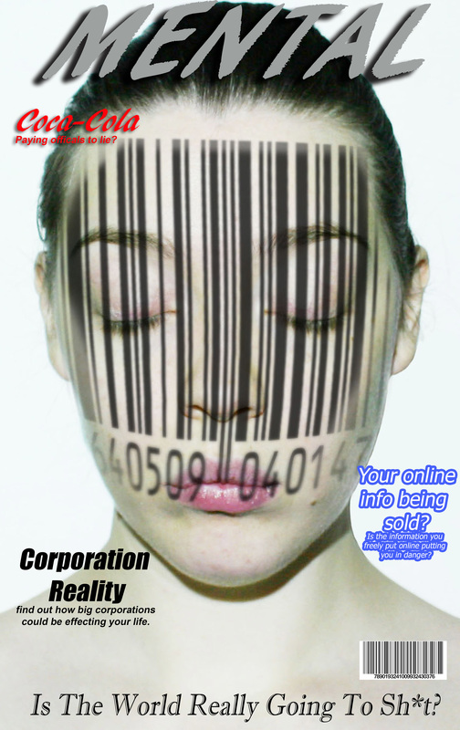
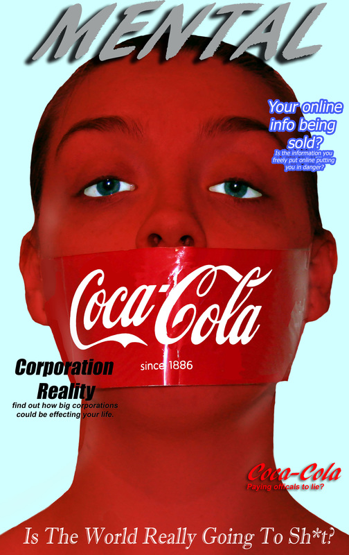
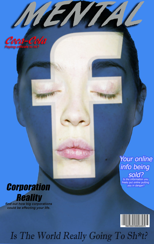
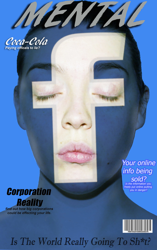
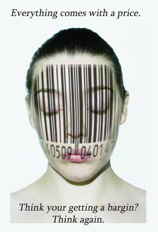
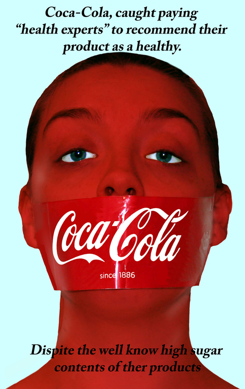
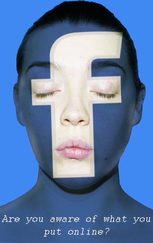
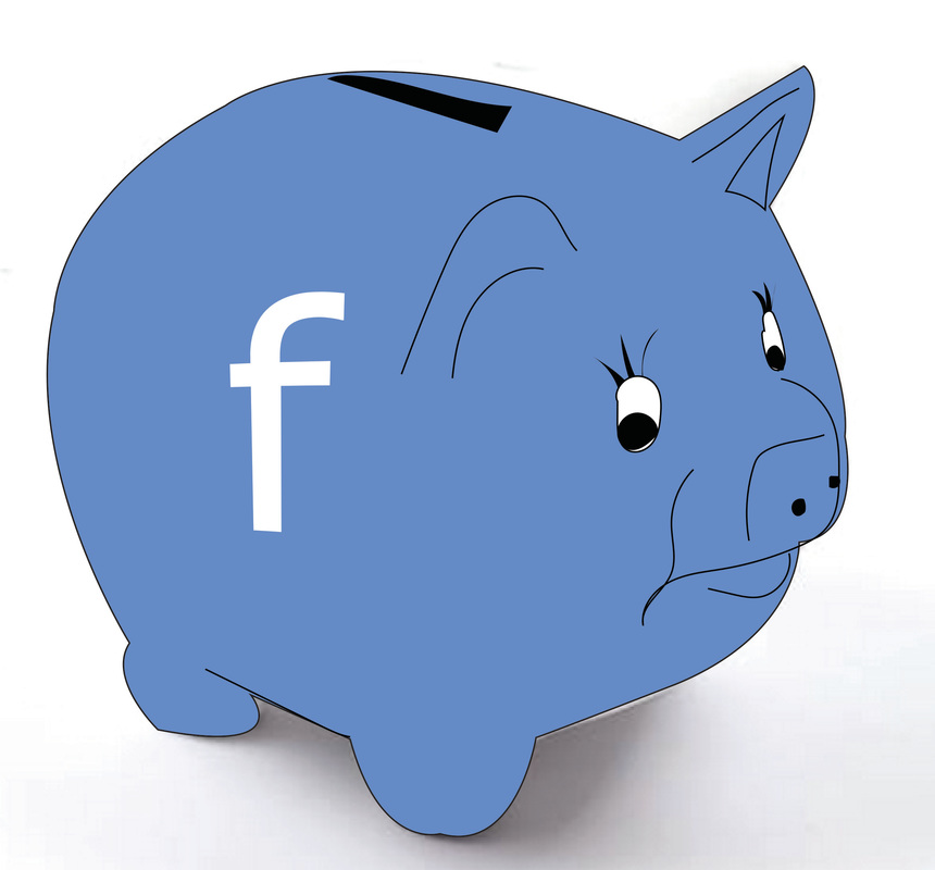
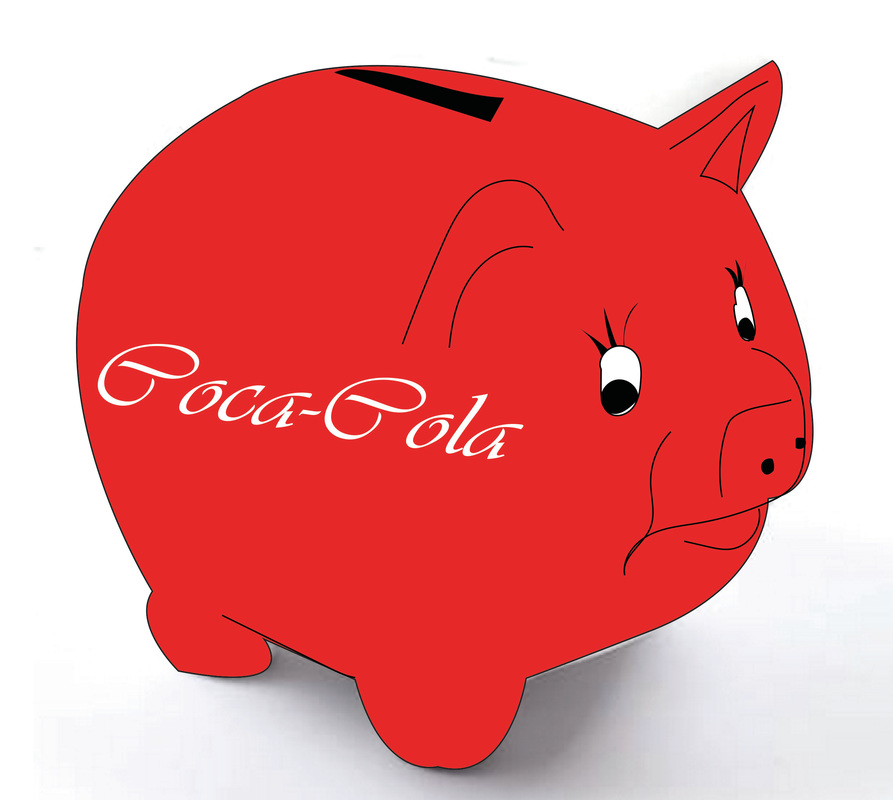
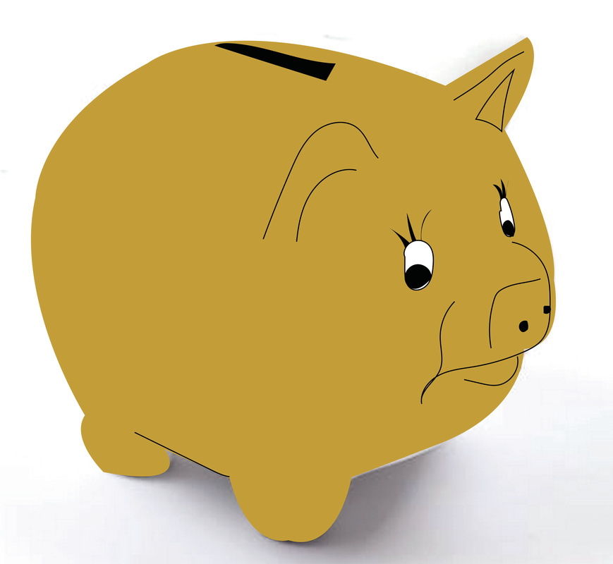
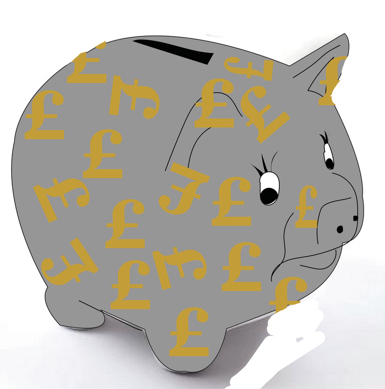
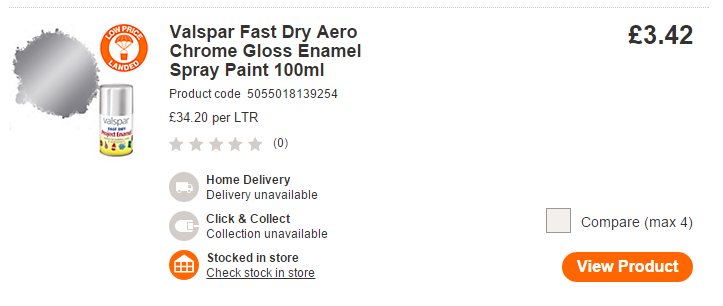
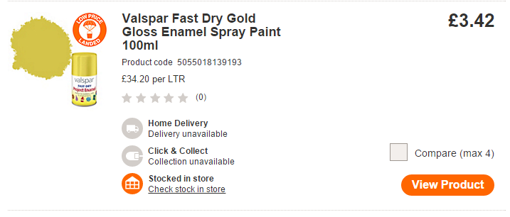
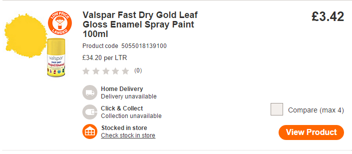
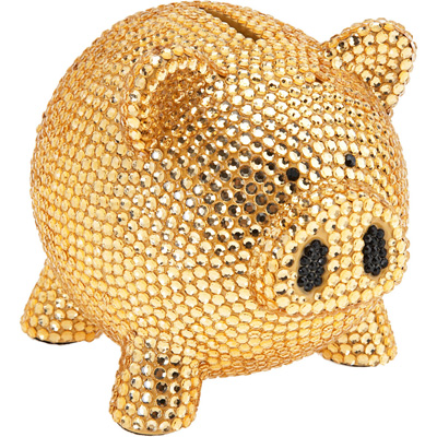
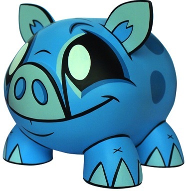
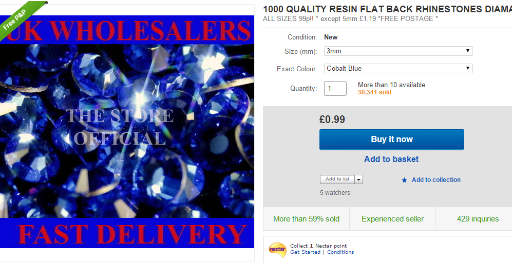
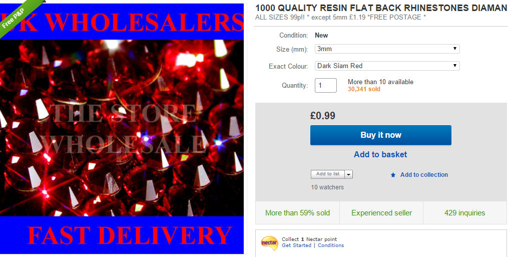
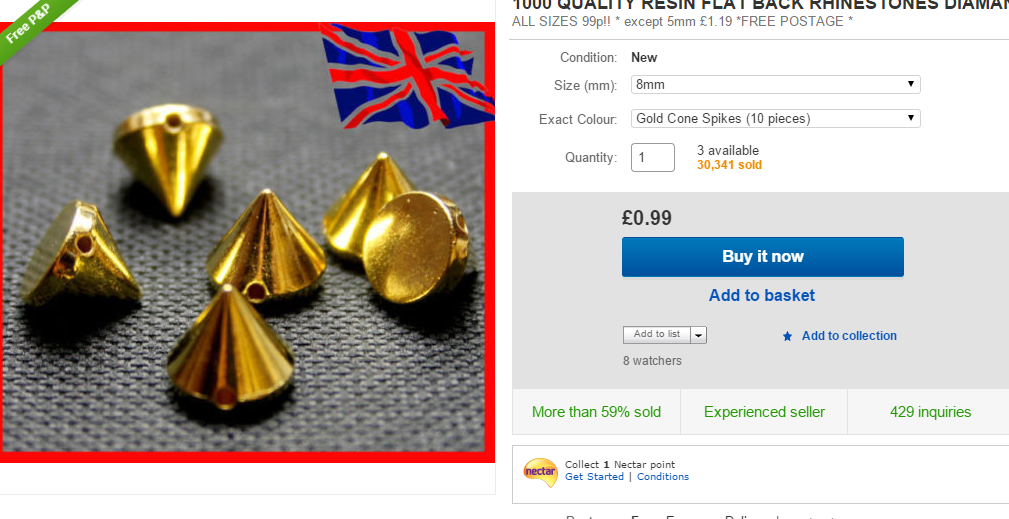
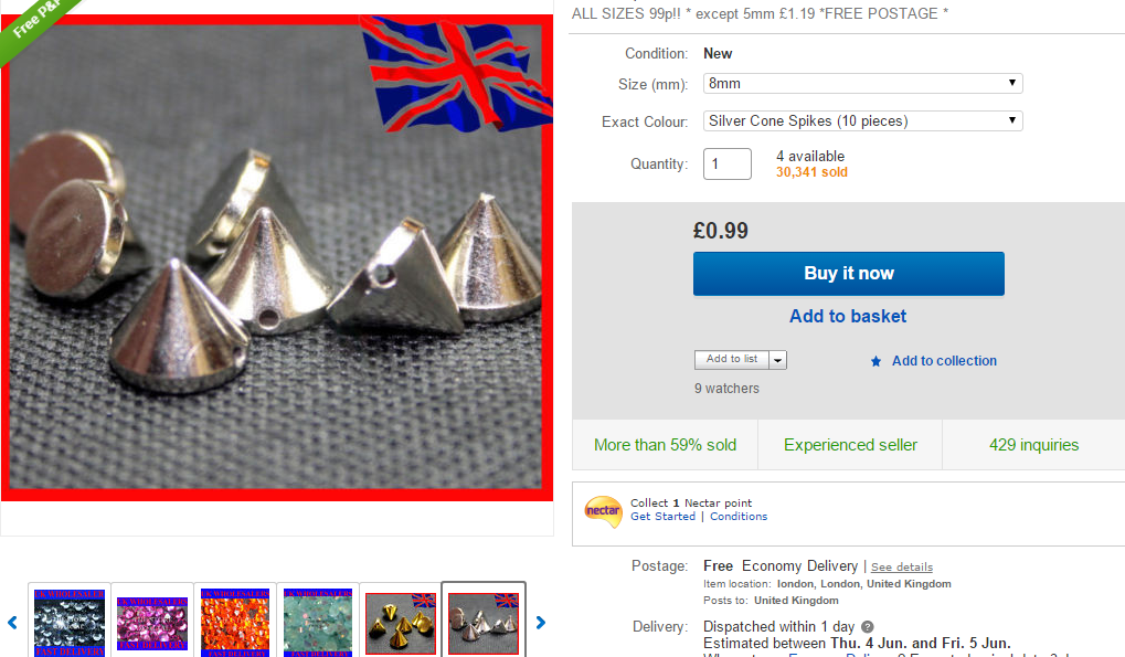
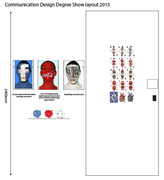
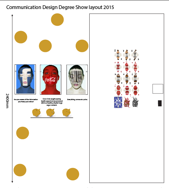
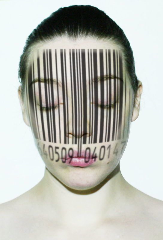
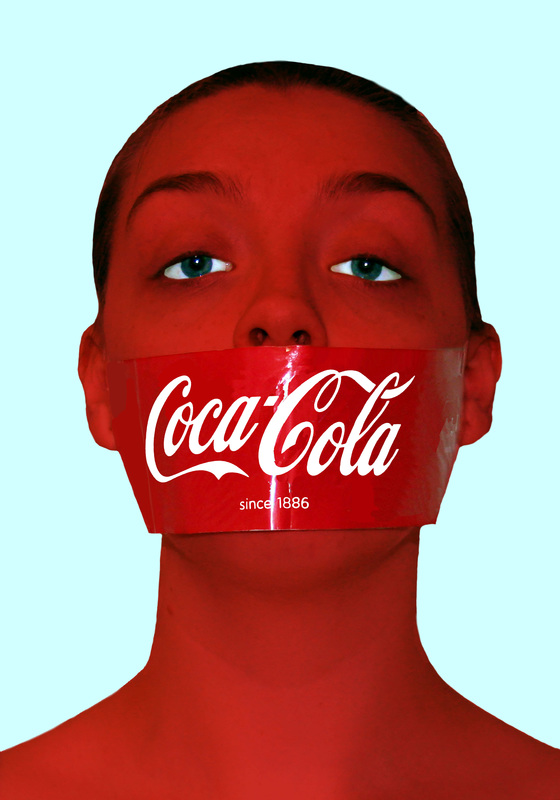
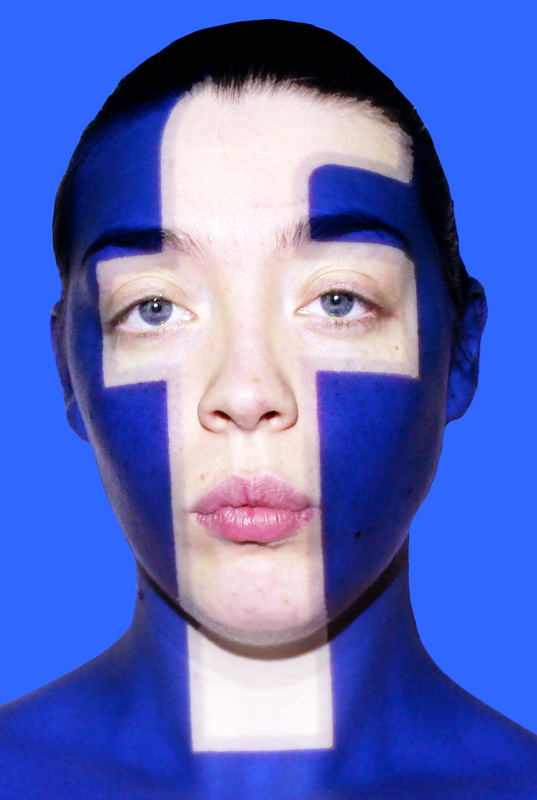
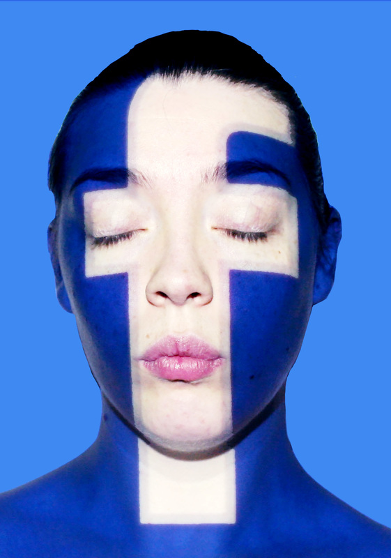
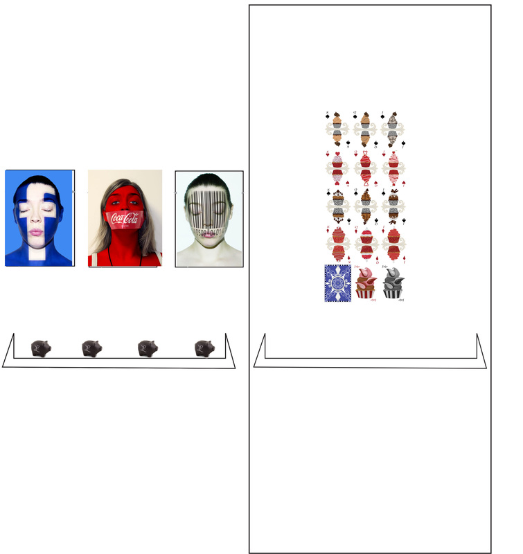
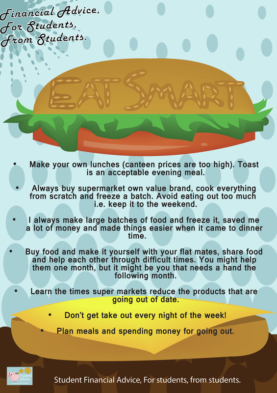
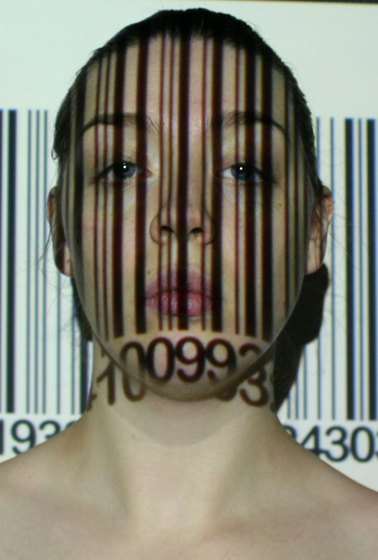
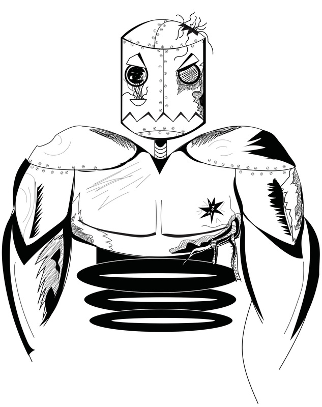
I got a good bit done today. I went back and started to add more to the portraits, as though they were magazine covers: I am aware there is an other magazine called "Mental", however there magazine is more based on mental health issues and in new techniques to treat mental illnesses. The reason I choose "Mental" was due to how we were asked by the labeling guys in our class, to pick 1-3 words to describe our work. A lot of the words others chose within my course were really funny and laid back words. I randomly chose mental, due to how the portraits I will be displaying and the whole back story to them is very heavy going stuff. Or in layman's terms "Mental". Also with how I am also displaying my playing cards. So as one of my friends suggested, it's also another symbolism of how corporations play games. I really didn't like my Coca-Cola magazine cover. I don't think any of the colours work. I have to admit I really under estimated this task. I really wanted to have the idea of a magazine that basically tells of all the things going on in the world, a bit like The Sun, but not as terrible. So I found that the Facebook Magazine and the bar-code, worked really well. I think this was mainly due to how the Coca-Cola image it's self already plays on the opposite of colours with the red portrait and the blue background. I also did a few more versions of sort of awareness posters. Within this campaign. I am still figuring out what to say with each image. I have a lot of information of each. I just don't really know how to put it all. Especially with how I want all of my images to have very bold and hard hitting statements. To really make you think and of course to try and get a shock factor involved. I also turned backed to the end of year show with my piggy bank idea. I decided to start designing them today to finally figure out whether or not I need to build my shelf tomorrow for them. Here are the designs I came up with: 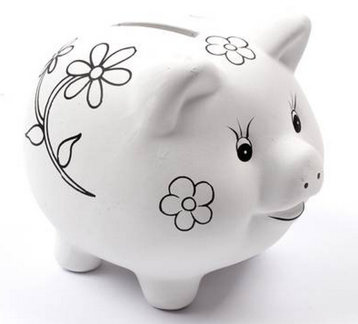 This is my piggy bank that I am thinking about buying to decorate for the end of year show. I took this image into illustrator and began to design over the top of it. I firstly thought about designing the pigs to go along with the pieces I am putting on. So I firstly created the first three images. I personally don't find these very interesting. Also because the when all the issues I am bringing up really boil down to. Is money, So I thought about why not be simple and have gold pigs. one for every image, then I of course thought about silver and decided to just have a little look at the idea of having a silver pig with pound symbols all over. I decided I really didn't like this. I even began to look into spray paint I would be able to get: I then started to look further into other piggy bank designs that others have done: 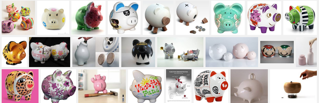 I came across the crystal covered piggy bank and the cartoon piggy bank. (two very big images above)I have to admit I got really excited to do something like the cartoon piggy bank. Although I realized within my time limit it just really wasn't going to happen. I have to admit most of my concern comes with the piggy bank I am thinking of getting. Because I am getting that particular one, I am not too sure on how to completely cover it minus spray painting it. So the idea of self adhesive crystals on the piggy bank, really makes sense. So I began to research this idea further: Found these crystals online. I also found the gold and silver studs. I think the studs would be amazing. Almost like a blow fish or a hedgehog. The idea of something being covered in spikes makes it a little harder to hold. So this I think would really work for the piggy bank. I also went on to looking at how I want to display all my work for the end of year show, again. So above are again more mock ups of the end of year show. 1st image is of my first idea of having a piggy bank for each portrait. 2nd looking into having just three gold piggy banks, 3rd I had previously mentioned about having vinyl coins around the wall, with again three gold piggy banks. Then of course I started to look at possibly not having any piggy banks or even vinyl coins. I have to admit I am strongly thinking about not having anything, but just my art work, and the slogans underneath the portraits.
This idea of just having the slogans under the portraits and no piggy banks, would really help me out with getting to concentrate with other work, true. But I think it's a little bit distracting too, for the public, in what too look at. The portraits them selves are very striking, with the added piggy banks and vinyl coins in the background. It may be too buys and not really knowing where to place your eyes on. I will have to ask around possibly and see what tutors say about this. Although, as it currently stands, I am thinking of not having the piggy banks or vinyl coins. This was a very long blog today. I clearly had an incredibly productive day.
0 Comments
Today was very productive, I got my finals done! YAY!!!! and I started to paint my wall for the show: 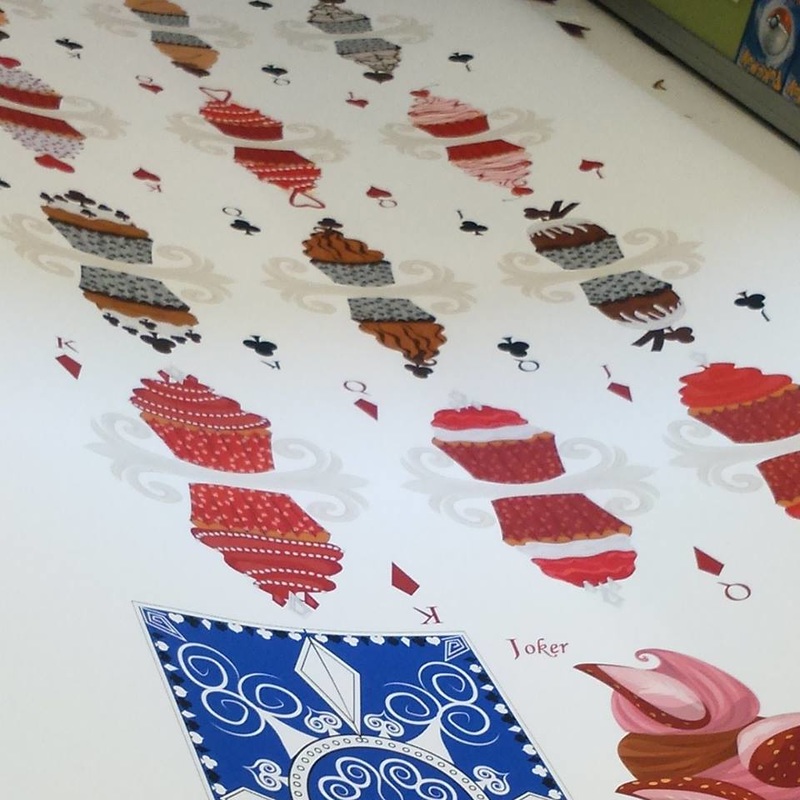 I have to admit I think I got one of the worst walls in the hall, simply because it had the most masking tape on it as well as holes poked through it. 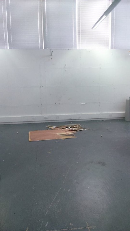 My wall had the random bar above the wall is directly above my space. We were told that the hall is in the best condition it has ever been in. The hall above is actually the First year hall, so it's a little poetic that our end of year show is being held were in our first year studio. So the wall was stripped, sanded down, gum strip ripped off and re-applied and painted. 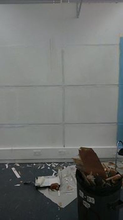 So this is how my wall looks now. I am hoping to have the wall finished tomorrow. I can only imagine I will have to polyfill most of the wall too. So this is all very exciting, then next week we get to hang our work. Then it will be final hand in. The rest of my day I have been spending making QR Codes for my sketch books so my tutors will be able to link what I say in my sketch books to what I write on my blog.
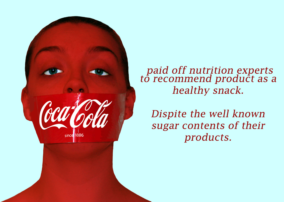
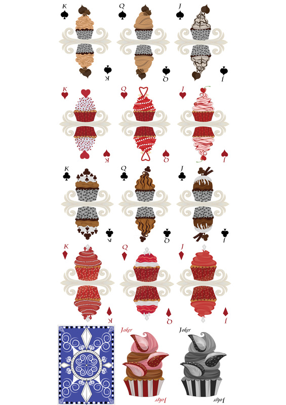
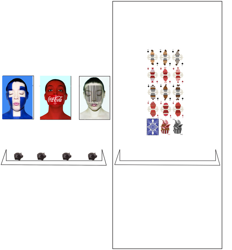
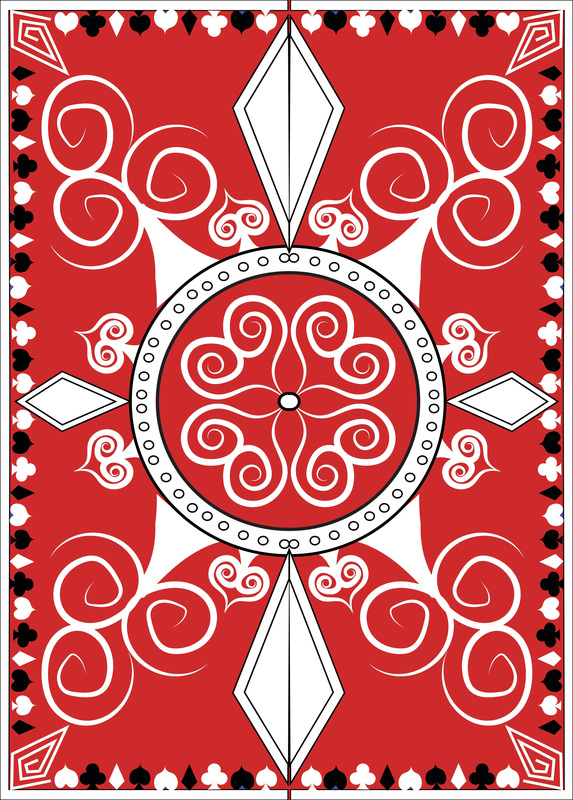
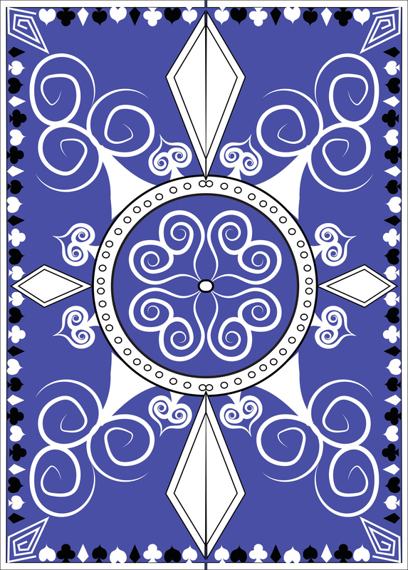
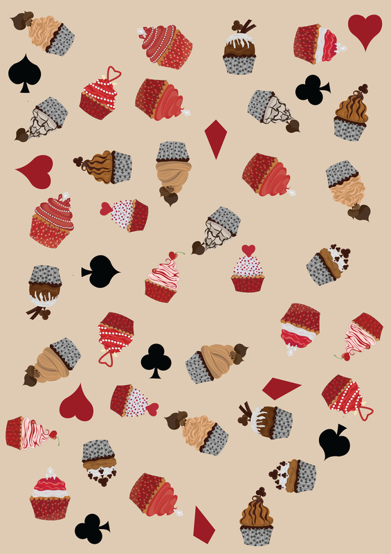
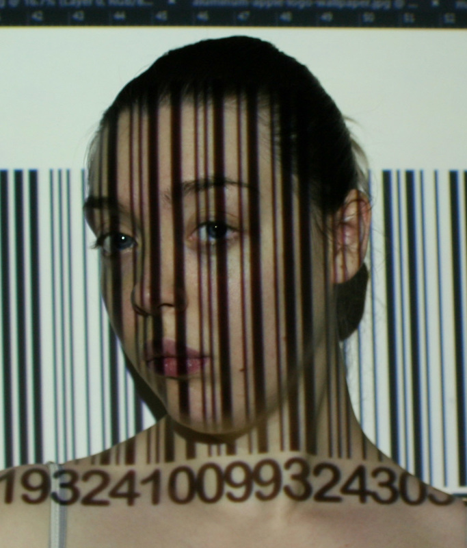
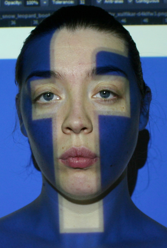
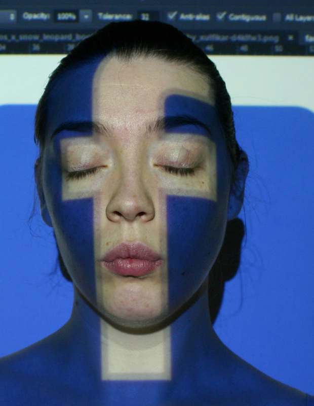
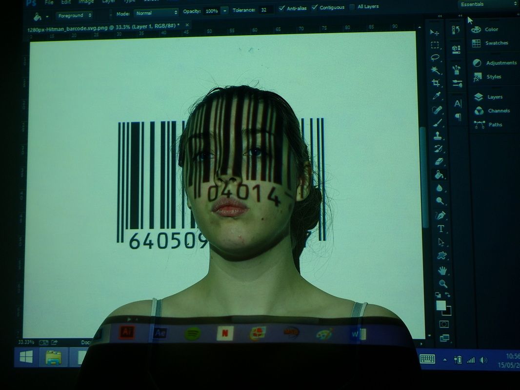
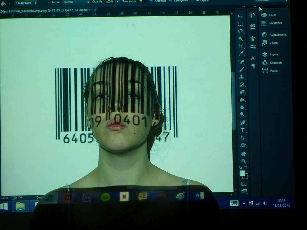
Short blog today, just a little up date on my final weeks of being at university. That's all from me. Today I got a lot done. I have re-photoshopped some images, even ordered my deck of cards to be printed for the end of year show. Everything seems to be coming together nicely. For my deck of cards I had a choice between my three designs: I have decided to just show my cupcakes, I have also ordered my monsters to be printed and my cupcakes to be printed to hopefully sell at the end of year show :) I had also experimented with the idea of having all three of my designs together and the jokers and backs of the deck of cards, I just felt that this looked really strange. 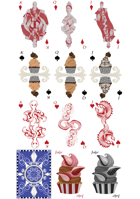 I'm honestly just not happy about it, So I have chosen to go for just the cupcake theme. I also successfully and finally got around to the re-edit of the "No Say" Coca- Cola image, I also went back to the facebook images and the bar-code ones too, and just tweaked them a little: I went back into my bar-code portrait, I just made the bar-code look a little more realistic, The Coca - Cola portrait I finally edited to a way I liked it. I will admit the almost turquoise background was a little unexpected. Although I have to admit I rather like it and I think it really makes all the other colours within the portrait really pop. The Facebook images, I simply just went back in and made the "F" lighter and more white to really stand out. I really like all of these and I am really happy with these results. This is an update of what my end of year show will look like. I just have to make a choice of whether or not to have my original Coca-Cola portrait or the re-edit of the portrait. I have to admit while l look at these side by side, I actually think the original Coca-Cola Portrait stands out more compared to the new portrait. I will have to ask around and see what others think. I am hoping to have these printed out either tomorrow or Tuesday.
I am still to buy my piggy banks, as well as dwindling down the slogans or facts I may put on them, although I have to think fast about either paper mache, black chalk board piggy bank and the paint it yourself piggy banks from hobby craft. Again hopefully this will be more items I can sell at the end of year show, hopefully people will want to buy them, I just have to start thinking of how and what way I am going to design them. Which I will hopefully get started on tomorrow. So, I am very much nearly there, If this was the lord of the rings trilogy, I have just reached Mordor. That's it from me today, hopefully more development to show tomorrow. Today I didn't get a much done today as I wanted to, I did a bit of research today, looking at piggy banks for the end of year show and even researching prices for foam board for the show, I haven't yet ordered my playing cards. I am still hoping to get others opinions, but I plan of making the purchase tomorrow, as well as trying not to cry over the price of them. I did however, re-take images for the No Say, Coca Cola image. I realized that all of the images I had chosen to use,like the facebook and the bar-code images. I had my hair tied back in all of them, So although, I felt I had a good sort of contrast with the images I have. I didn't really feel it quiet worked. So I re-took the images. and low and behold, I don't like any of the re-taken photos: 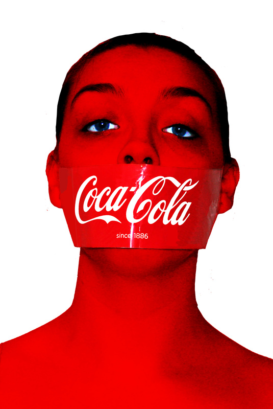 I want to go back again and re-edit the image in a different way. As this seems too worked on.
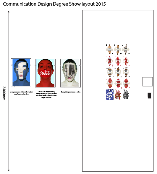
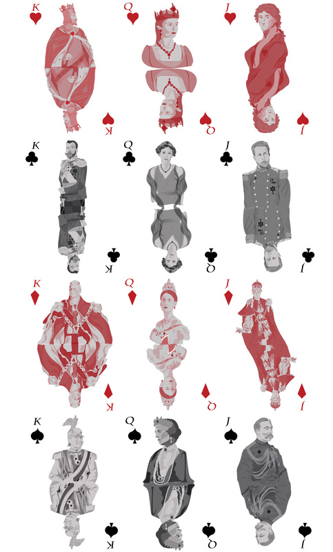
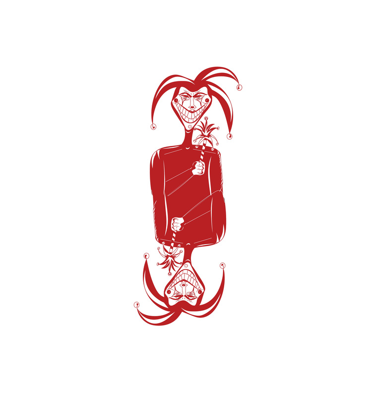
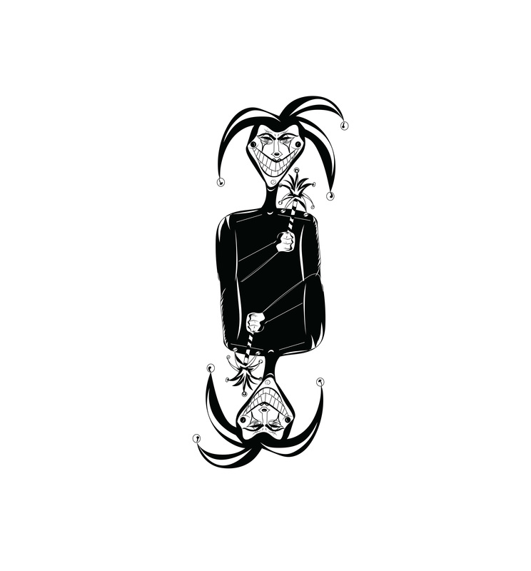
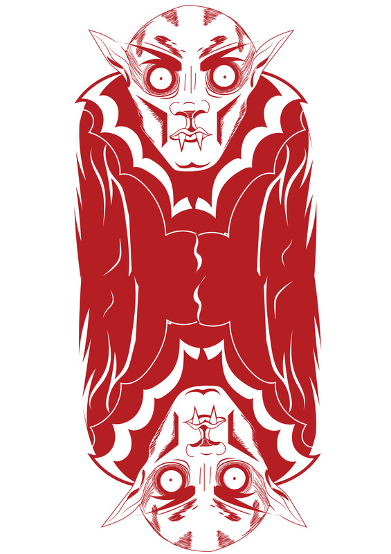
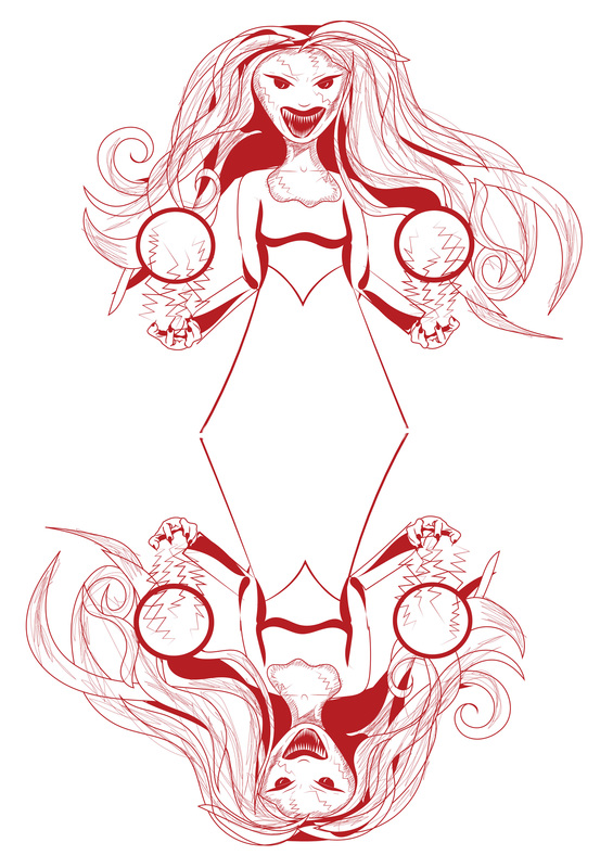
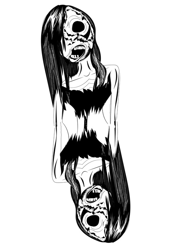
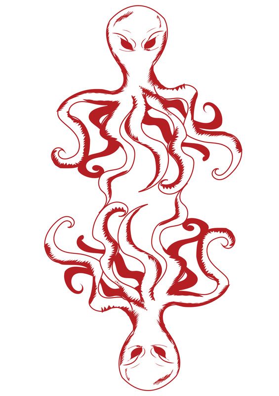
Short blog today. That's all from me for today. So I got a hell of a lot done today, I am almost there to having everything finished up, it's just a case of getting things printed and mounted for the degree show. Today I spent mainly drawing up my jokers for the Monster deck and the cup cake deck. I also went back and fixed my traditional deck of cards. I have now gone online and have managed to find a quote to get them printed. I am just not too sure at the moment whether or not to get multiples printed off to sell, as I am a poor student. At the moment I have worked out that I am able to at least get 3 of the cupcakes and 3 of the monster decks printed. I have looked at my traditional deck of cards and although I do like it. I have realized that they more than likely will not be very interesting to others. I would prefer to get all of the one deck of cards, So I am going to ask around and see what others suggest. I have basically until Sunday to decide. As I had hoped to get them printed out for my hand in. But looks like it's going to take roughly 3 weeks to get them sent here, so yea. Anyways here are my jokers I designed: I have also decided on which backs I want to have on my cards: I am not too sure about the cupcake backing, I am hoping to use the jumble of cupcakes, although I am unsure. I have however decided to go with these blue and red backs for the Monsters and Traditional decks of cards. The red for the Traditional and the Blue for the Monsters. I am hoping to do more research into the photography portraits I previously done and get them all prepared as well as my cards above for print for the degree show, I am currently thinking of having the below as my exhibition: 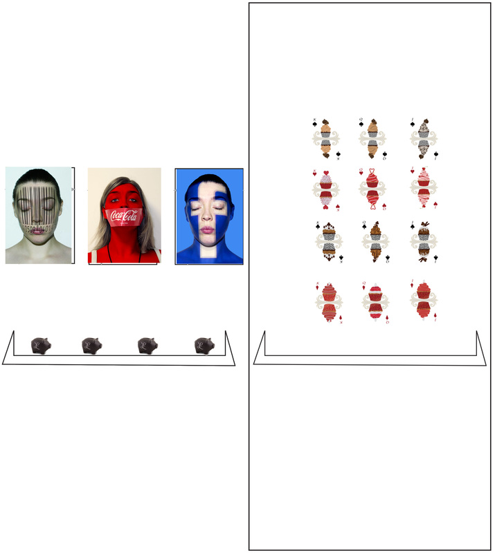 obviously With the Cup Cakes I am planning on just choosing one of the suits and I will do the same with the other two suits, then on the fourth line of the cards I am planning to show the jokers choose one of the backings. to display. I was also thinking about even having some vinyl gold coins around the portraits. I also want to experiment again with words at the bottom or along the top of the portraits with facts. Although I already have a feeling that these may be stronger on their own. However I am still planning on experimenting further.
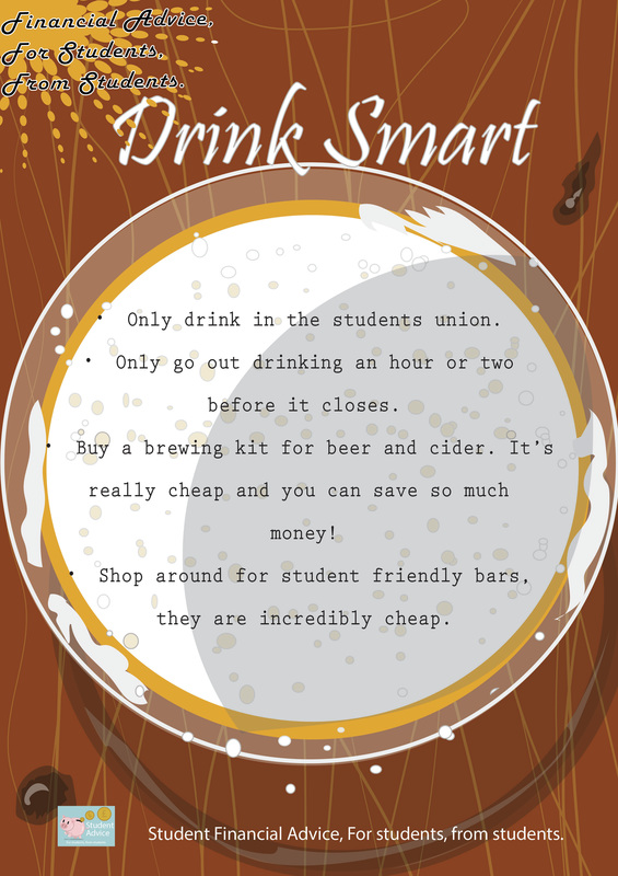
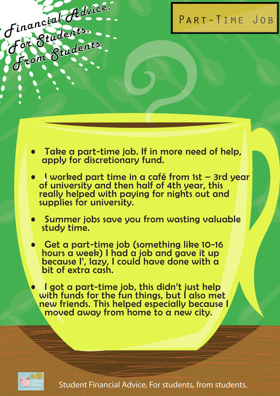
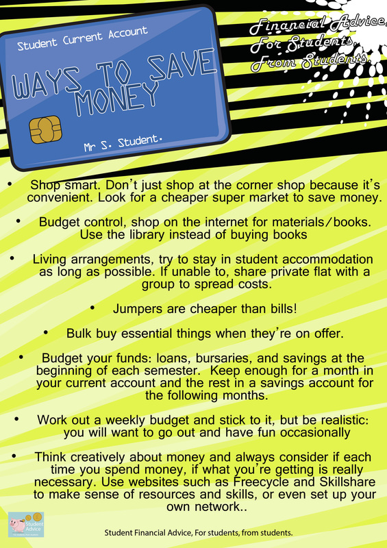
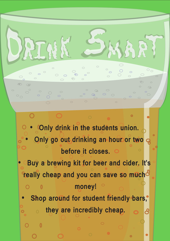
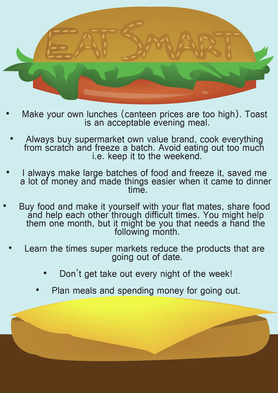
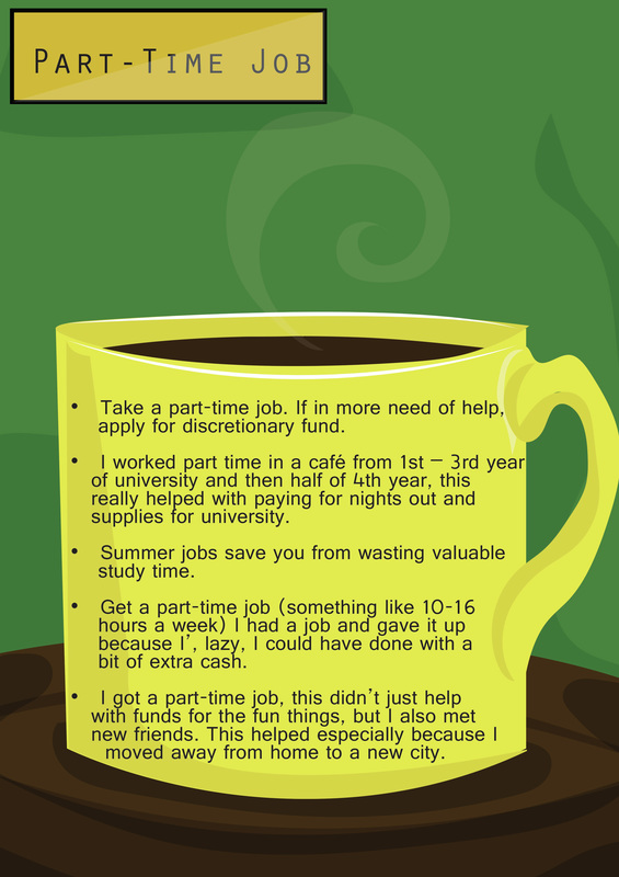
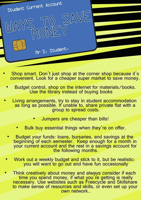
Even as I look at these now, I have realized I haven't yet bought the piggy banks, I am hoping to also go to hobby craft. Maybe find some cheaper Piggy Banks.... Anyways, to get to the point, I may even experiment and see if I might be able to write facts about how companies exploit people out of money or even just the facts of how money in big businesses are corrupted. I knew my dissertation research would come in handy now! That's it for me today, hopefully more to show tomorrow. Today I got a lot of stuff done, I'm happy to say I am nearly finished all of my major images. I went back and began to play about with my posters for the student advice section of my project: I am actually really happy how these have turned out. Still unsure on the fonts, but I am still very happy with these pieces. They aren't amazing, but i do like my graphics and I put a lot of work into them. I am still unhappy with my coffee cup poster, The other three though, I'm more than pleased with. I have also started to get my joker done for cupcake theme of cards. I am even starting to think about the portraits of facebook, the bar code and coca cola with possibly going back to putting writings on the posters as a bit of insightful information. I am pretty sure that the portraits of the exploitation will be displayed for my final end of year show. Anyways here is my Joker cupcake so far:  I'm still really not too sure on the colours I am using as I want to merge the red and black suits together, or in this case the browns and the reds. My idea is to try and get it to look like a chocolate and strawberry cupcake. This is still a work in progress, I also have to do another joker for the traditional and the monster decks. I am planning on merging these two together. Either way I don't think it will be too hard as he traditional looking jokers are creepy looking anyways. So it should fit in with the Monster and Traditional suits. So here is hoping I will get this all finished up tomorrow and be able to send them off to get printed for the degree show. It will be awesome!
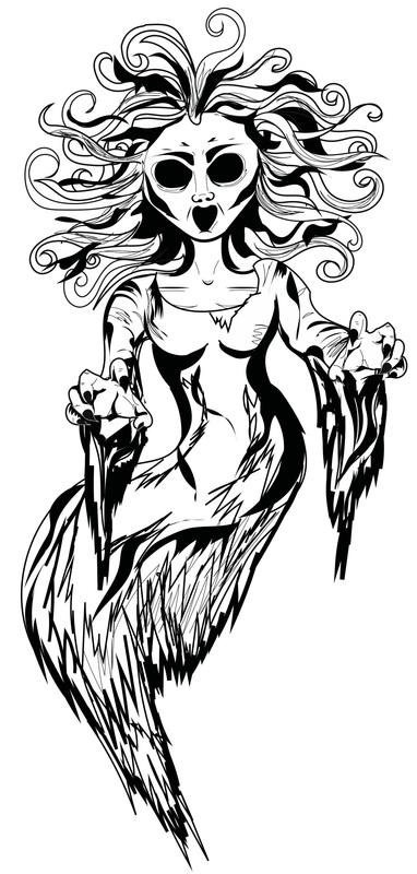
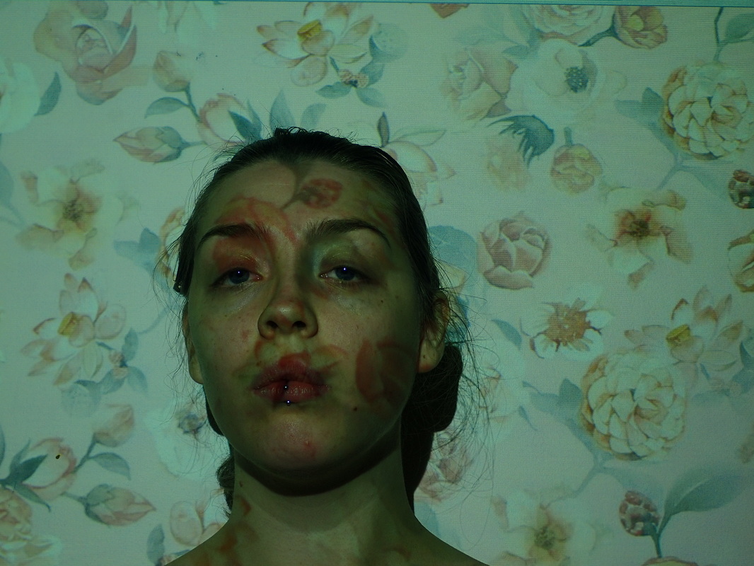
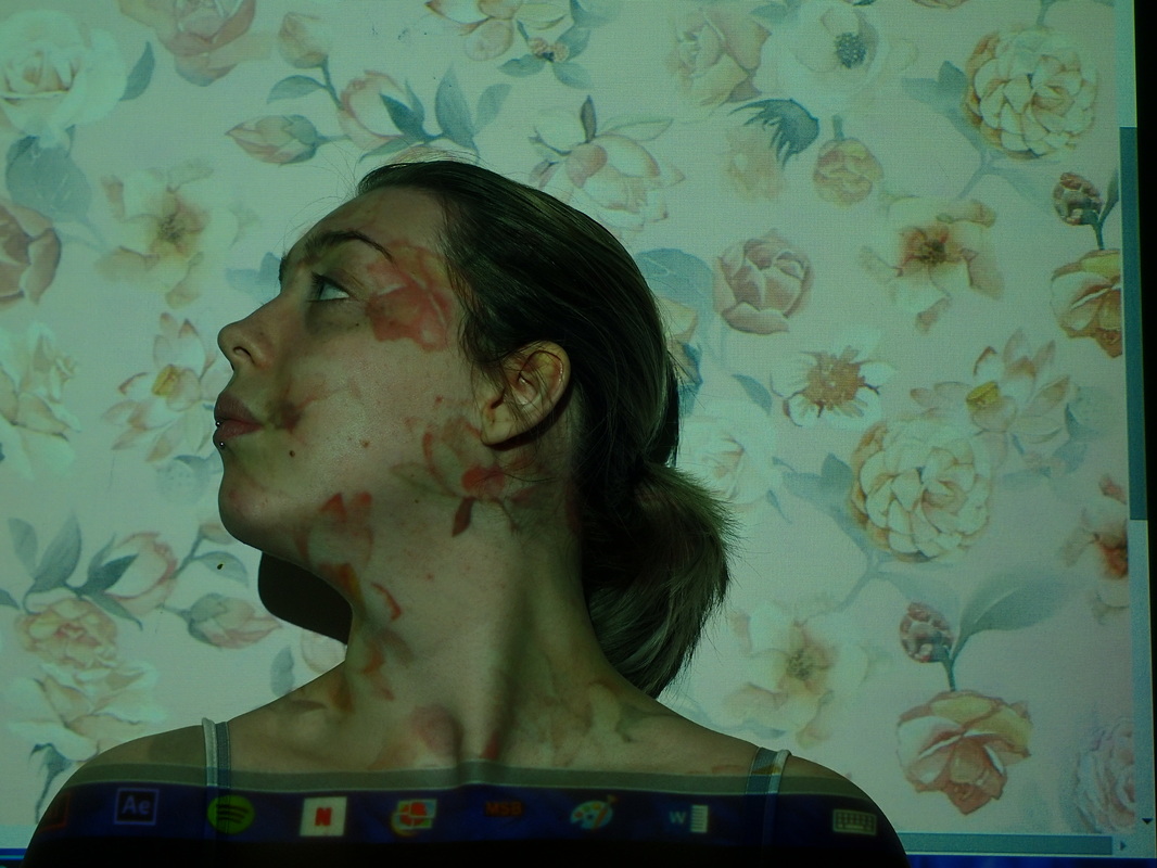
Today has been a busy, busy day! I finally got around to doing the projector portrait photography, This was my set up today and it was so complicated: 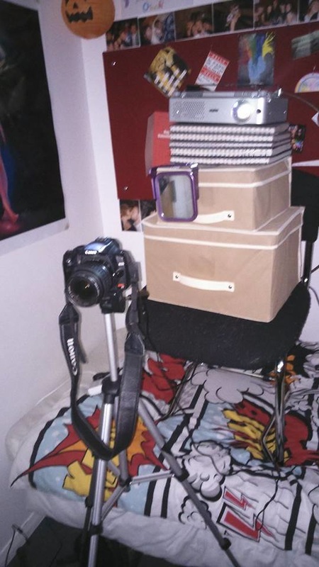 As I was using myself as the model, just cause it was easier and my flat mate is currently at home. I had to set up a mirror so I could actually measure my face up to the images I was projecting onto my face. As I couldn't really line up with the camera. It was really hard to be honest. But I got through it! Yay me! These are just some of the images I took today. I haven't yet photoshopped any of them apart from just cropping the images down. Minus that these are oh naturale. I also started to look into doing student advise posters. I have to admit I really don't like them and although, the above images are tied in with the viewbug challenge. These I feel (and I know I've said it before) tie back into my main project of consumerism, just in a different direction of looking into the companies that exploit people. Anyways! here are my posters that I created, due to really not liking my video: So as you can see they still need a bit of work. I really don't like how I've displayed the writing, I wanted to be clear, but I find this pretty boring of a layout. Tomorrow I plan to start photoshopping the portraits I took today, work away again on the above images, I am also hoping to get started on possibly a new card set. That's all from me today.
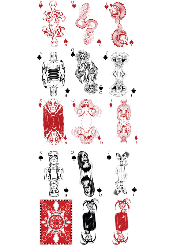
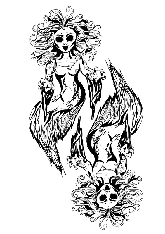
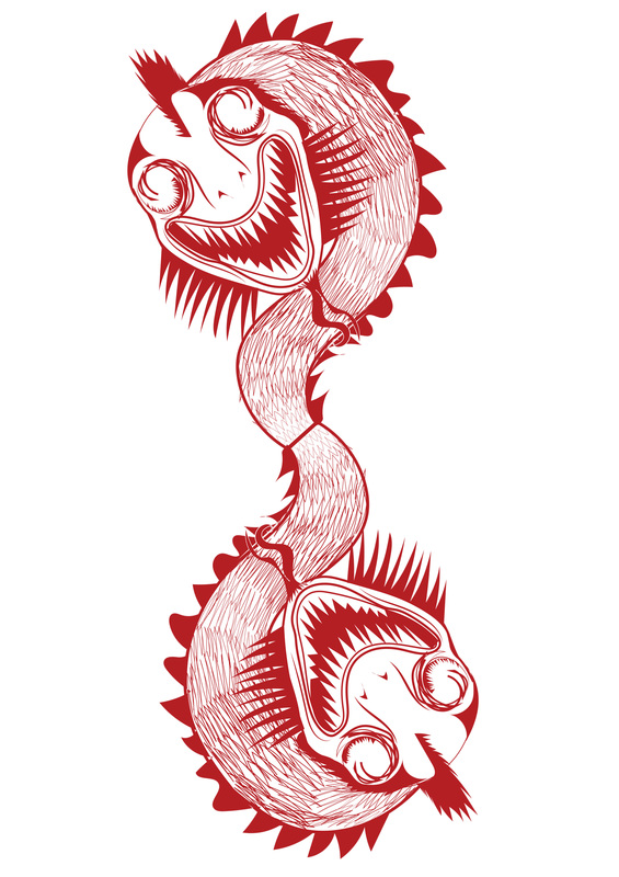
So I have completely finished the monsters deck: TAAAAA DAAAAA!!!!! Ok, so these go in the order of Clubs, Diamonds, Spades, and Hearts. I also went back and fixed a few things I wasn't too happy about within my original, or should I say first design. I am not too sure about continuing on with a 4th and final design for the end of year show. I will plan to, I am just unsure of my time left. Tomorrow I will be focusing on my photography and using the projector. I feel like I am at a really good stage with all of my projects. I am more or less finishing off all of my projects and fixing things that need fixed. In truth, I am actually starting to shit myself. This is go time and time suddenly feels like something I don't have much of.
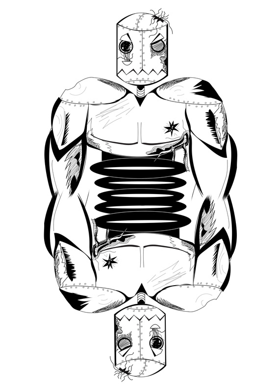
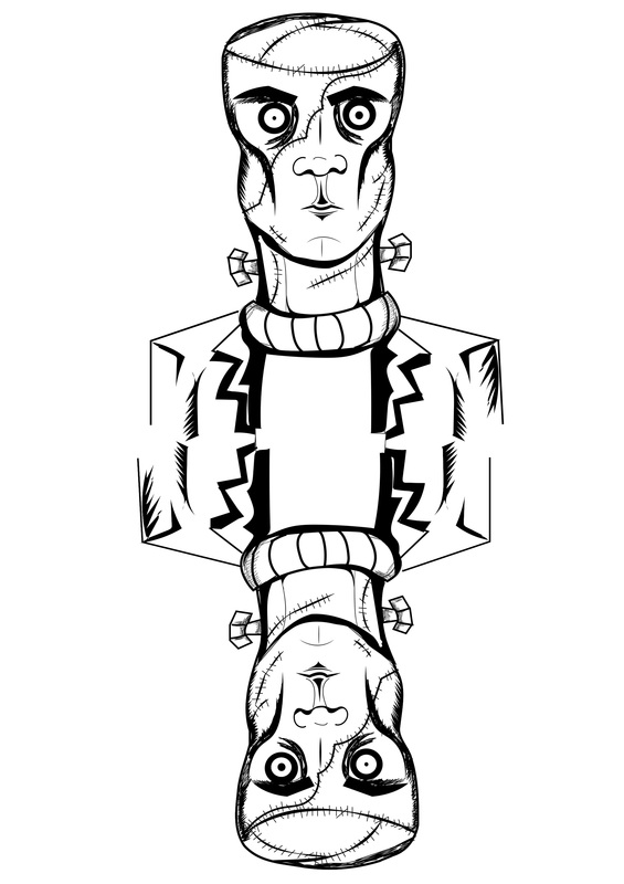
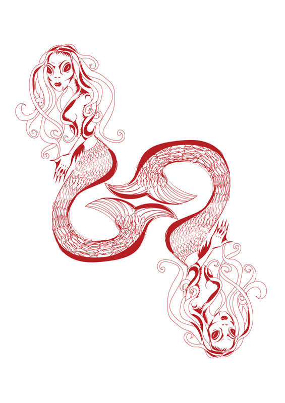
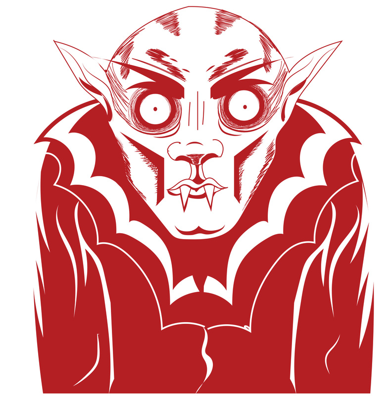
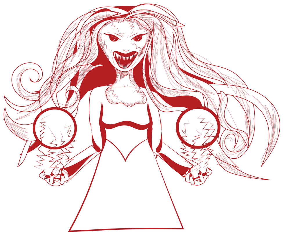
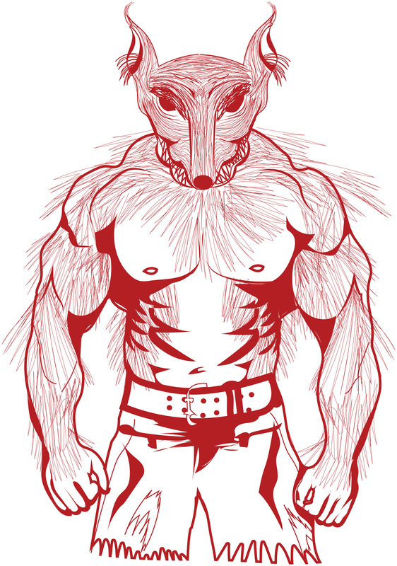
So today I officially have two sets of my deck of cads completely finished: So these are all in order of King, Queen and Jack. I have also already started the clubs suit, I am half way through getting my Jack done, my King is already done and I am hoping to get the Queen done tomorrow. So here is my Frankenstein Monster: 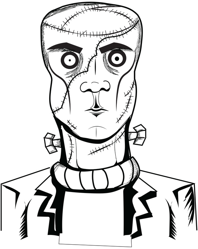 This theme is coming on very well. It's simple, although I think it's very effective, so hopefully this will be completed by tomorrow. That's all from me today, quite a short blog for today.
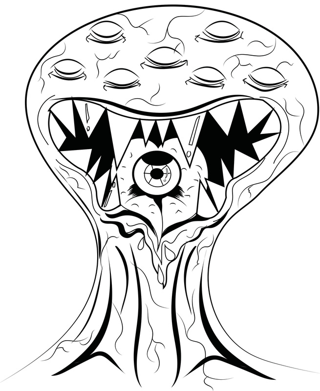
Today, I started to experiment with the projector I borrowed from uni. I have to admit, it is a little more difficult that I had first thought. Although I did take a few experimental images: So I randomly got the first image from the internet. I then projected it and.... sat in front of it. Such a science.... I look very impressed, due to not really knowing how the images were going to look, and also being blinded. I then started to experiment with the bar code images again, however, I found this more challenging as I didn't have a big enough image, then it was too small, then not in the first place, then I couldn't get my camera in the right place. it was a pain in the butt. So here are some of my images from that side of the experiment. As you can see, these definitely need major improvement. I also reworked my existing illustration characters for the deck of cards project: I have also been sketching out my other monsters, although they still need some work. Anyways, that's all from me today, Hopefully a lot more to show tomorrow.
|