|
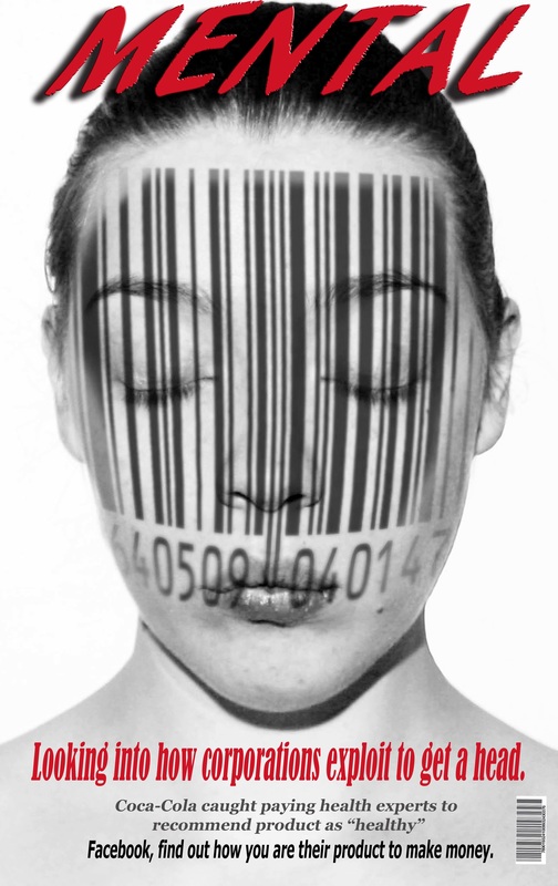
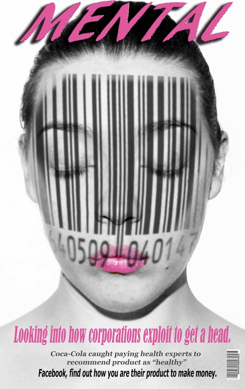
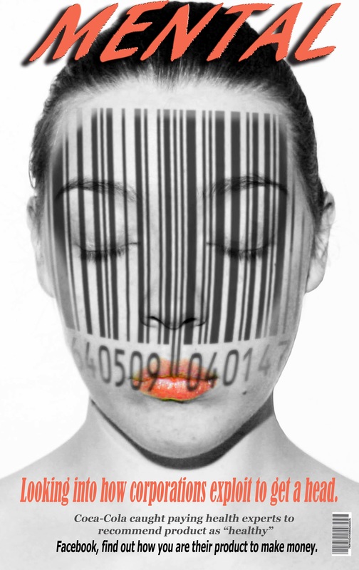
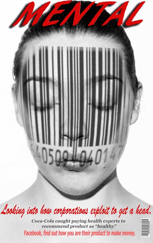
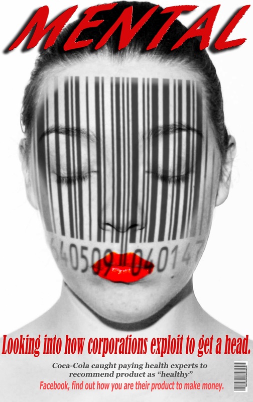
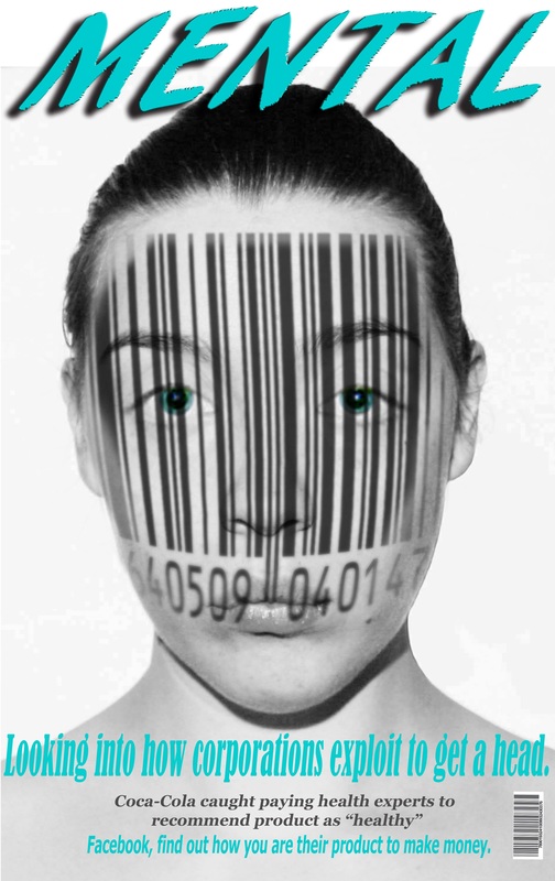
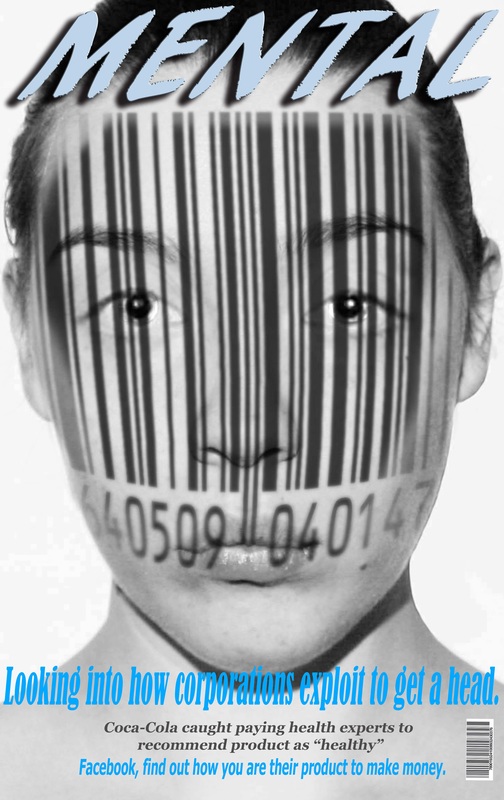
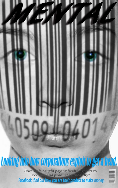
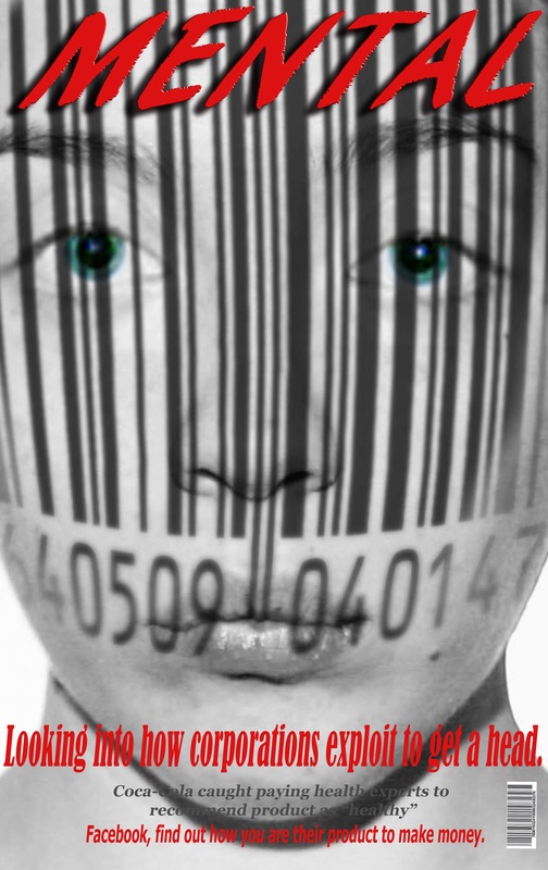
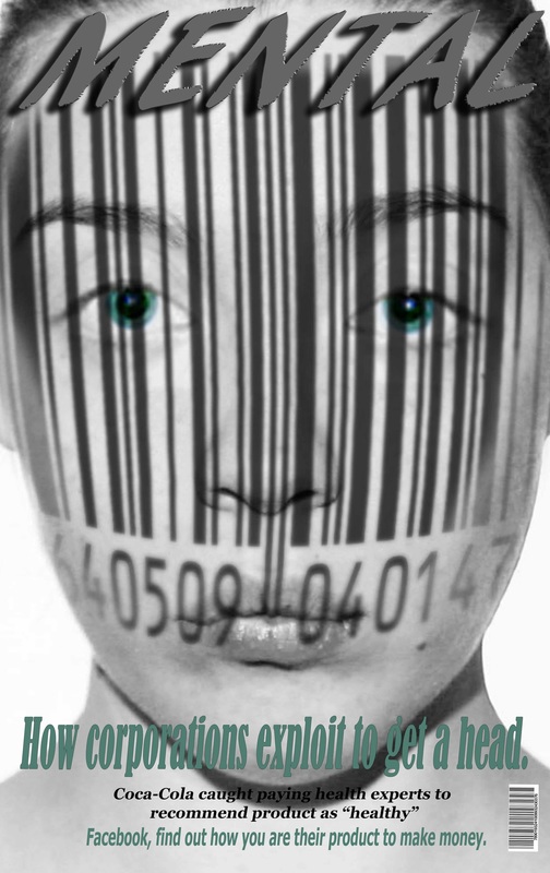
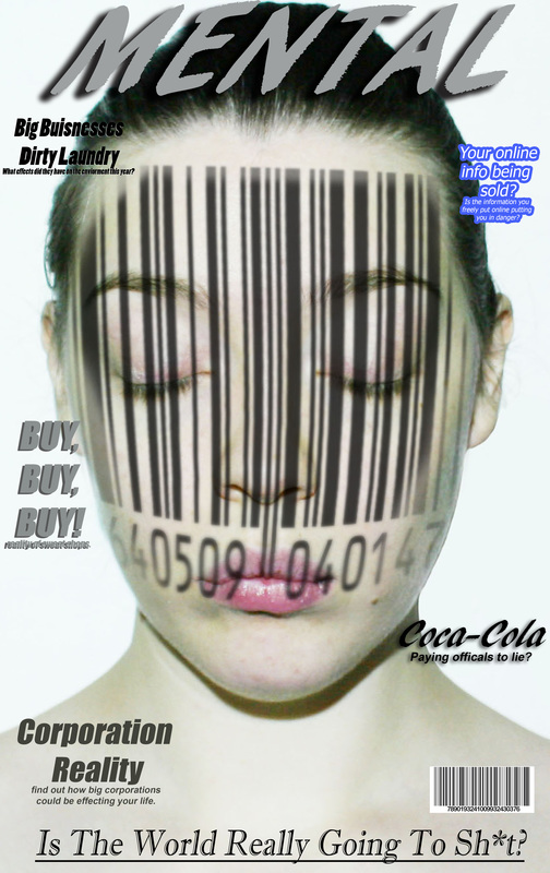
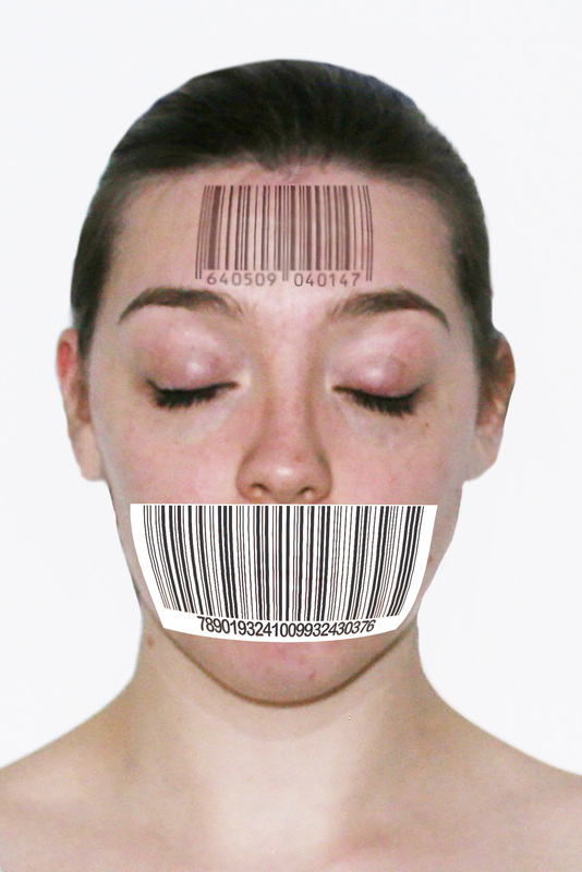
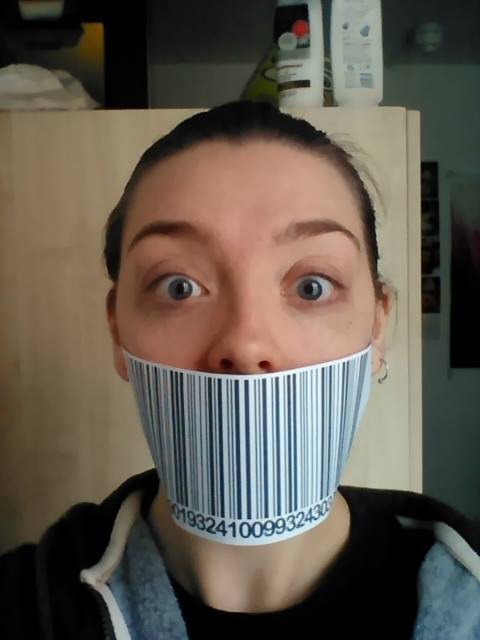
Today I got a hell of a lot done, everything for the end of year show that I wanted to put up is now up. I had to re-cut some new vinyl for my wall. And now everything is beautiful! I now get to just concentrate on finishing off my sketch books and writing everything up that needs to be done before hand in. I feel like I'm in a very good position, I even feel that I could hand in all of my stuff on Monday. Everyone else in my class is currently panicking and therefore this makes me also panick a little more due to myself feeling calm. Don't you just hate that. Although speaking of things that you hate most coming up to hand in, one of my class mates mentioned to me today was he "can't wait for this to be over, so he can stop feeling guilty about wasting time" Shit just got real! Deadlines can be really good for people or you can crash and burn, I do have that feeling of panic and worry, trying to get things done. It is a little weird when you stop just to breathe and then feel guilty. So anyways on to a more productive and positive note. I have done what feels like a million different magazine covers: As you can see I have been experimenting with a variety of different colours as well as text. I also went a step further with this I knew I wanted to have a bit of colour within the black and white image. However I think the lips actually make it more sexulised. This could however be a poster or even a magazine cover for human trafficking or something within that sort of topic. I however want a more generalized kind of image. So, I took the image from the above, went through all my photos I had taken from this project, and photoshopped eyes in from a different photograph. This was unbelievably weird I can tell you that, straight off. 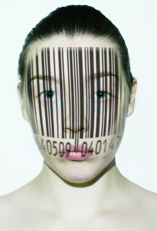 I have to admit this I think worked out pretty well, I however think that this looks like me, but a little different..... I know it sounds weird but, yea a different version of me. Although when it really comes down to it, as long as it looks like a person, and gets the point across. That is the whole point. So my idea here is a little more self explanatory. I want the eyes to try and look into your soul!, no I just want to eyes to grab peoples attention, although I still want them to look along the lines as realistic, however the more I photoshop this the more and more unrealistic it looks. especially as the eyes are very much a small part of the image, the colour doesn't really pierce through very well, even with the lines of the bar code coming down the face. I however really like the 1st image on the 2nd row, as I think this does grab your attention. I am just currently a little unsure on how to take it further. I am also really unsure on what colours to have my text and I seem to be continuing the same argument with myself on which fonts look the best. I am continuing to work on this even as I write this blog, I have a feeling however I may need to sleep on things and see how I feel about it tomorrow. So yea, that's it from me today.
0 Comments
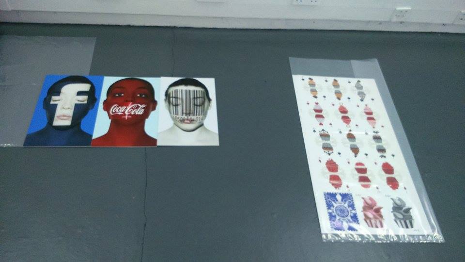
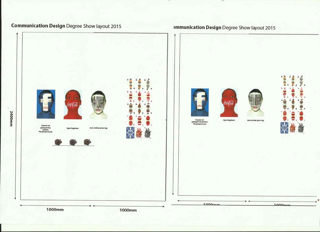
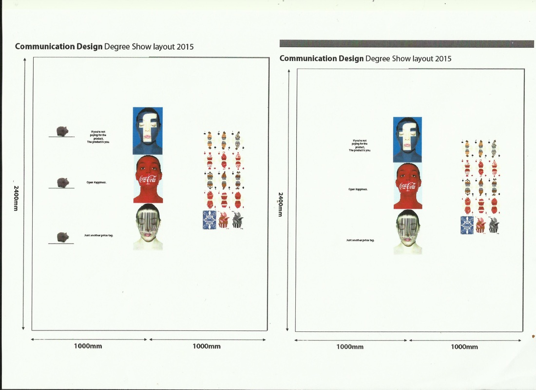
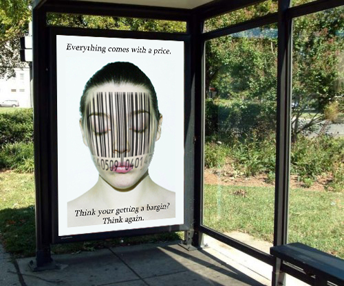
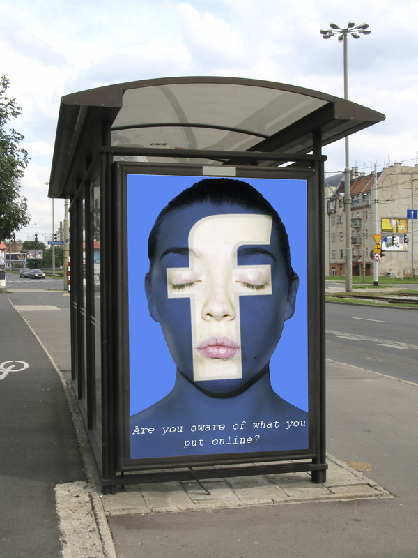
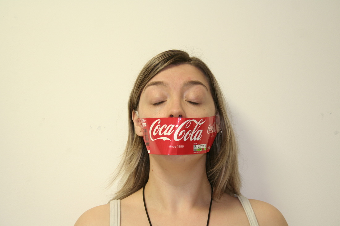
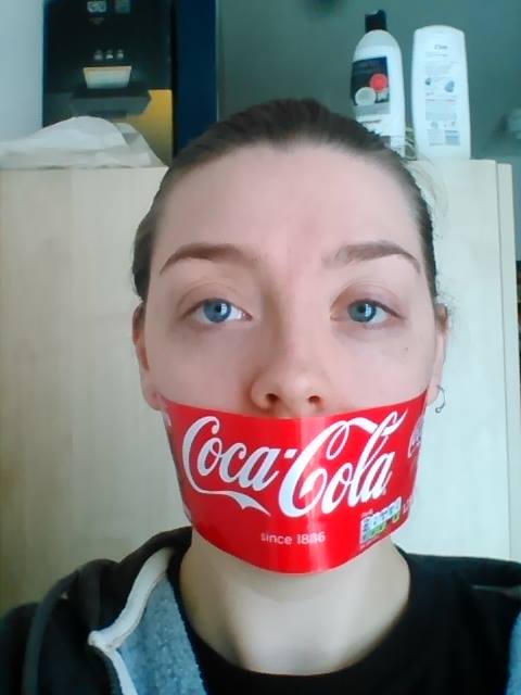
Today has been such a tiring day. So today I was to put up my work for the end of year show. I went to put my work up and then after speaking with tutors. They thought I should go back to my plan and edit it a little further, such a blow. I was hoping to have all of this done by today. So I went back to he drawing board and came up with these very similar ideas to show: I decided to in the end go with the second image. So I then had to go and get my vinyl done. I have to admit I was very nervous about getting it done. I have never used the vinyl cutter, but thankfully I had another class mate who was just as clueless and we, I mean she. Figured most of it out. I have to admit I have been working so hard and trying to get all of my work done for hand in and then some. I was a total zombie most of today. So with my vinyl I had originally wanted to have under my facebook image, "If you're not paying for the product, the product is you." Under the Coca-Cola portrait "Open Happiness?" I wanted to plat on words for that. Then finally for my bar-code image "Just another price tag." 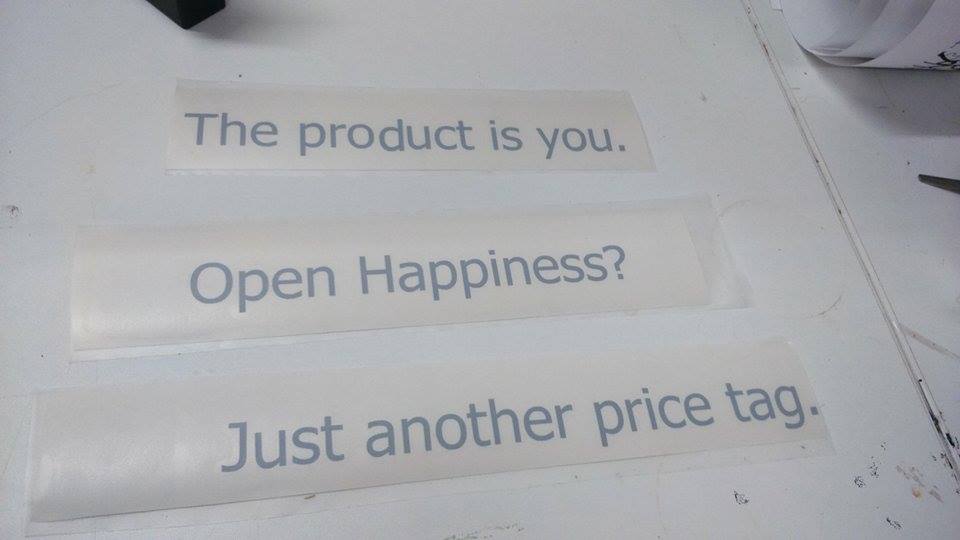 Due to my Coca-Cola and Bar-code slogans being one line, after a little bit of debate, and discussion. My self and the tutors all agreed on simply shortening down the slogan. "The product is you." The plan is to finally get all of these up tomorrow for the end of year show. I have to admit after all the running about I have done today, I definitely feel more prepared for putting all the portraits and everything up tomorrow. Also excited to see how the vinyl will look.
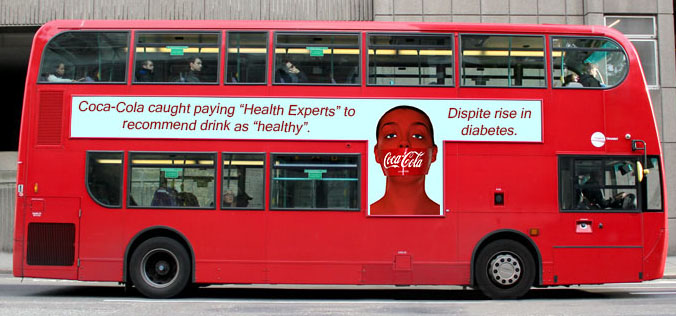
Just a little miffed that I have left playing with the vinyl to literally the last week of university. Although I have to also admit I found that the process with vinyl is unbelievably tedious. Tomorrow will tell more however. I also decided it was best to go a head and get another sketch book. As I plan to do a lot more editing and just in general more work. So that now brings me to having 10 sketch books to hand in next week. I am just hoping that tomorrow I will be able to really start in getting things done. I have also done a lot more of my sketch book write ups today. So I plan to finish it off hopefully tonight and then the rest of tonight I will be stuffing my face with chocolate and watching Netflix. That's all from me today. Today, I just went back into my magazines and even did a little advertisement stuff: I wasn't too sure about how to cover the magazine cover with the type. To be honest I am still not too sure, I think I will have to edit this a little more. I did however print out the first image in A4 to see how it looked. I have to admit I still want all of the writing and topics around the cover to be a lot bigger. Which is strange due to while in Photoshop I didn't want to cover the face too much. I think I will have to do some additional research. The coca-cola image I was getting pretty annoyed with the portrait I had chosen for the end of year show. The colours within it I really couldn't get it to work. It started to look like a 90's magazine cover, which isn't a big deal. But it's not the idea I am trying to convey. So I got my original portrait of the Coca-Cola portrait and put that as my magazine cover. I think this image work a lot better. I am again still not happen with my colours or fonts. Within this sort of magazine cover, I decided to go further and put my images into bus shelter advertisement slots, buses and even billboards. So I did a bit of a mixture, although I have to admit, I prefer the bar-code image to the other portraits: As you can see, I have been busy. I am also still trying to figure out what to say underneath the portraits. I also realized that with other awareness portraits, they have their image, slogan and then some other smaller text:  here is just one campaign, that shows what I am describing. I might even go back and try some of my other images that I took for the portraits to try and see what else I can come up with. I will hopefully have something great to hand in, which is now a week away, and I have a funny feeling it may end up with a 10th and final sketch book....
Today I didn't get a much done today as I wanted to, I did a bit of research today, looking at piggy banks for the end of year show and even researching prices for foam board for the show, I haven't yet ordered my playing cards. I am still hoping to get others opinions, but I plan of making the purchase tomorrow, as well as trying not to cry over the price of them. I did however, re-take images for the No Say, Coca Cola image. I realized that all of the images I had chosen to use,like the facebook and the bar-code images. I had my hair tied back in all of them, So although, I felt I had a good sort of contrast with the images I have. I didn't really feel it quiet worked. So I re-took the images. and low and behold, I don't like any of the re-taken photos: 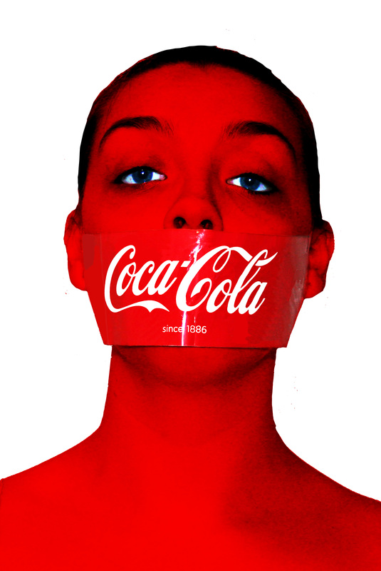 I want to go back again and re-edit the image in a different way. As this seems too worked on.
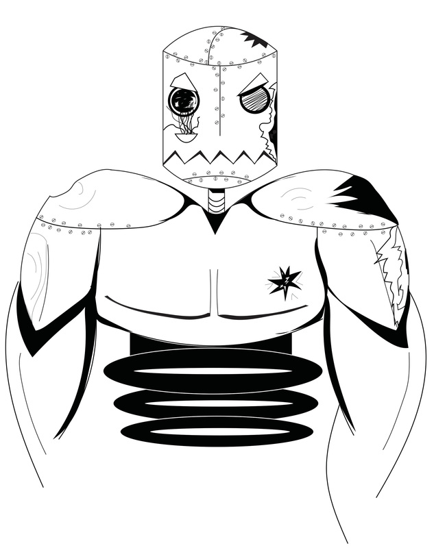
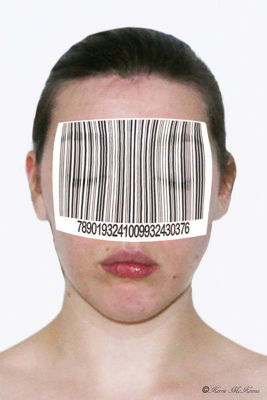
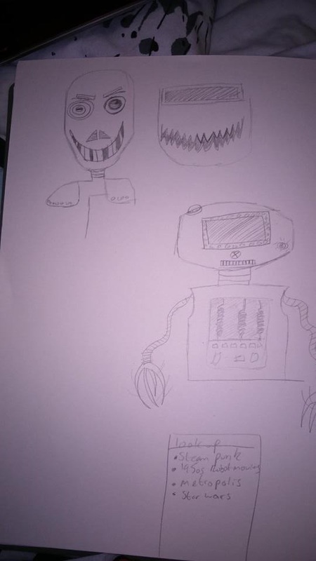
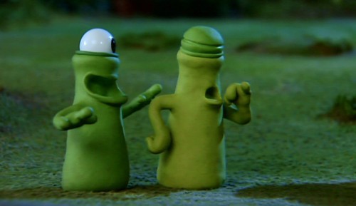
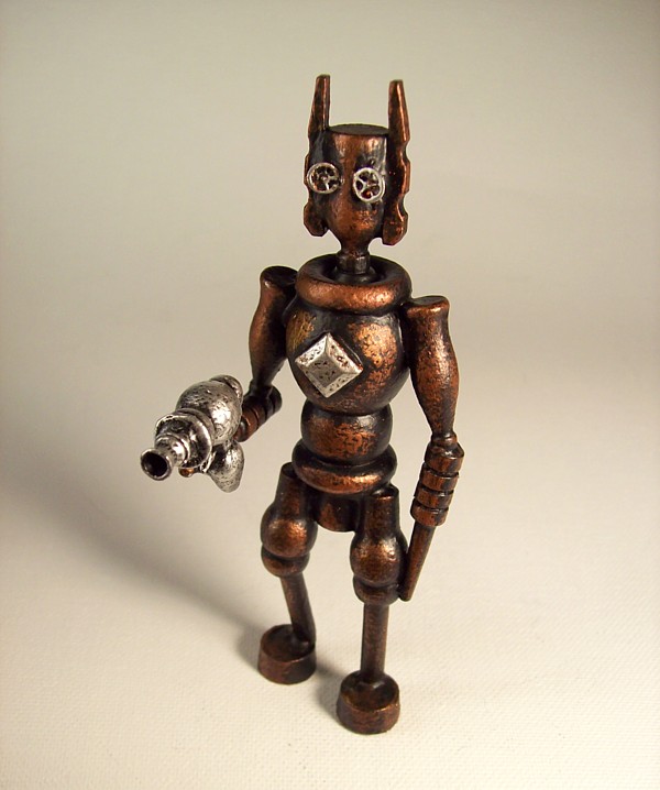
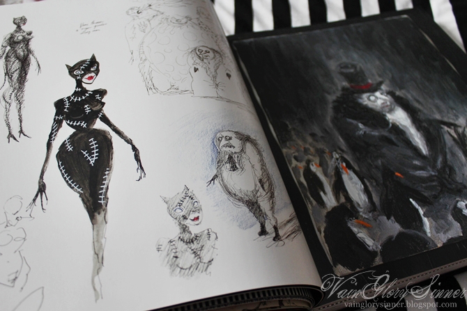
Short blog today. That's all from me for today. Today has been a productive day! So I got talking to my tutors and I was surprised to find, that actually they preferred my first design that I gave them. They also looked at my coca-cola image and we all agreed, to take out the writing at the top as the image is stronger in it's self the way it is. I also let them have a look at the bar-code images, they didn't even know it was me! We also came up with more ideas for two other designs. So Because the ViewBug challenge is due. I will have to just add one of the bar-code images for my second image. Although, I am very glad that my tutors really liked what I had done and want me to expand on it. So much so that they want me to use projectors and project images onto the face. So I now have the loan of a projector. Very excited! I have wanted to experiment with using a projector for ages, so I am really looking forward to this. I also got started on my illustrations. I now have a completed suit, although there are still some changes I want to make to them. Here is where I have gotten up to so far with them, this being the Clubb suit: I have to admit, I don't think they all look like they belong to each other. As with the ghost, she is very detailed and there is a lot to her. The Robot and Alien, not so much. So I printed these two images out and drew directly on top of them as an experiment: 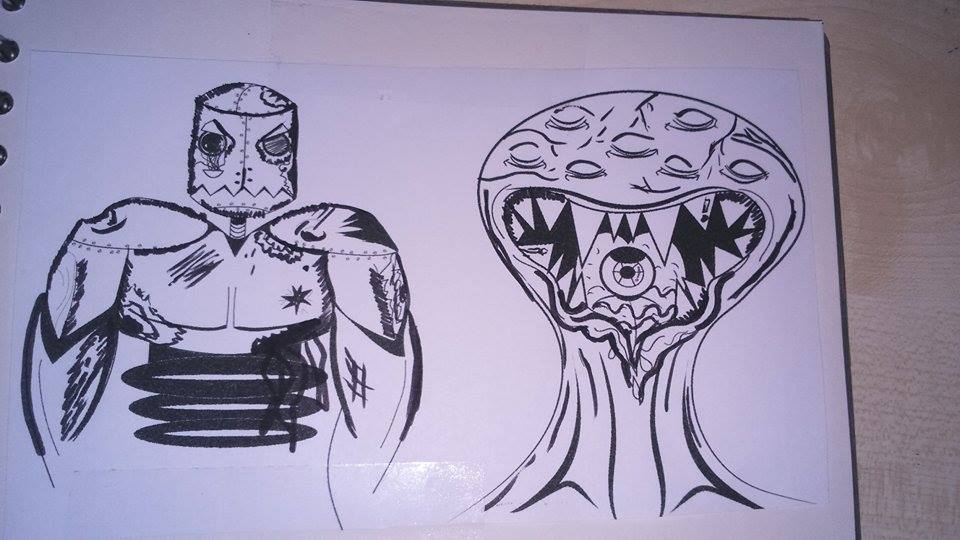 I think doing this has defiantly improved how they look and the changes I will make later on. I think that this also makes them look more gruesome. ore monster like and even possibly more graphic.
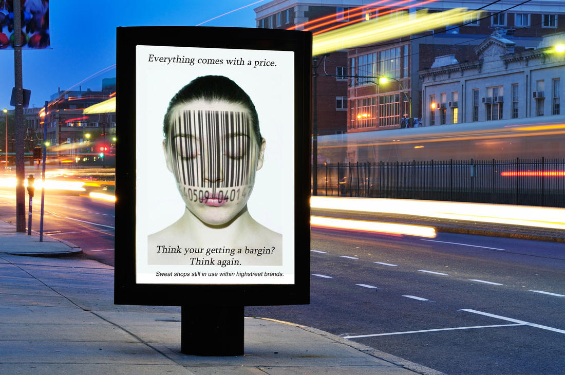
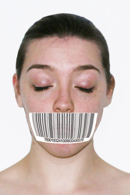
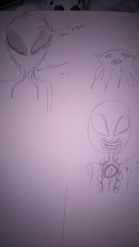
Short blog today, so that's all from me. So my video is finally up, however this isn't my official video. All I have to change however is the music. Which I will fix tomorrow. I am proud of my video, although I'm unsure about showing it at the end of year show. I also got my images done for the ViewBug challenge, you have already seen the Coca-Cola image I made. I decided to continue on with one of my other ideas with the bar-code. I wasn't too sure but I thought it was worth a shot to see how it would at least look: These are my four finals, while designing these, I tried to dehumanize myself. As you can see I tried to remove facial features. In one case I completely covered the face. I purposely made it so you can see some of the facial features through the bar-codes. I am still trying to tie this challenge in with my main project work of happiness and consumerism. Although I still plan to do my posters of my student finance. I plan to start them tomorrow as well as my deck of cards. I have been doing some more sketches. These characters are for robots and aliens: As you can see, my sketches aren't fantastic. Soooooo I did some research also see below: As you can see I really wasn't too sure on what I'm doing. Although now I have a better Idea, I'm hoping to again get started on my deck of cads project tomorrow also. So that's all from me for today.
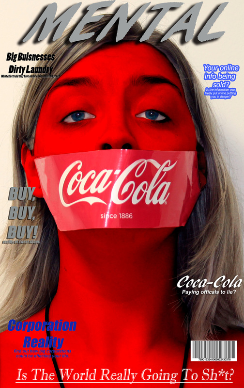
Today I pretty much wasted it by going from website to website, trying to find a company that would print my cupcake deck of cards, for cheap. It was unbelievably tedious as I had to make very quick designs of just the numbered symbols for each suit, Most websites were very slow with the uploads, they wouldn't let me edit the images to the way I wanted them displayed on the cards, Some websites stopped uploading my designs after a particular number. I was pretty much like 4 hrs of trying to get the right company to print these. I finally got it sorted. Although for one pack of cards it'll cost me roughly £15. Which sucks, although I think it will be worth it. I also have been trying to write my blurb, which will be the little bit of information that will go beside my work at the end of year show. To be honest, this week has been a complete nightmare. Just so much stuff to do and next thing I know a week has past, and the work I have done is not as much as I had hoped to have done. I have been looking at the whole planner for the end of year show, even looking at people from the past years, and I hate this feeling I have. I honestly don't feel like any of my work is good enough, the work I have done in my side projects I feel more confident to show than my main project. Even looking through it all, I can see exactly where I have gotten lost. I had originally wanted to do really mad, in your face posters showing consumerism. I am now doing student financial advice. Making a video, I honestly don't feel that comfortable about. I just really really lost. So looking at the wall planners and everyone else's displays from the past years, I have decided to continue on with the video, and see how it is at the end, maybe Ill surprise myself and it'll be the most amazing thing. Although I have also decided to create posters, which was my original idea in the first place, many tutors have more or less talked me out of it. Saying in the usual nicest possible way, that they didn't think that it was the best Idea. I just feel like I'm drowning. So screw this, I am going to do what I want to do. If it ends up looking shit, at least it'll be my colourful shit and stuff I feel comfortable showing. I also went back and re-edited my Coca-Cola portrait. I am actually really happy with it and have decided it will be my piece for submitted to the ViewBug unique portrait challenge. 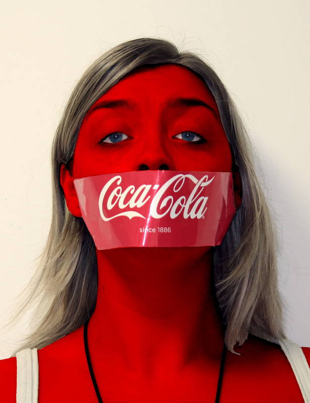 This is very simple, although I find it very effective and I think it really stands out. I am happy to upload this for the ViewBug Challenge, I plan to do a few more tweaks to this image, such as having a fact about Coca-Cola on the image, and even fixing the hair a little bit. I also finally got round to testing my line drawing skills, to make a ghost in Illustrator: 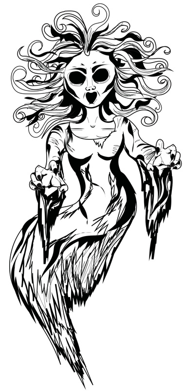 I am actually so happy with this, I want to fix the eyes a little more. But minus that I am really happy with this. One down, 11 more to go.
That's all from me today, I am going to do a few sketches for posters for students on financial advice. But the way that I want them to be. I am even slightly playing with So, I missed a day yesterday. I took the day off from doing my work, I needed to shower my head and just chill out. Pressure is properly building and I'm not going to lie, I am getting so stressed out with work and I'm started to firmly believe that I may not even get my degree... I have been working on my blurb for my end of year show, I have to admit I am actually not even too sure on what work I will be showing. So I have found the whole process of writing about my work incredibly difficult. I have also been doing a bit of photoshopping today, and re-took my Coca-Cola portrait images. So the above are my original images from today, I then took them into photoshop and began to experiment with them. I firstly started to clone tool out all the un-needed shadows, I then went on to actually take off all the calorie counts and bar-codes off it. Mainly so the viewer doesn't get distanced by all things Coca-Cola put on their labels. I wasn't really satisfied with just that, so I decided to actually colour my skin, red. Just like Coca-Cola. However. I don't have any face paint, so I have been experimenting through photoshop. Although I may invest in some face paints and experiment further. Here is what I have come up with so far: 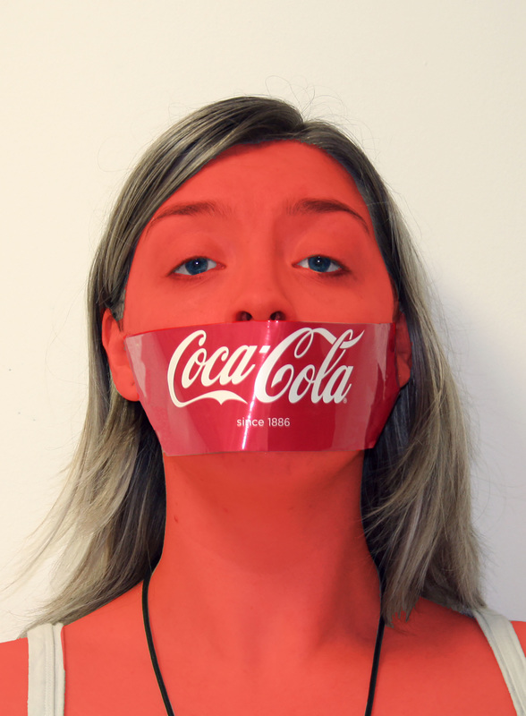 I'm still not too overly sure about it, although I plan to continue to experiment.  While I was experimenting I ended up doing this, I am starting to think that this might look even better if I drew it. Although I have to admit I have a lot of things I need to start getting on with within Illustrator. Like my monster deck of cards. Speaking of cards, I got my business cards ordered!! whoop!, I ended up going with my original idea of having just the logo on the front and the text on the back. and going with the old school rectanglenessnessness look.
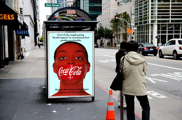
I have finally decided on a song for my video. What is great about this is because the song is so long, I can cut it down to the parts that I want. I think that this song will work well in the background of my video. It's upbeat and slightly dance. Please listen to You Tube video below. I experimented a lot with portrait photography. As the ViewBug challenge I have decided to do is on unique portraits, I wanted to create something that had a connection with consumerism and basically how big companies completely screw people over. Here a few of my very quickly photographed ideas: Coca Cola, is very well known for actually paying researchers off, when the content of their sugar is called into questions along with basically everything that is bad for you in their soft drinks. Coca Cola, actually owns a lot of other products. Especially lots of other soft drinks. I also started playing around with the idea of consumerism in the future. I very badly painted my face and put little gems around my eyes and cheeks. Playing around with the idea that models may get even skinnier, our health getting worse due to the amount of crap big companies put in our food, and the never ending want for pretty shiny things. Even a tiny little bit of mad max theme (badly done make-up) These images will of course need photoshopped and tweaked a little bit: 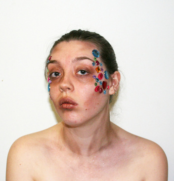 I have also been looking at getting my actual deck of cards made. I am still trying to figure that part out but so far it is going well, and it is do-able. Just not too sure on the price and when they will get here. I have been sketching more characters for my monster deck of cards, Which I have to admit it is going very well, I am hoping to have them all done in illustrator by the end of the week, well at least started anyways.
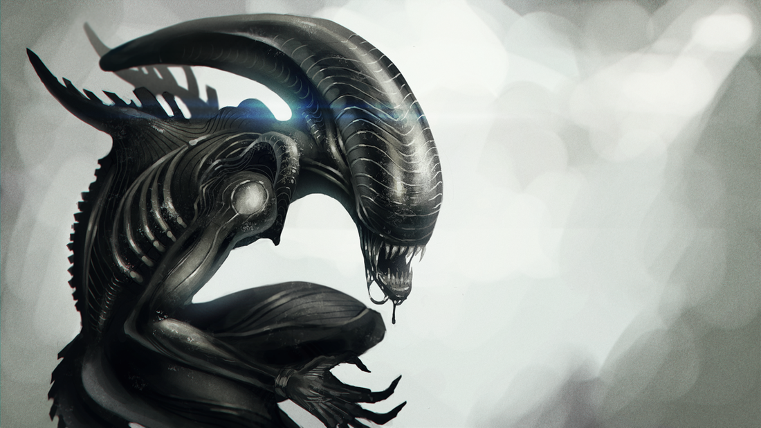
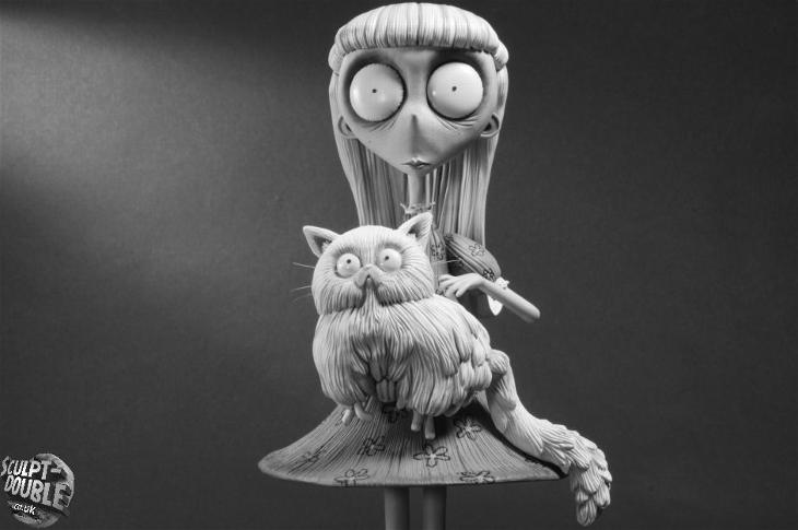
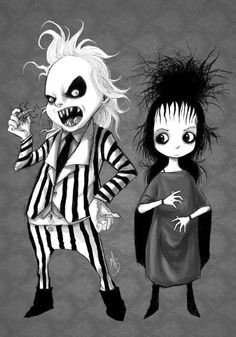
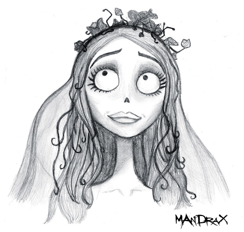
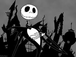
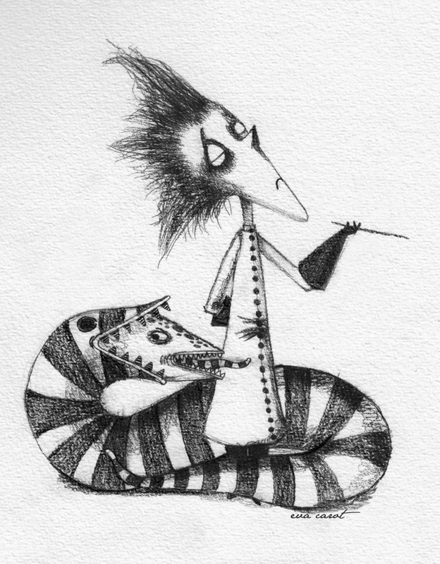
Today I didn't get a much done as I wanted to. Although I am starting to make progress with my main project and starting to get my third and possibly final re-designing of the deck of cards done. Below is a quick sketch I did for one of my characters of monsters, my ghost. 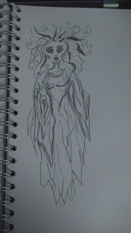 I think it looks very Tim Burton like, So I thought it would be pretty interesting to make all of my character stick in with this theme Here is some characters from Tim Burton's movies for inspiration.
I have also been sorting out the information that is going into my video. It is a lot more categorized, which is good. Tomorrow I am planning on just working on my video. I also have to re-write my little blurb that will go beside my work at the end of year show. Things are getting really hectic, I am hoping to also purchase my new business card tomorrow..... hopefully, I have asked a good few more people their opinions on which business card designs I should get. I have had a bit of a unanimous decision on which design to go for. I am still waiting on people to get back to me, but I think I might just go for it. Means they will be here before the end of year show. That's all from me today,hopefully more things to show tomorrow |