|
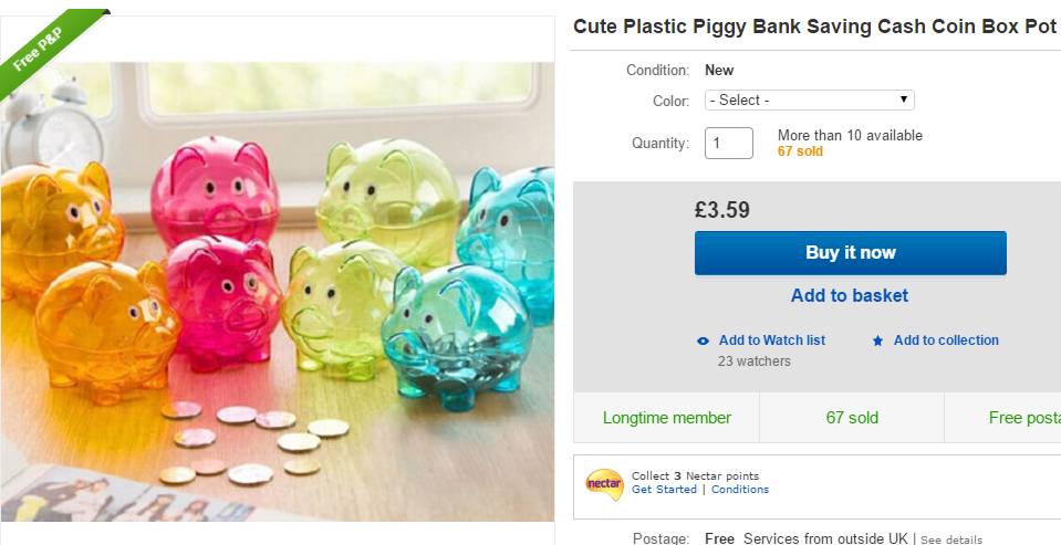
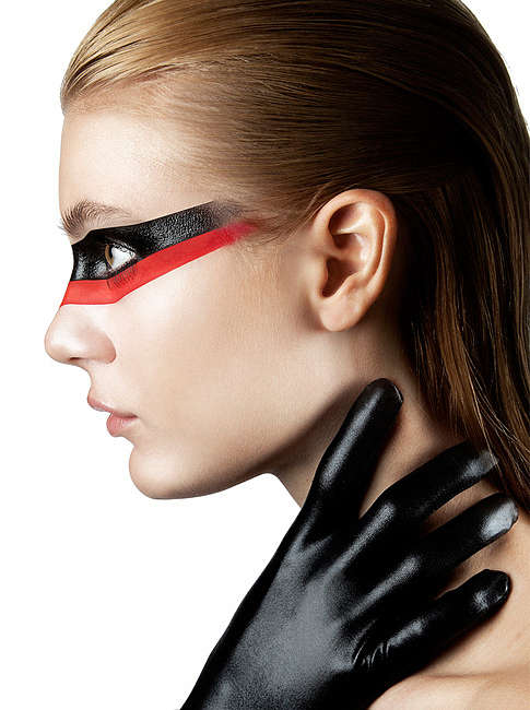
Aaaaaahhhh!!!!! so my video is nearly finished! Putting the finishing touches on it tomorrow. So happy. Just hope it's good enough to actually show people. I have also been working more on my deck of cards project. I have finally assigned all my monsters to each suit and almost completed my werewolf: 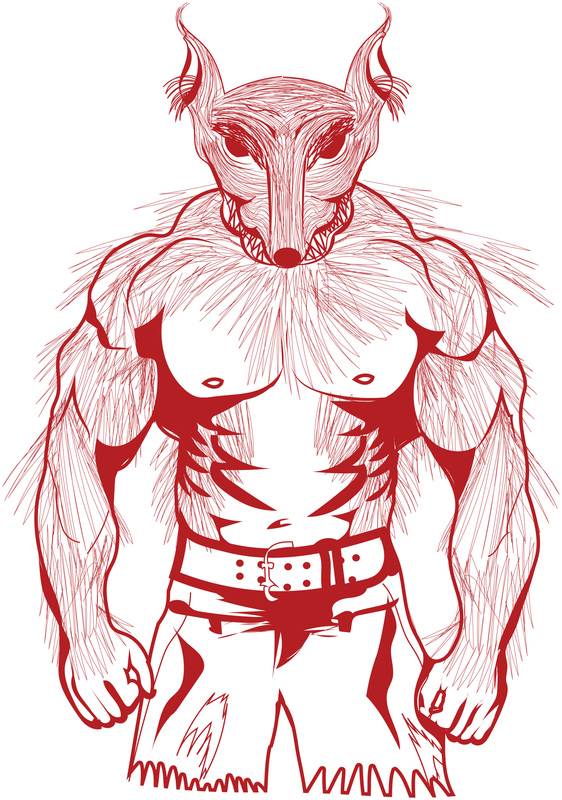 There is still a few more changes I'd like to make. For example I don't like the hands or the shorts. There is also a few bits that need fixed, but apart from that I am surprised at how well it looks. I was also thinking if I should incorporate the suit within the character, like I did with the cupcakes. For example the werewolf here is part of the Diamond suit. So like some dogs would have, I might put a little white diamond shape of fluff on the chest. When It comes to the Unique photography ViewBug challenge, I am still to find a nasty fact about Coca-Cola to attach to the bottom of the photograph. I will more than likely do this when I post this blog. I have also sketched out some idea for posters for the student financial help. I just haven't gotten around to start drawing them up in Illustrator. I might actually show these at the end of year show, instead of my video, if the video is too amateur looking rather than professional. I have also been thinking more and more about the end of year show, although I already handed in my draft of what I might do:  As you can see, my Coca-Cola portrait on one wall and my cupcakes on the other. I am beginning to toy with a different Idea though, I might get a few ceramic piggy banks and put them around my exhibition. Depending on how many I can get, if I can sell them at the end of year show that would be amazing. I might even donate the money to the New Blood people. Depends how broke I am by that time. So I just quickly had a little look at cheap piggy banks on ebay, they are all roughly the same price. I at the moment, if I am going to go with this idea. I really like the chalk board piggy banks, the first piggy bank above.
That's it from me today. hopefully more to show tomorrow.
0 Comments
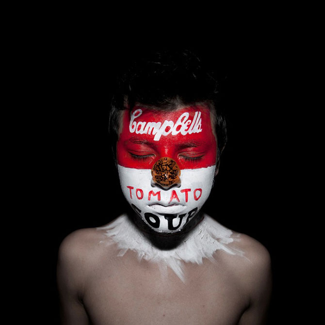
Today I pretty much wasted it by going from website to website, trying to find a company that would print my cupcake deck of cards, for cheap. It was unbelievably tedious as I had to make very quick designs of just the numbered symbols for each suit, Most websites were very slow with the uploads, they wouldn't let me edit the images to the way I wanted them displayed on the cards, Some websites stopped uploading my designs after a particular number. I was pretty much like 4 hrs of trying to get the right company to print these. I finally got it sorted. Although for one pack of cards it'll cost me roughly £15. Which sucks, although I think it will be worth it. I also have been trying to write my blurb, which will be the little bit of information that will go beside my work at the end of year show. To be honest, this week has been a complete nightmare. Just so much stuff to do and next thing I know a week has past, and the work I have done is not as much as I had hoped to have done. I have been looking at the whole planner for the end of year show, even looking at people from the past years, and I hate this feeling I have. I honestly don't feel like any of my work is good enough, the work I have done in my side projects I feel more confident to show than my main project. Even looking through it all, I can see exactly where I have gotten lost. I had originally wanted to do really mad, in your face posters showing consumerism. I am now doing student financial advice. Making a video, I honestly don't feel that comfortable about. I just really really lost. So looking at the wall planners and everyone else's displays from the past years, I have decided to continue on with the video, and see how it is at the end, maybe Ill surprise myself and it'll be the most amazing thing. Although I have also decided to create posters, which was my original idea in the first place, many tutors have more or less talked me out of it. Saying in the usual nicest possible way, that they didn't think that it was the best Idea. I just feel like I'm drowning. So screw this, I am going to do what I want to do. If it ends up looking shit, at least it'll be my colourful shit and stuff I feel comfortable showing. I also went back and re-edited my Coca-Cola portrait. I am actually really happy with it and have decided it will be my piece for submitted to the ViewBug unique portrait challenge. 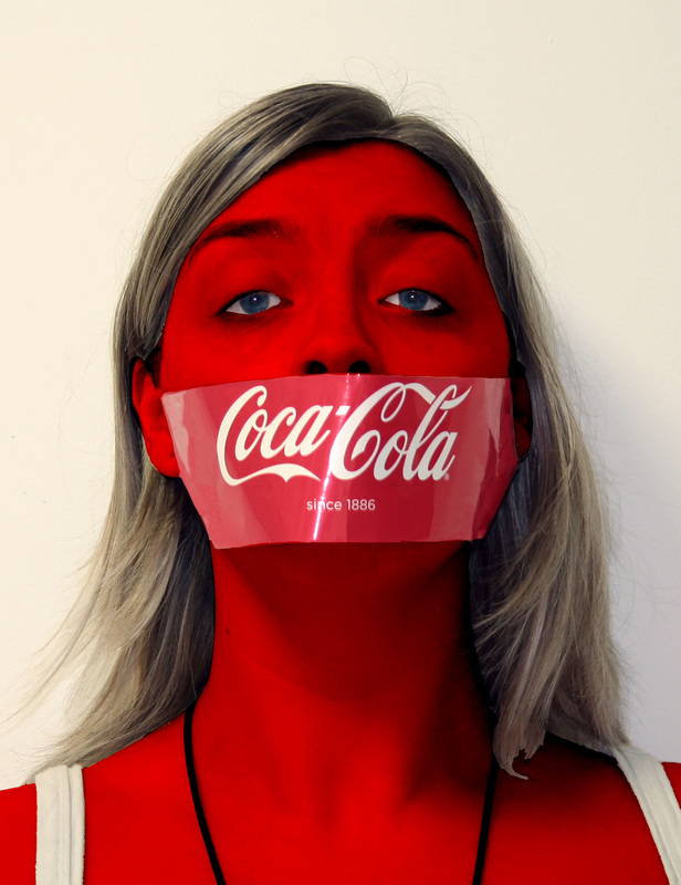 This is very simple, although I find it very effective and I think it really stands out. I am happy to upload this for the ViewBug Challenge, I plan to do a few more tweaks to this image, such as having a fact about Coca-Cola on the image, and even fixing the hair a little bit. I also finally got round to testing my line drawing skills, to make a ghost in Illustrator: 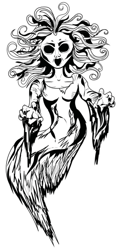 I am actually so happy with this, I want to fix the eyes a little more. But minus that I am really happy with this. One down, 11 more to go.
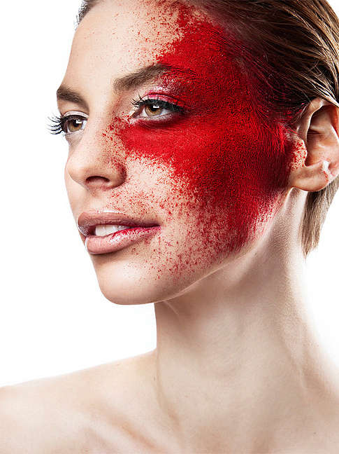
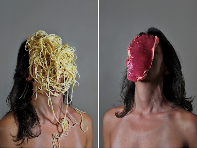
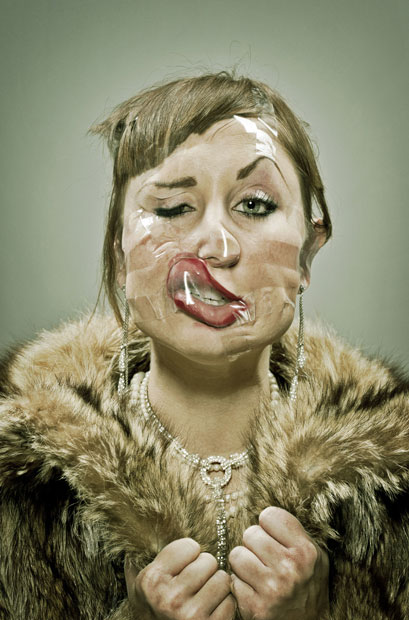
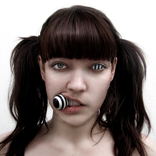
That's all from me today, I am going to do a few sketches for posters for students on financial advice. But the way that I want them to be. I am even slightly playing with May The Forth Be With You! 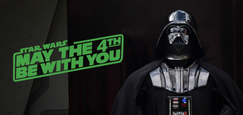 Today I finished off writing up my sketch books, I also researched unique portraits from my ViewBug project which the deadline is for next week. So here are some inspiration images I have been looking at. I really like how I have total freedom with this, I have a maximum of two entries. Some of these are pretty mental, like the top image on the right with the spaghetti and meat just randomly on models faces..... its a creative? yep... a little weird. Totally entertaining though. I really like the powder paint and the paint on peoples faces. I have been thinking about the possibility of putting in some things to do with consumerism, not too sure how that's going to work out, but I will be experimenting with it anyways.
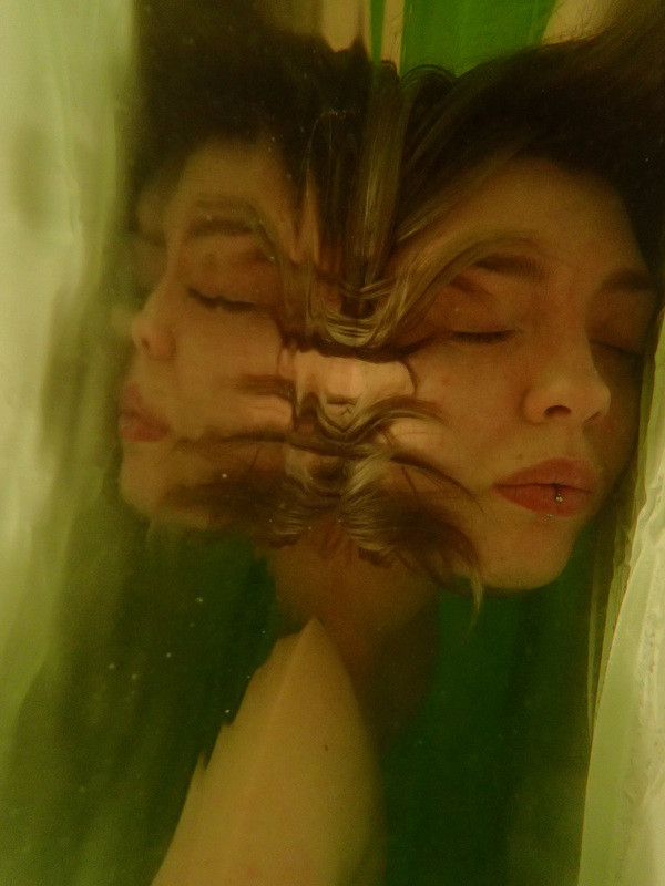
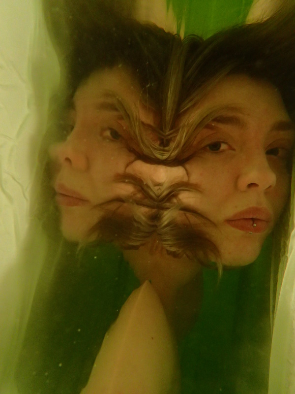
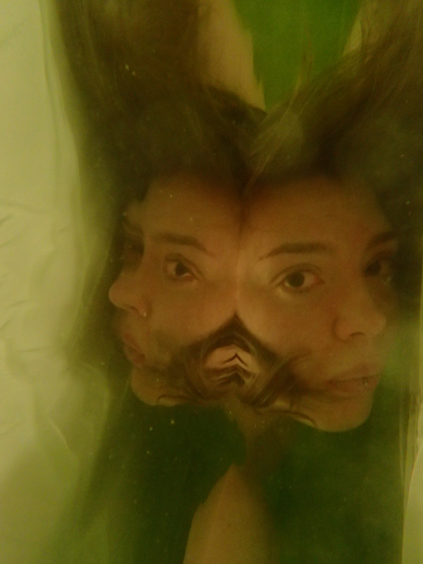
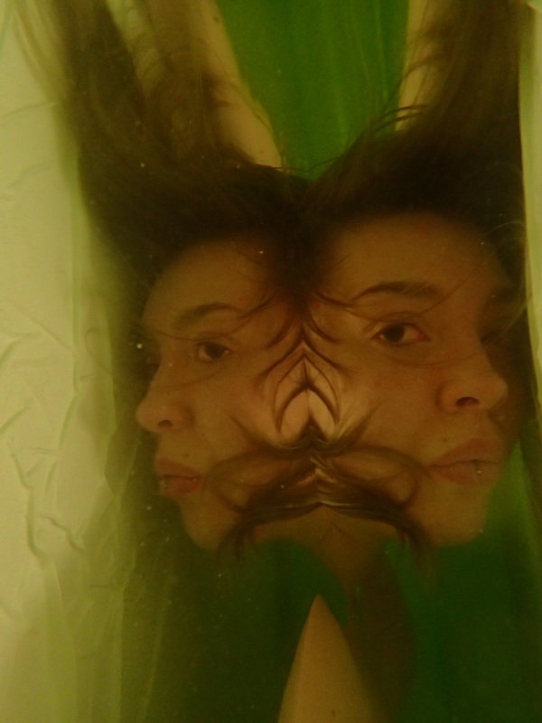
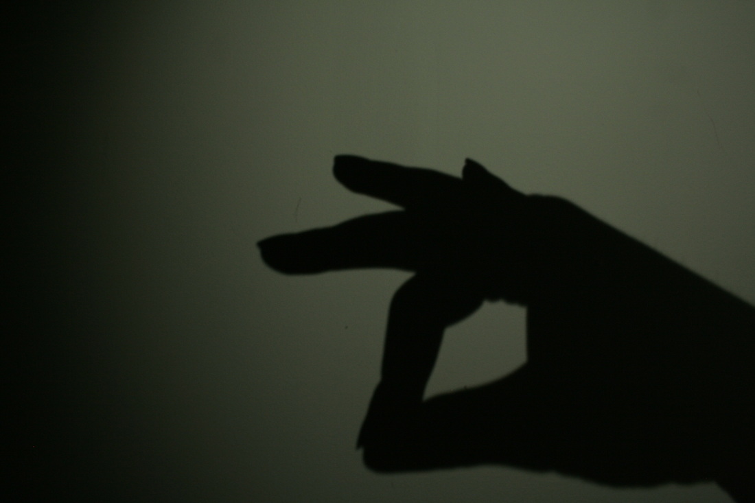
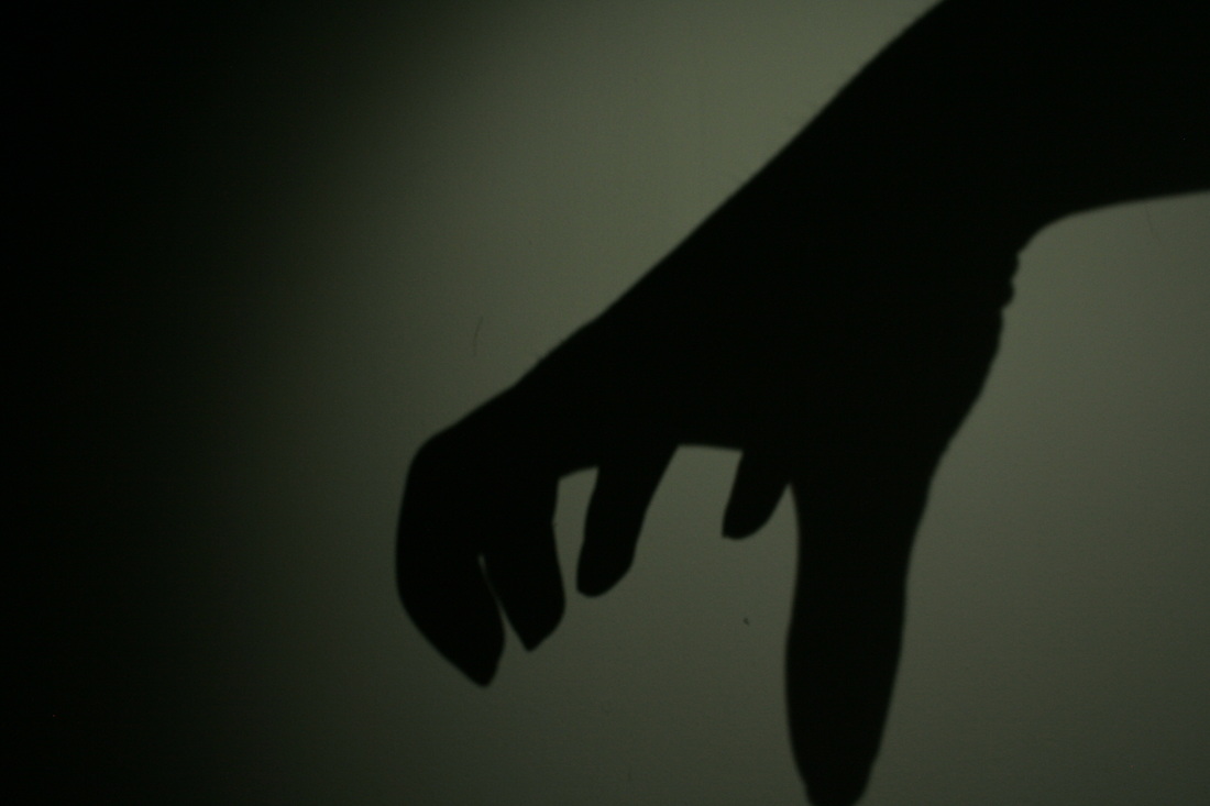
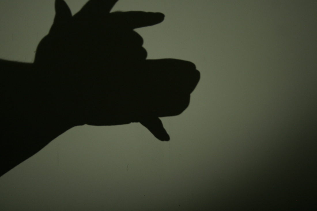
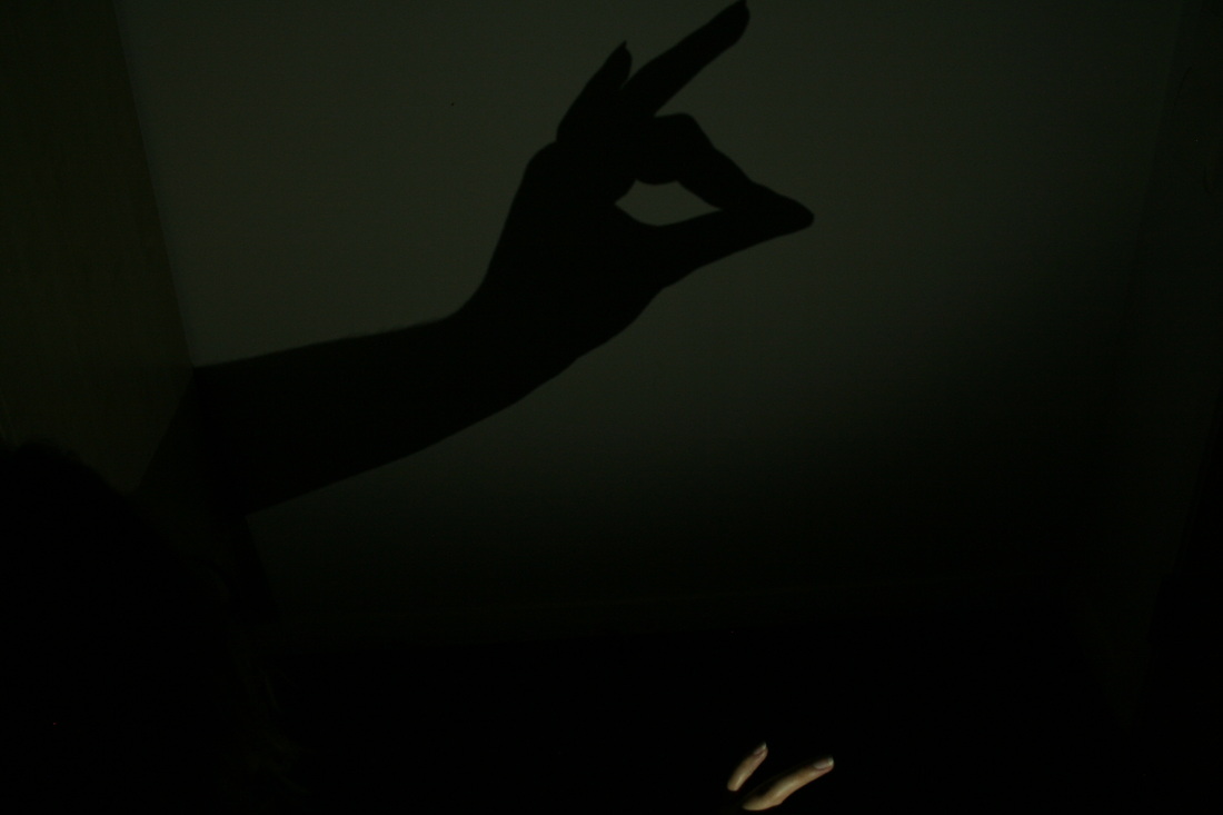
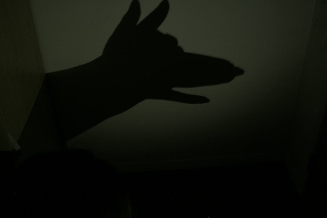
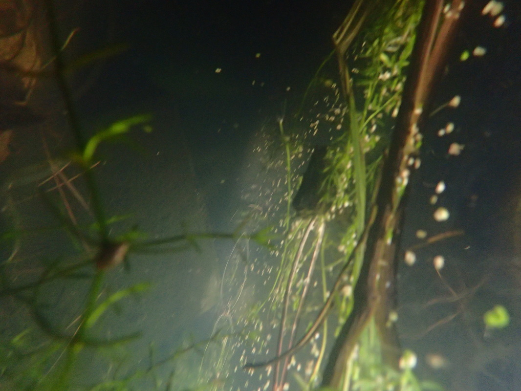
I have also been looking at some of the art supplies I have. I have a lot of ink, so I might also incorporate that into this portrait challenge. I have also been looking for music to go with my video for my main project and been planning out what I want to do. I have things a little bit more sorted, however I'm not going to lie. I have been more thinking and planning one what to do with all my projects today. I am in that panic mode when I think of all the things I have to do, and end up sort of doing nothing..... eeeeek I am hoping to have more to show in the next following days. So today I have been mainly focusing on my ViewBug projects . I have been looking back at my most recent underwater images: So, these are just a few of the images I took. I have to admit the paddling pool was a little disappointing. I didn't really have anymore space that I had before when doing the last underwater images in the kitchen sink. I really need something deeper, I am going to start aiming for doing underwater photoshoots in the summer. I think this is more in reach of the kind of ideas I want to do. I also think it'll be more fun. Here is the final image I have chosen for the underwater portrait challenge. 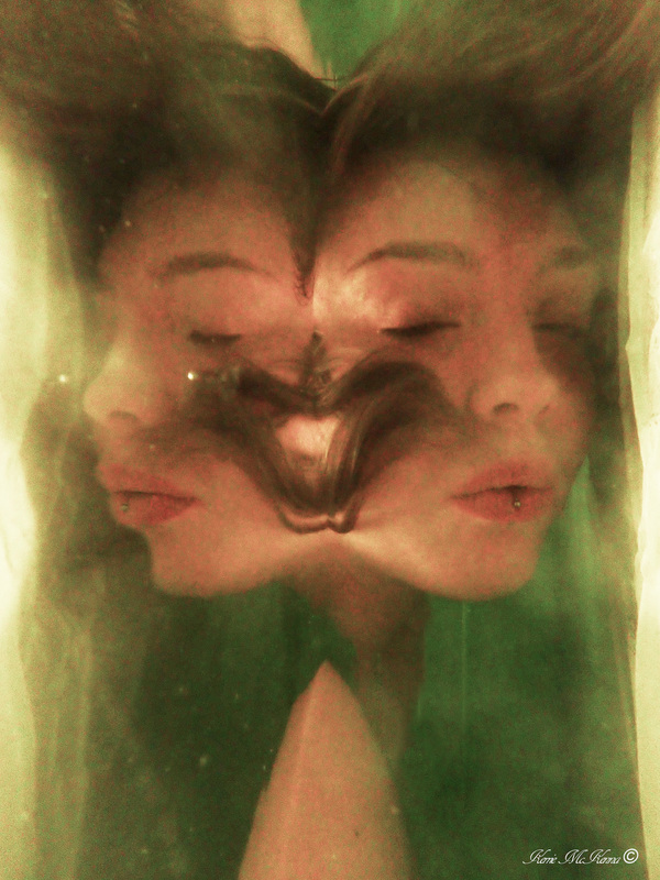 I really like ho trippy this image is, and how surreal it is. I also really like how the colours are almost dream like. I also really like how my hair has almost made a slight heart shape under the water. I have also finished another challenge, although my final for it was very unusual for me. It was a bit of an experiment. I think I had mentioned it before, when I went out to photograph the stars. I got the idea from my "assistant" as he was making shadows in the torch light on the forest. So as I hadn't really made it out to photograph this for the past few nights, I improvised. So here are a few of my hand shadowy shapes. I then drew out a wood scenery, but I felt it all looked a bit too illustrationy, rather than more of an illustration and photography mix. So I got an old photo I previously took at a forest a few months ago and photoshopped my animal shadow shapes into it. I then decided to make the whole image Black and white, so the shadows would fit in a little more. Below is my final image for the ViewBug challenge, playing with light: 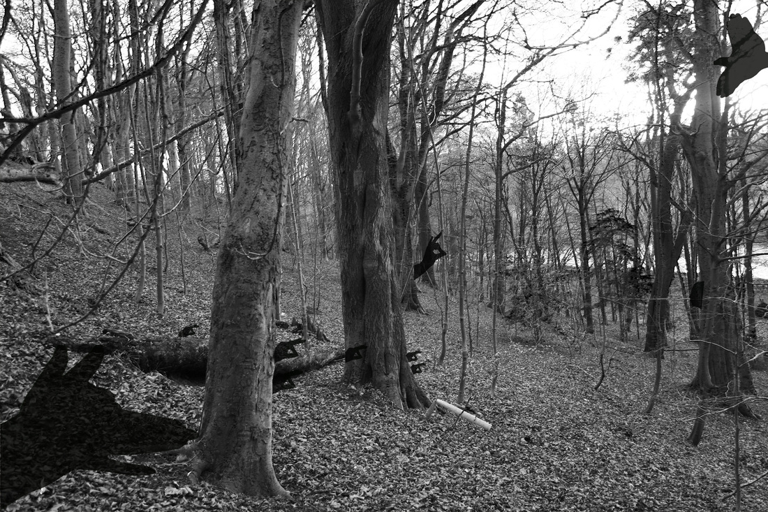 Thats all from me today, tomorrow, I will hopefully get talking to a tutor about my main project and see where it is going.
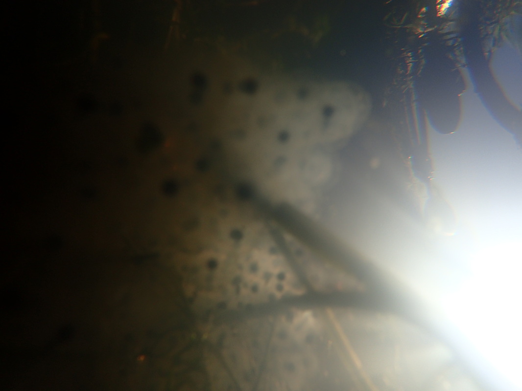
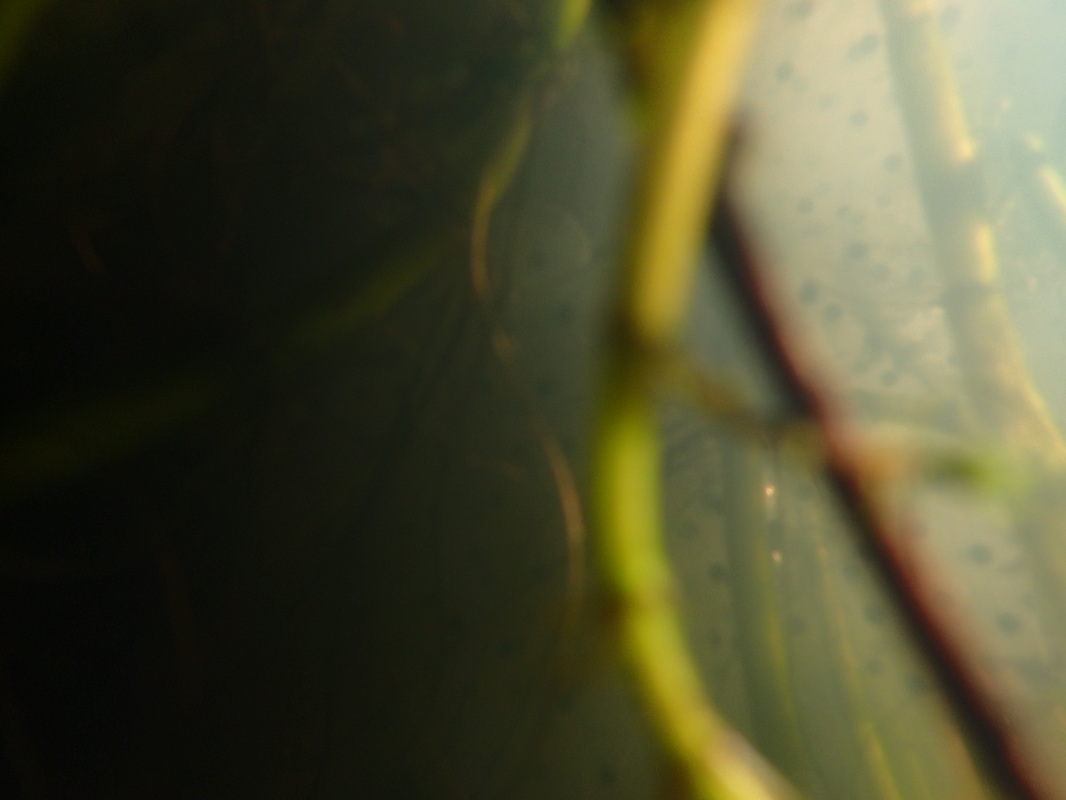
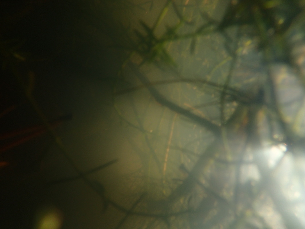
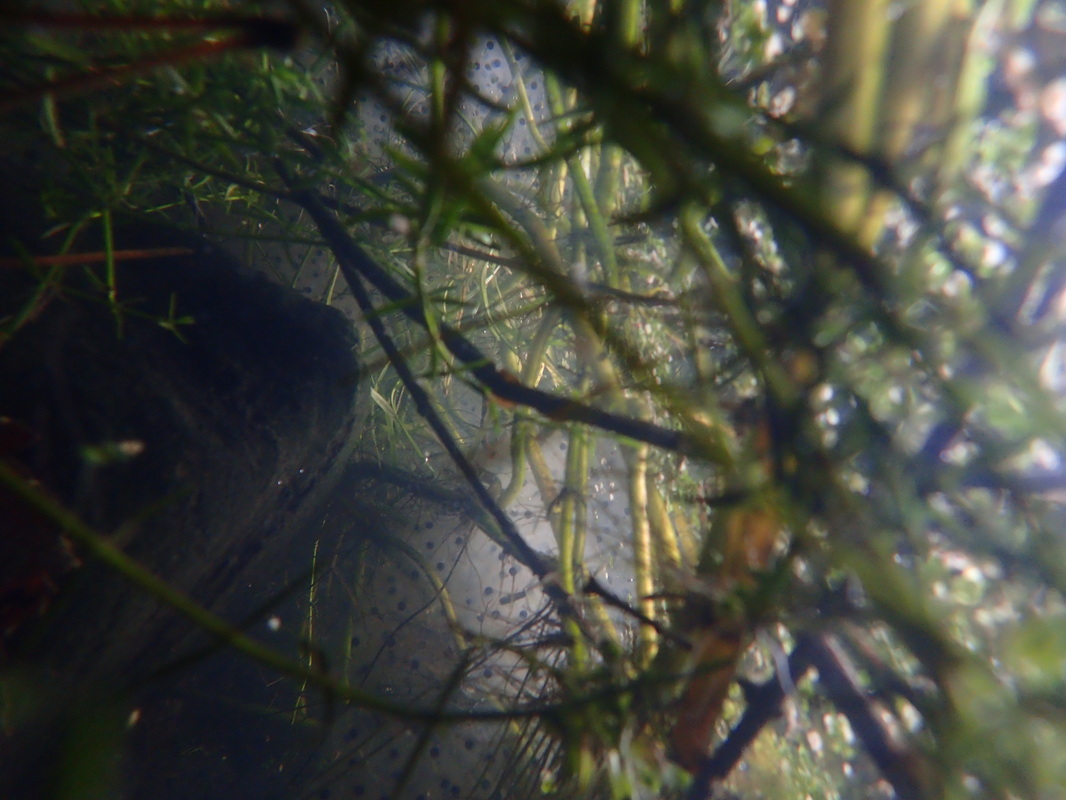
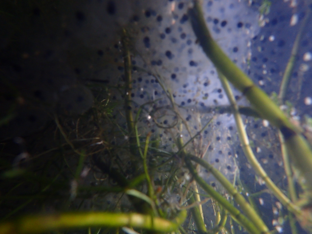
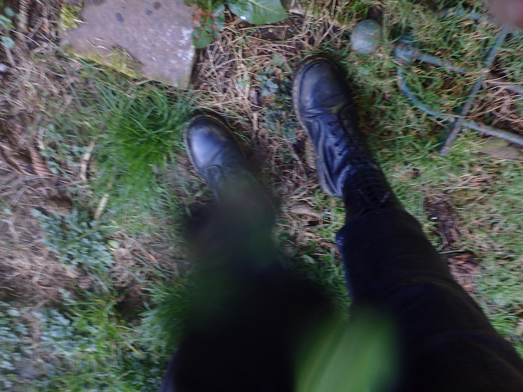
So today was horrendous, the weather was one word. shite. I really didn't think I was going to manage to get photos. So I opted for a slightly different option. I took photos within my parents small pond in their back garden. There is already frogs spawn in the pond, so i hoped to photograph some frogs too. As you can see the water was really murky and rather creepy looking. I also experimented a little bit with the flash on. It didn't really do much and I ended up preferring the images without the flash. I then decided to run the garden hose into the pond, in hope that it may make the water clearer to see through and even just healthier for the frogs. My parents also own two dogs, so the garden was filled with "land mines" So taking photos of the pond was a little bit like an obstacle course. This really worked! YAY!, I also saw I frog, however it was too quick for me to photograph, it's head bobbing above the water looking at me..... made me jump to be honest. Also algae got absolutely everywhere, so many images taken where the algae had stuck to my camera lens. As you can see the image of my boots has algae firmly stuck to the lens. I plan to take more images of the pond tomorrow, as I have spent the rest of today cleaning dead leaves, little toy boats and even pipes that have fallen in to the pond over the years. Really got my work cut out for me I think. I have also been thinking about my main project, however, because I am home this week I haven't been able to do the research I want. As I would like to see what is available at my university for students and then start to really develop an angle to what I will start to create, also not going to lie, the project has started to bore me a bit. So I really feel I need to find a way to make it more interesting to me I also got an email today about the Belfast Photo Festival. They want a range of images from the same body of work. The deadline is the 17th of March, which is just short of next week. I am also hoping tomorrow to go through all of my images and possibly even re-edit old photos. I am currently thinking of uploading the paint images I took roughly five years ago. I am still not too happy with how I have edited them since. So I am hoping to go back and re-visit them. If I had of known about the festival a little earlier I would have started a new body of work for it. As I have recently gotten a new shipment in of powder paints. So I am starting to plan what I want to do with them. 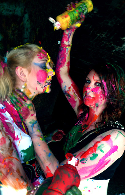 This is my main image from the paint photoshoot. "Model Envy" there are other images from this series.
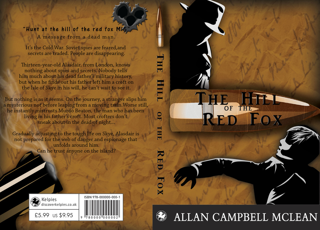
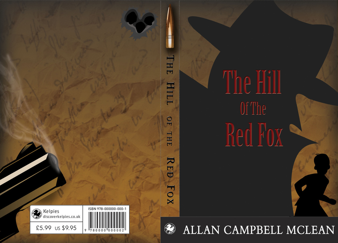
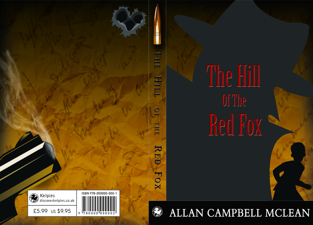
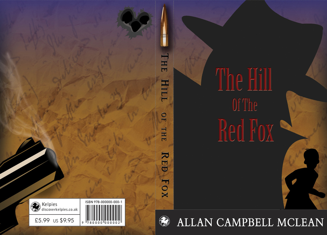
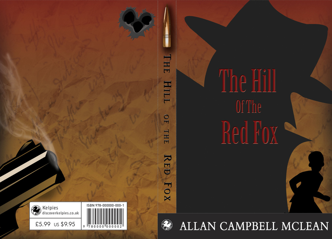
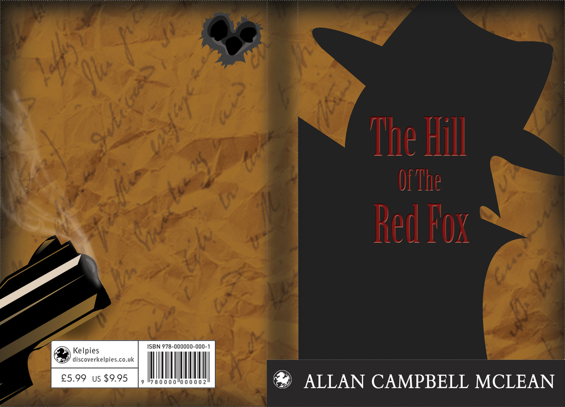
"The theme has been left open to remove any restrictions; submissions must be photographic or lens-based but can include incorporations of other art forms with the photographic medium (i.e. performance, painting, sculpture, music, literature etc). Individuals and collectives are welcome to apply; individuals should select and enter between two and six photographs from a particular series or body of work AND/OR submit their Photo-book for exhibition by uploading a single PDF (no image limit). (Note: You can submit both a photo-book and photographs of the same project, but a fee will need to be paid for both. If submitting only a Photo-book and not photographs, it will be your photo-book that will be selected for presentation and not photographic prints for exhibition) Collectives are also welcome to apply; as a collective, you can submit up to 10 photographs (a £15 submission fee will apply for every 10 images submitted)" This is just a little snippet from the rules and requirements of the festival. I have to admit I am not happy about having to pay the fee of £15, again I would have loved to have photographed something specially for this festival. Although there is always next year. Just excited that this is festival is coming from home. That's all from me today, here's hoping I will have something more interesting show tomorrow. So I started looking at my dissertation today..... then I thought the dishes needed done, Have to get my finals ready for the interim show. So may as well add the blurb to the book covers. Had to then change some of my elements within the book covers around so the blurb would fit.... And about two hours spent arguing with myself on which fonts to use.... so yea..... em, didn't get much of anything to do with my dissertation done today. Whoops! I have to admit though, I really under estimated how much time it would take to not only tweak one of the covers to look semi finished, as the others do. But to then get the elements to change about and try to make them identical to the other. Such a pain in the arse! I did get it done though, in between cleaning my flat and any other distraction that I let take me away from my laptop. I got it done! 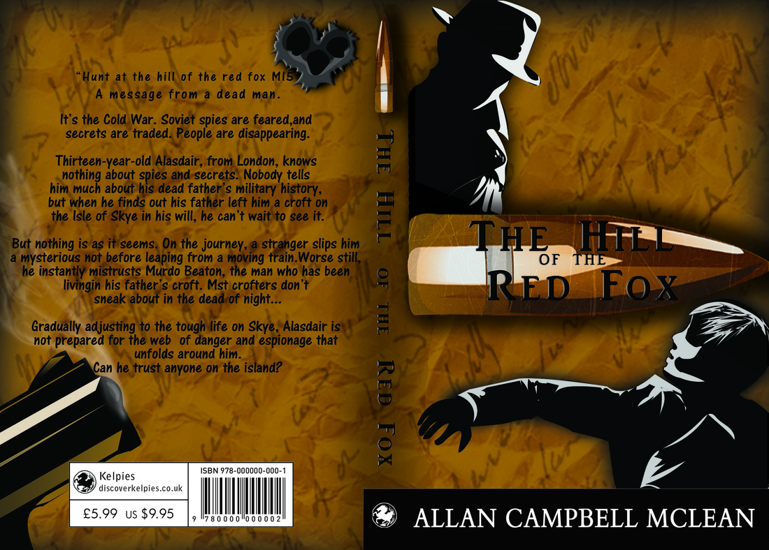 So this was the first font that I really liked. Also just to let you know, the colours are a little funny due to me being lazy about putting the images into RGB mode. I have uploaded too many so look through past blogs to get an idea of colour. I want you to look at the font anyways. So as I was saying. This was the first font I liked. I then tested a few others and finally landed on this one: 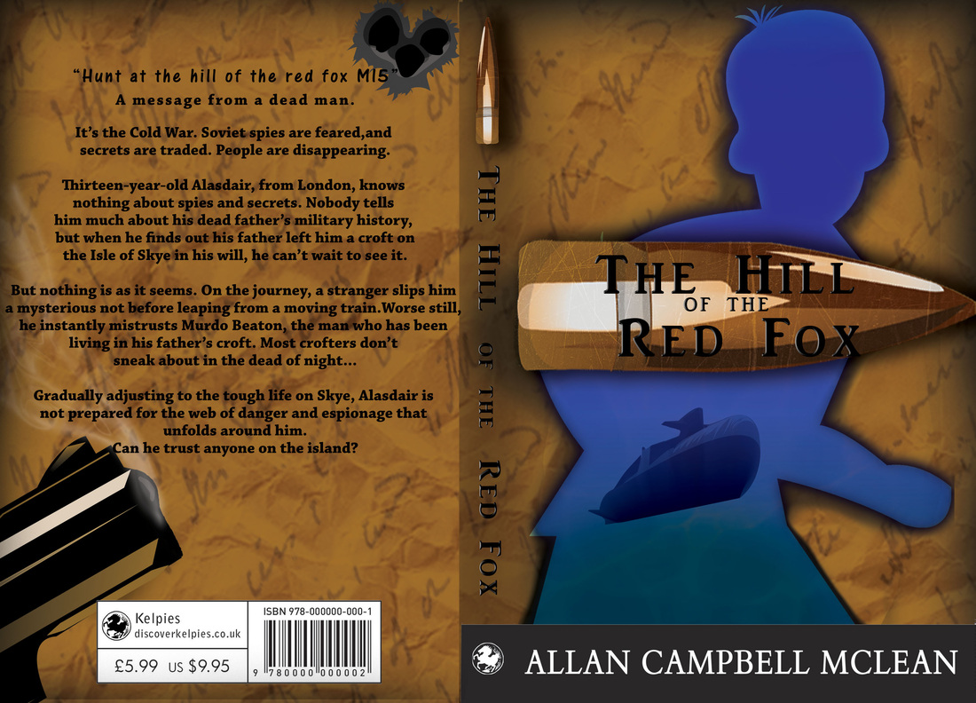 Now this is actually the font called "Chaparral Pro", this is it in bold. So I realized I had to move all the elements on the back page. I was determined not to move my guide lines though. The gun, smoke, bullet holes. ALL had to be moved to have room for the blurb. Took me a good few hours for each of the book cover, to try and get the placement exact on each one. So, eventually I got this working for me. I then decided to still have the font "Chaparral Pro" in regular. So these are my finals ready for print and hopefully mounting on Monday.
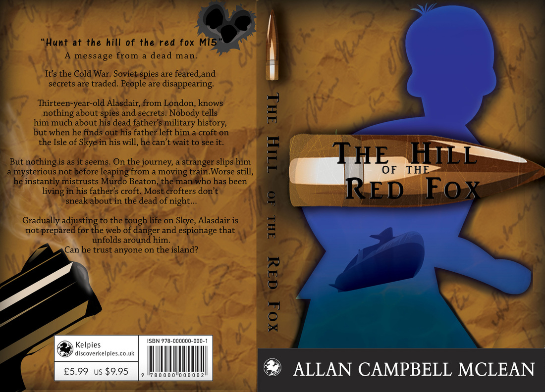
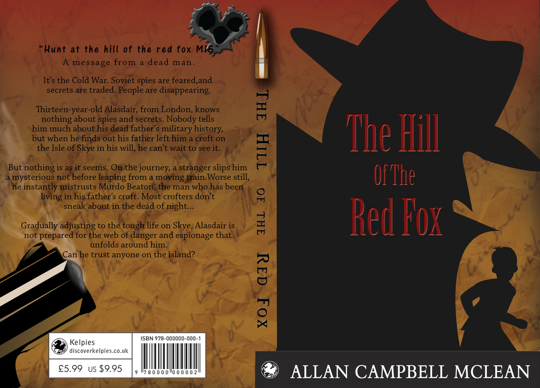
Ok, so I got my final done today and sent off. Very proud wee moment. I actually put so much work into the cover, as my previous book covers for the other project I was working on were just horrible. They we re far too dark and I did have a really had time with them. So with these book covers, I tried so hard to make them bright and easily seen when printed out. I learnt a lot more techniques than I had first anticipated. So now comes the doom and gloom, from this day forth.... Interim show and dissertation work..... Yep, lots, and lots and lots of fun. Then 6th of March things should get a lot more interesting. If I haven't thrown my dissertation out the window by then. So for my interim show these are the three book cover I have decided to show. Not totally sure on the 3rd of the book covers as I really don't think it is to the standard as the others. But I am still proud of the image, a lot of work still went into it.
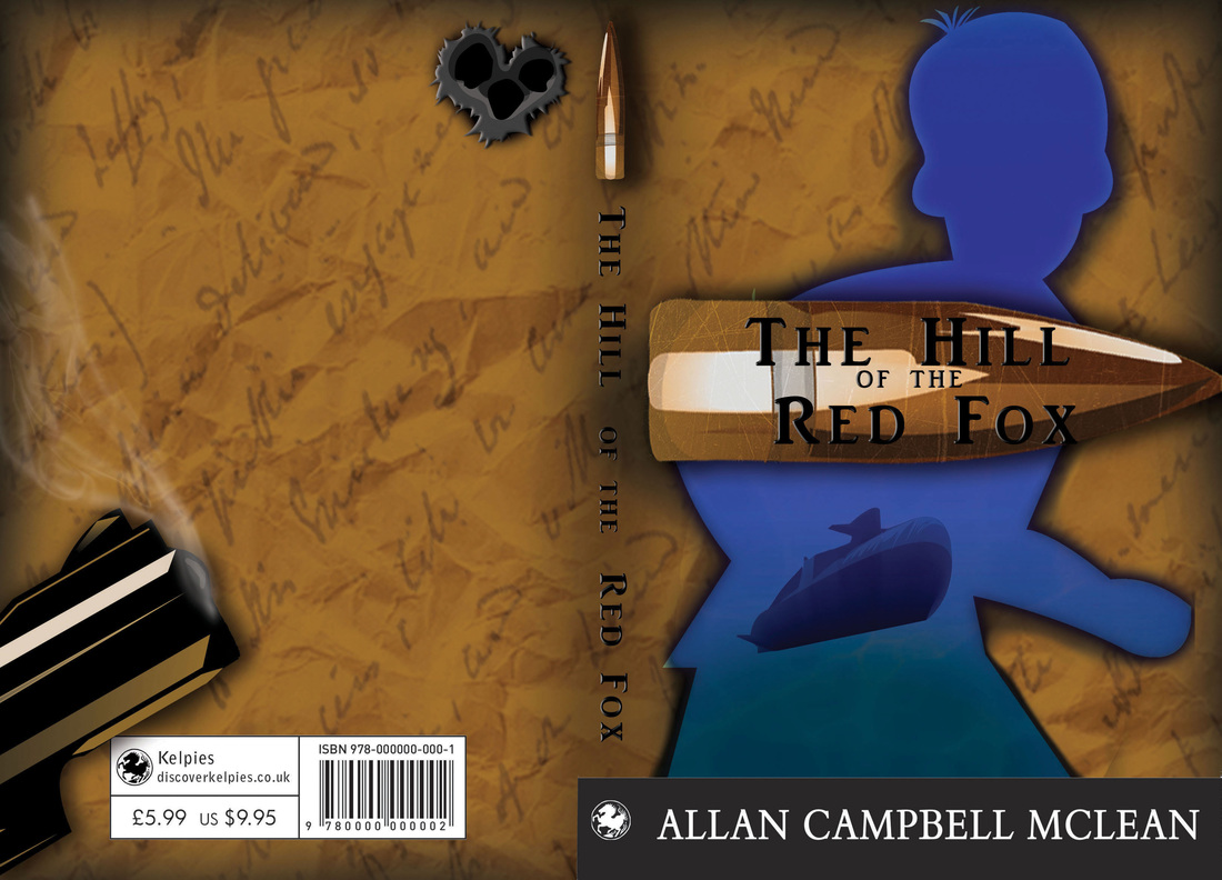
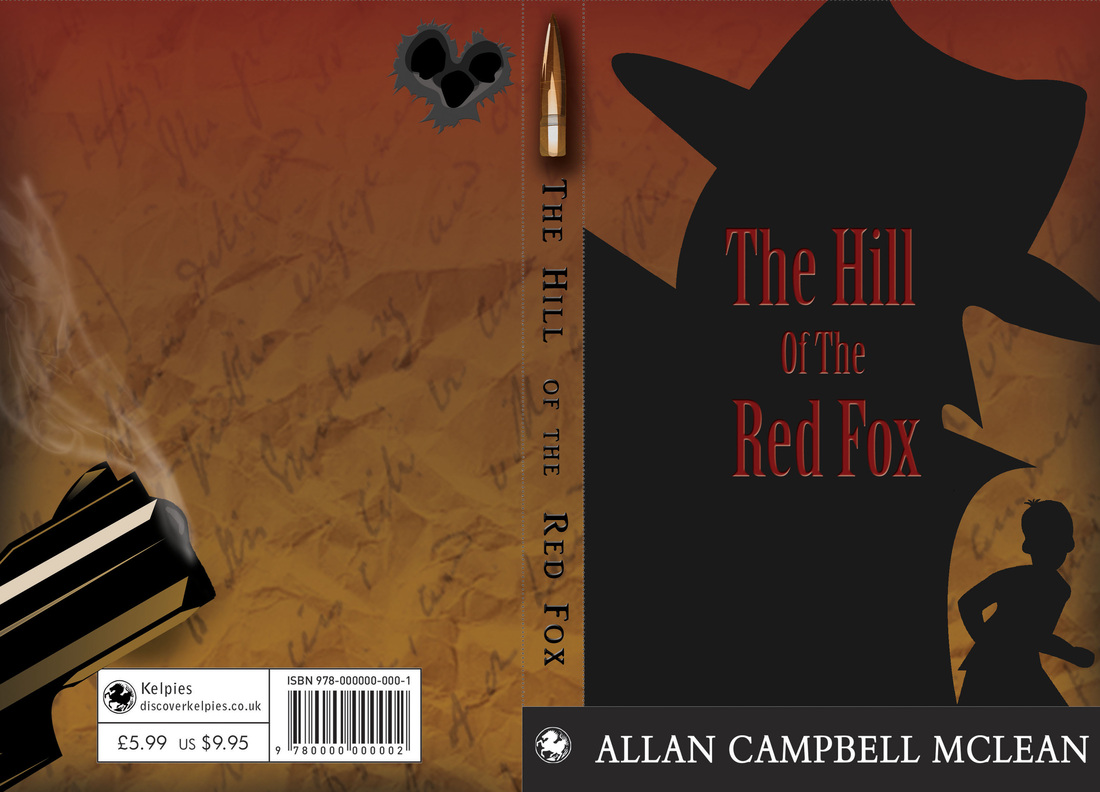
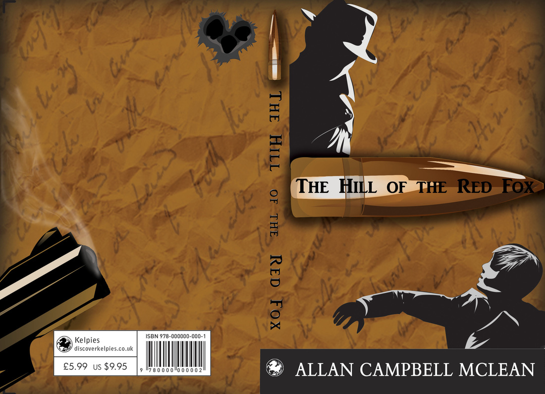
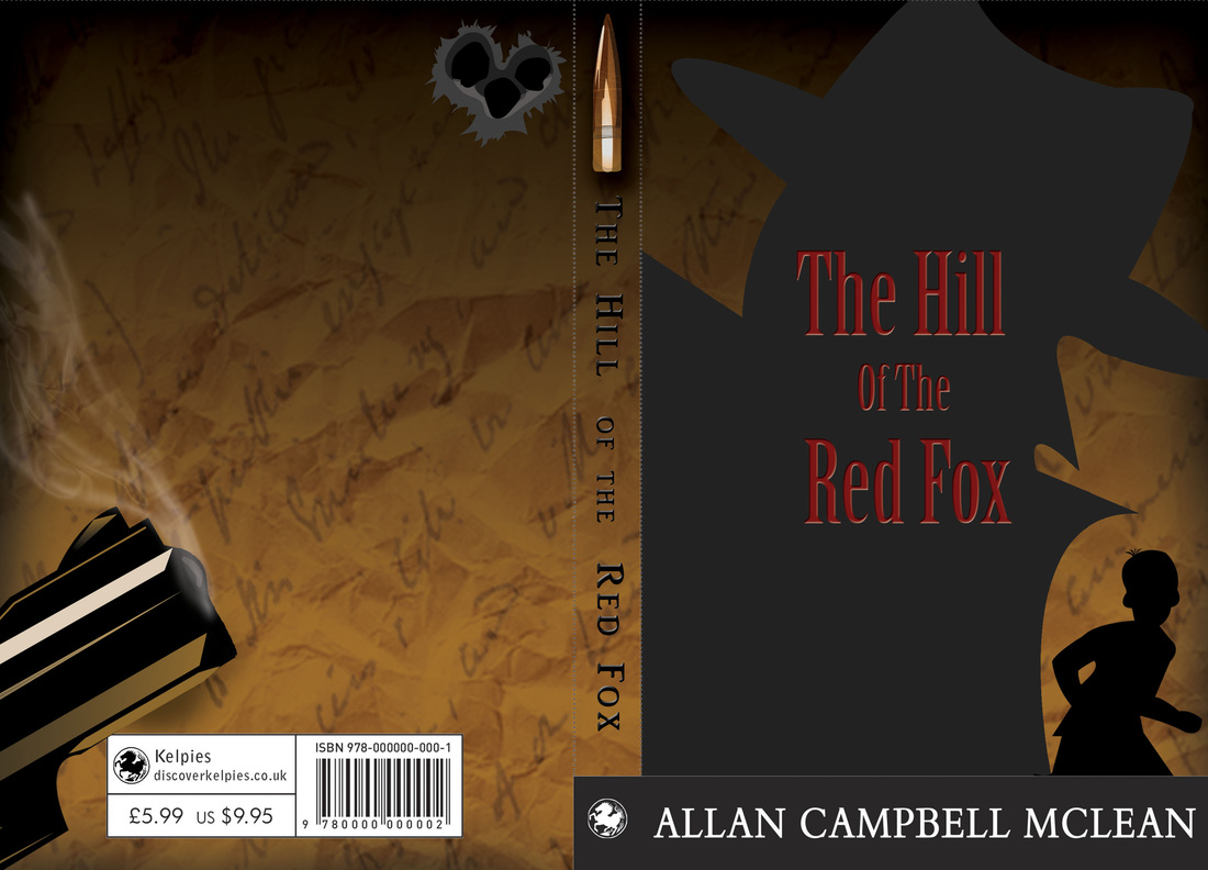
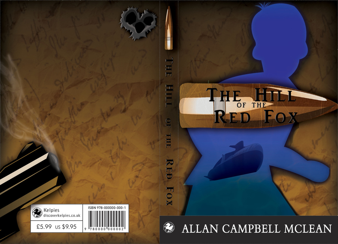
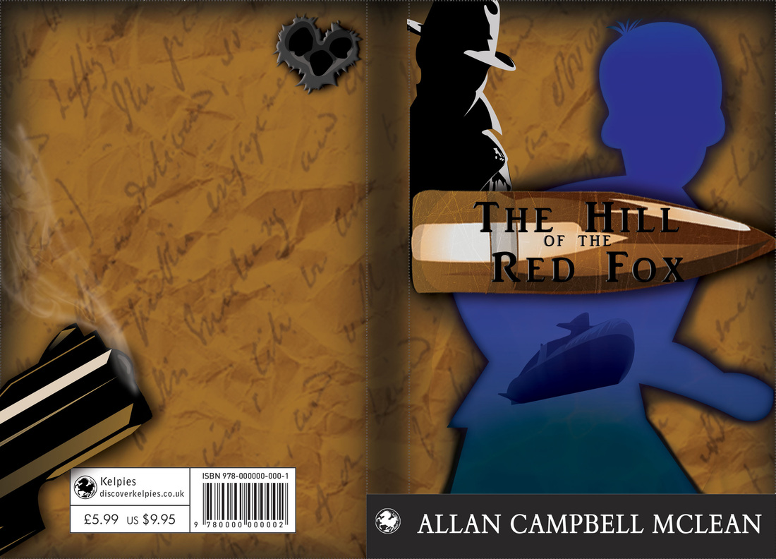
This weekend I plan to go back to my dissertation and see how things are going with it, and look at what I need to fix as well as what I want to take out and put in. I will try to make my blogs a little bit more interesting than...... So I was working on my dissertation today.... Like I did last semester. So, again really wasn't feeling well today. Spent another day in bed wrapped around my laptop doing more work. So I did soooo much today. A lot more book cover stuff for Kelpies. I did majority just variation work. So these are all different variations of the spy and the child work. I decided to play about with gradients . As I had said yesterday my relatives who are the age range that the book is aimed at. They preferred this image as apposed to my blue boy. So this was really me, trying to make myself like the image more, as I do think it looks very simple. I even did a few variations with my other preferred book cover, to see how it would look. So I added gradients to the image that I preferred most. I realized that actually still preferred my original of all of these with the boy and the submarine. 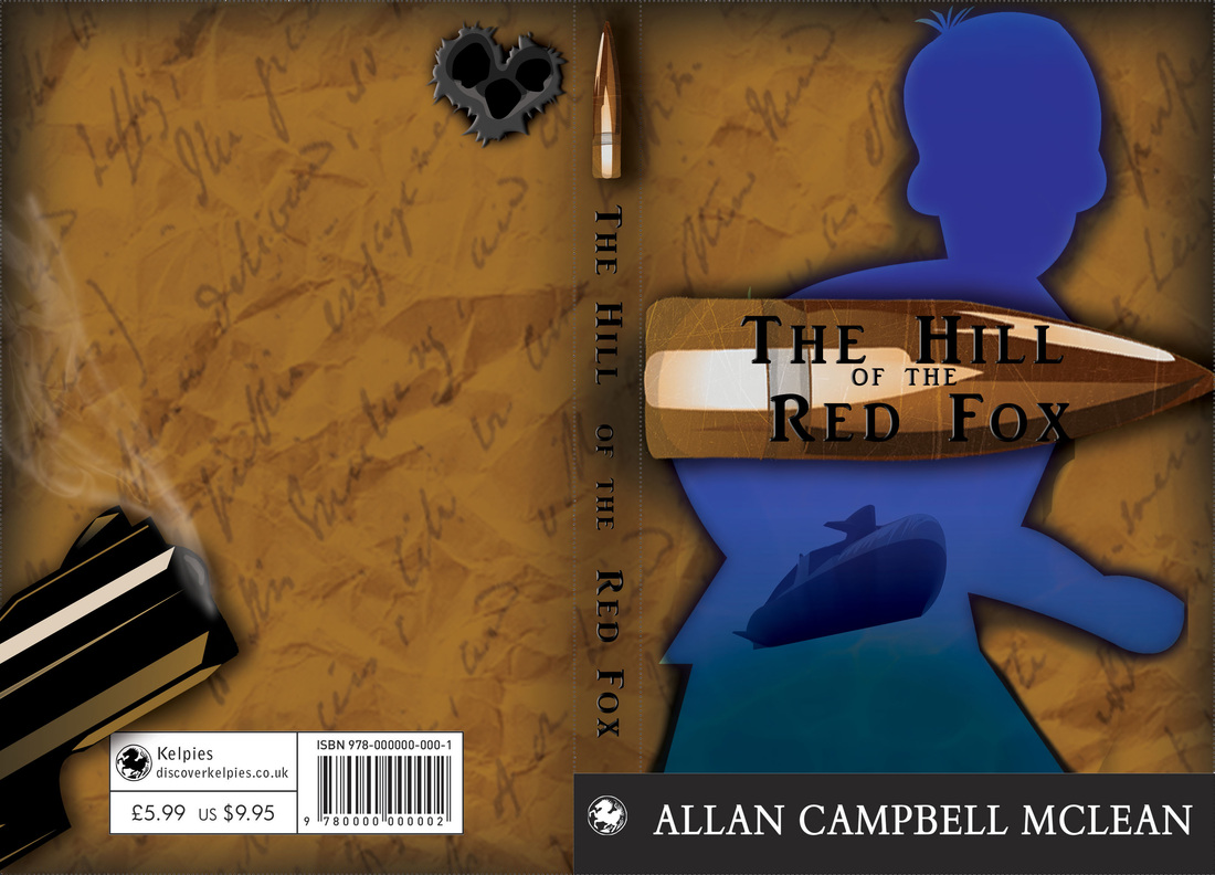 So, the more I think about it the more I keep thinking, this right here. This is going to be my final for the Kelpies book cover. I know my relatives really preferred the other. But I don't know, I keep being brought back to this cover. Also with the added, "Your also selling to the parents as well as the child". Keeps coming back to me and I think this really work. As within the story once you read it. The cover will suddenly make a lot more sense. Which should be how a book cover is made anyways, with clues and symbolism. I also started to go back and have a look at my Main Project. I have a fair wee bit to catch up on before I start to analyze the new data that I've collected. So I did a few more sort of little illustrations with some of the questions from old data. As I wanted to make it a little bit more fun to look at and more interesting than a pie chart. These are outrageously simple looking, but these are just little designs really. I'm more experimenting with how and in how many different ways I can show data. So these we're more little quick designs that I came up with. Tomorrow there should be more. I also have an interim show next week. So I have been having to get myself sorted for that. So I will try and get a few images of what my space looks like. Here is just a little quick design peek of what I am planning on putting up. 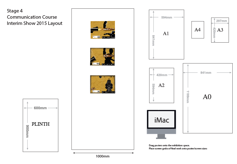 So as you can see I am planning on putting up 3 of my book cover designs. The interim show, is more or less a mock exam, to get me ready for my final end of year show. So yea, I will report back tomorrow.
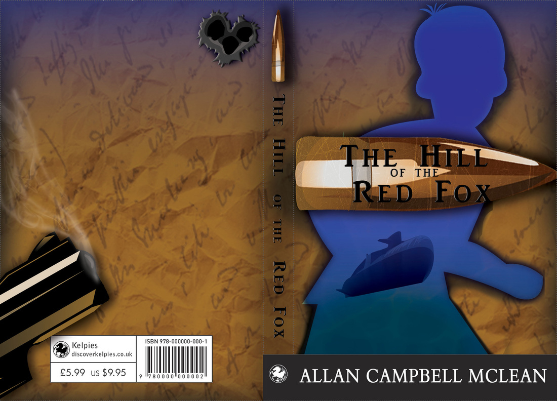
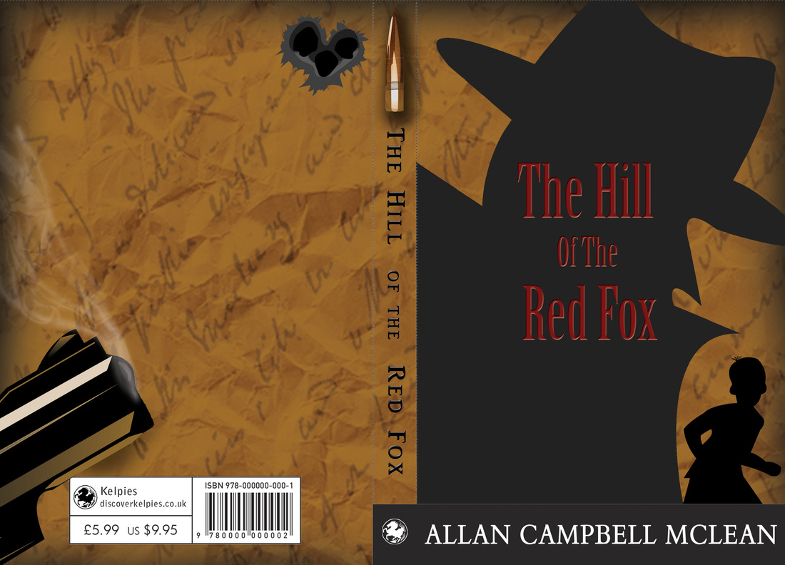
So, today I still feel iffy, but feeling a whole lot better than what I was yesterday. So, I did what I mentioned yesterday about asking my relatives which of my book covered they preferred. As they are the age group the design is aimed for. I realized however that after I asked, I was slightly rooting for one design over the other. Especially when both my relatives said they preferred the image on the right. I had also asked some of my friends which ones they preferred. They all answered the image on the Left. So I think there is definitely something to be said about that. I then began to analyse both of the designs. Why did I really not like the image on the right, compared to the image on the right. I realized it was mainly due to the very simple shape and design of the spy like figure. I then looked at the image on the left , what did I like so much about this cover. I realized that it was just this. The image on the right, was a bit too complicated, too much going on. The image on the left, too simple and not much happening. So I went back into photoshop and made a few changes. So I added text to both of the spines, I took away one element from the left book cover, which was the little spy vector. I then made the right book cover a little more complicated. Now with the image on the right I still feel there needs to be more done to it. Even just making the little boy in it the same colour as the main figure of the book cover. I would also like to add gradients. Although I am still figuring that part out, in which way exactly I want to do that.
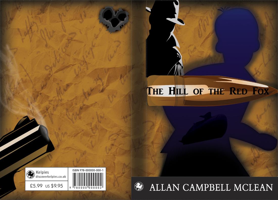
Now, here's the kicker. I show these new designs to my relatives. They still pic the same one as they did before. I ask friends who are the same age as myself. They still all pic the same book cover of the blue main figure. I really have no idea, what to do. Although after speaking about these with my friends. Something I hadn't realized was brought to my attention. When children want books, it's the parents that buy the books for them. So this cover needs to appeal to children as well as adults. This being a key factor I had forgotten. I am hoping to send my design off to them tomorrow, So here's hoping I will have made a decision. I still feel myself leaning towards the image on the left. whoops... So, I'm annoyingly feeling even worse today. Although I again just lay in bed, and wrapped myself around my laptop and did some work. I spoke yesterday of how I wanted to pick a few of my designs and really finish them off. So i chose these two designs: So these are the original, I then went on to tweak these a little more. However, I really like the back page design, and in all honesty. I don't really want to change that. I think though, that there still needs to be a lot more done to these. So these are the newest versions. I felt as though I had been concentrating so much on the illustrator point of view of these designs that I totally forgot about making things a little more realistic looking. So I added a scrape texture to the bullet with the title on it. I also added a water texture on to the boy to, not only brighten the image but, again make it a little more realistic. I really like these but I feel that they are just images hovering on a page. I feel that there should be more to these, However I just can't put my finger on it.
I have also decided to send my designs to a family member who is within the audience target age. She is not shy about letting anyone know her thoughts. So hopefully she'll be gentle. I also think that this is great for me, as I don't want the cover to look to aimed towards boys. So maybe she will like them, or say they need to be a bit more neutral. Here goes nothing.... |