|
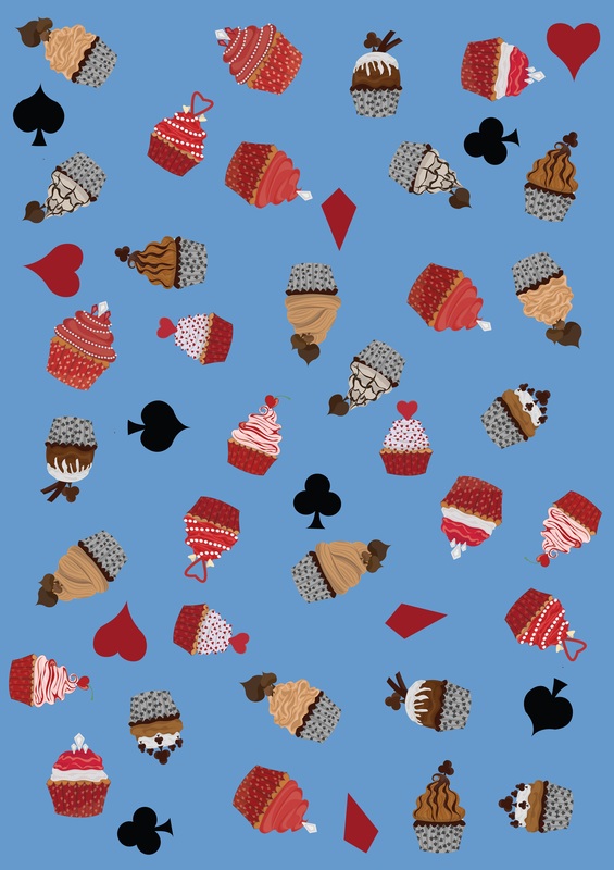
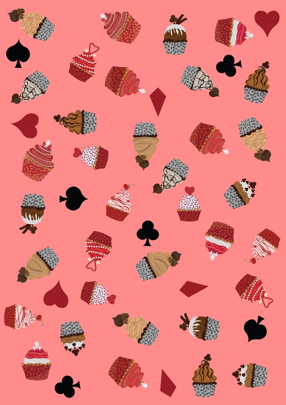
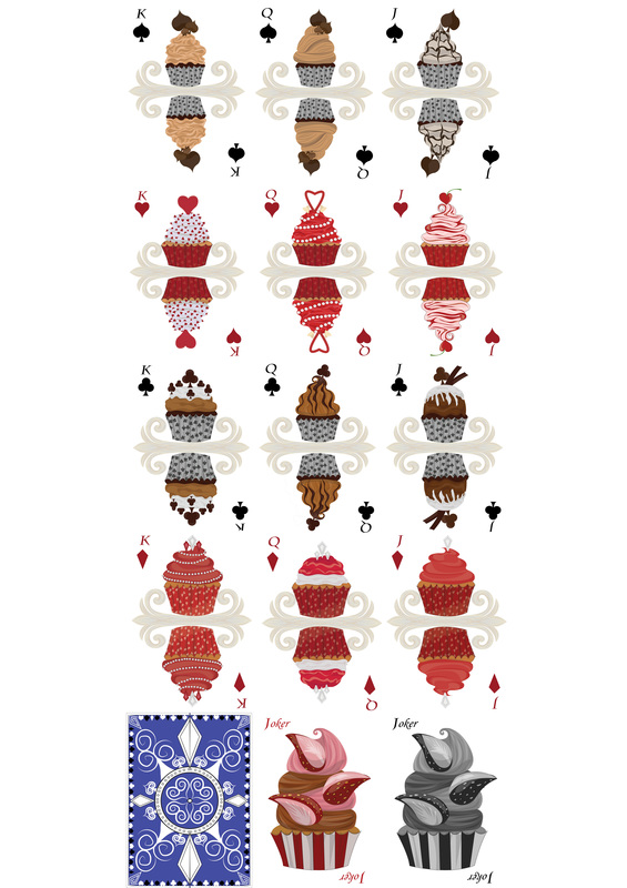
So, today I have been seriously finishing things off. I also have so many sketch books that I even weighted them all... 10 sketch books weighing in at 10 kg.......Mental. So I went back and had a look at my shop, now if you were to click the shop tab on my website, it will actually take you to another website called "Red Bubble". This site is basically where I upload my images and I can apply the images not only as images them selves, like posters and things. You can buy my designs on mugs, t-shirts, bedding, pillows, scarves, leggings, phone covers. The list goes on! So today I went through and decided to put up an image of my cupcakes. I decided to actually put up the mixed image. The image is all of the elements of all the suits as well as their symbols. I wasn't happy with the original image so I changed the colour of the back ground to blue, pink and grey. 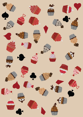 So the top 3 images are of what I uploaded. the single image above is the original. 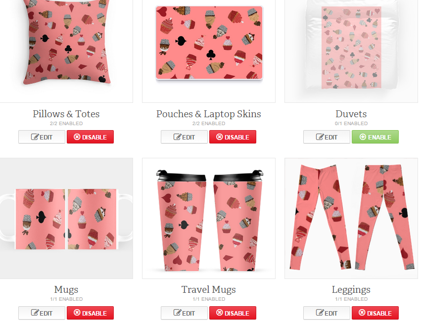 This is just a screen shot from the website after I uploaded the pink image, you can see all the different products I can apply my work to. So yea, it's pretty interesting. I also have my final done for my main project. the final for the magazine cover: 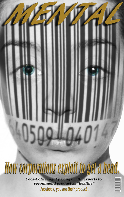 Im actually so happy with this, and just to really scare you here are all of the finals from all the projects I did this year: So yea, I have done a fair bit of work this year, and although it was by no means an easy year, I have actually enjoyed it. I want to keep experimenting and doing art. This is just a stepping stone for where I want to be, and yea I'm freaking out about leaving uni and being a real adult. So that's it from me today, Tomorrow will possibly be my last blog on university work for at least a week.
I am hoping to keep my blog up, however I feel my life is very boring. We'll see though.
0 Comments
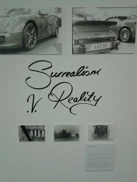
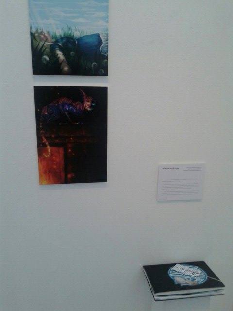
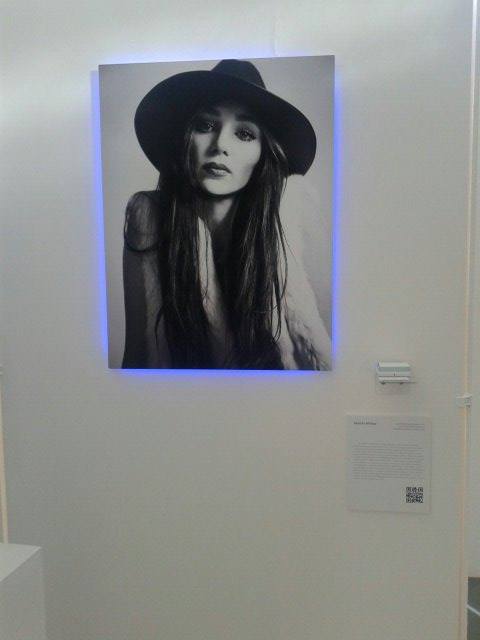
So, I finally got into uni today. Running around like a headless chicken. I recently have been assessed and found to have dyslexia and also dyscalculia. So uni have given my lots of new toys to help me with my work. I also went and got my dissertation draft, so I can now write all over it and everything to hopefully help me with my dissertation. I also went in and seen the interim show. I have to say my book covers looked very smart and I really think my little blurb about my work made everything very professional looking. 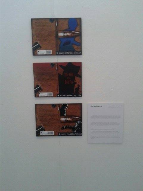 Here is a few people's work from my class, I really hope none of them mind me taking a little snap shot of their work and putting them up on my blog. I just wanted to show a variety of the work that was up for the interim show. So as you can see there is a huge variety, and some people's work looking more professional than others. Although this was a mock "exam" for the end of year show, I am already starting to think of what I can do differently, and what sort of work I want to have done and shown for that. I was honestly very surprised how much work does go into a show. I think it was very much to do with the planning and about 60 art students running round and slightly freaking out about what they were doing and getting the space to have their work put up.
That's all really from me today. Tomorrow I will be getting stuck into dissertation work. Hopefully I wont hate myself. I have been running round like a headless chicken all day today. But I am not totally ready for the interim show. I got my finals printed and mounted on foam board. They look so much more professional. So I am very happy with how today went. I even did a little bit more research with my dissertation work. I have also made a start on my dissertation, so today was incredibly productive. I am just so tired at the moment after all the running around. But I'm happy :) 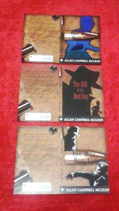 Not the best photo I know, but I did try my best. I know it's hard to figure out but on Thursday I will be able to show you how it will look mounted on the wall. With my dissertation I have not only started looking at photoshoot ideas, but also poster ideas. 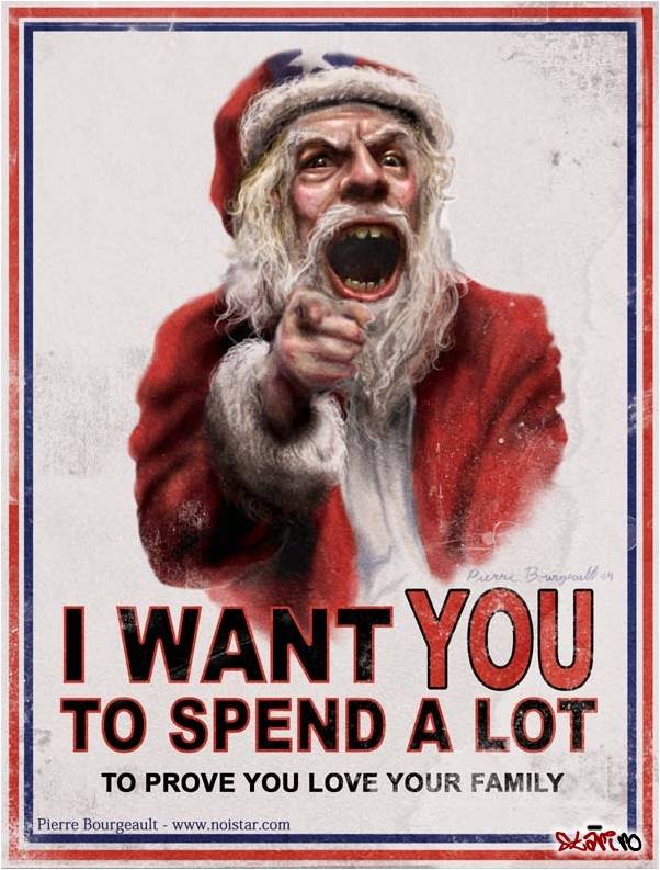 I think this image in it's self is very true and I think a lot of people can relate to it, whether it be themselves or people they know. Tomorrow I plan to look up the survey I gave out after the festive rush. If you haven't already I would really appreciate you take just one minute of your time to tick a few boxes. https://www.surveymonkey.com/s/CFZ7G9T
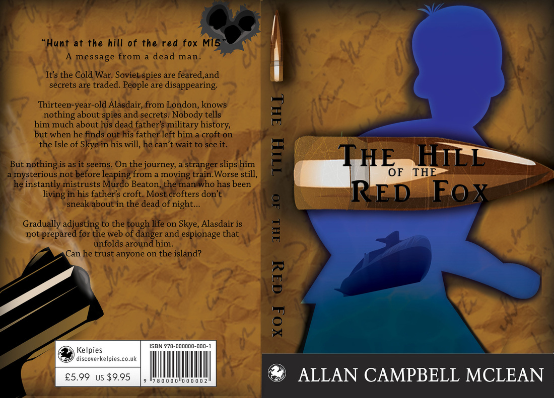
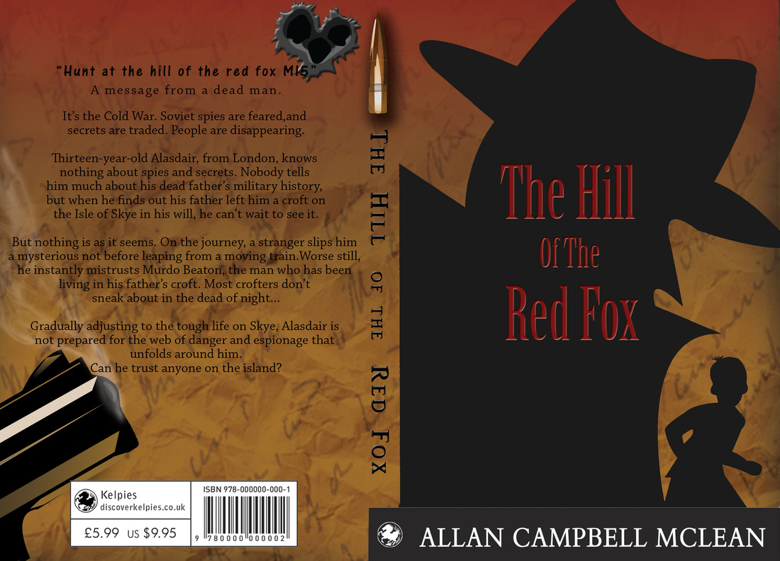
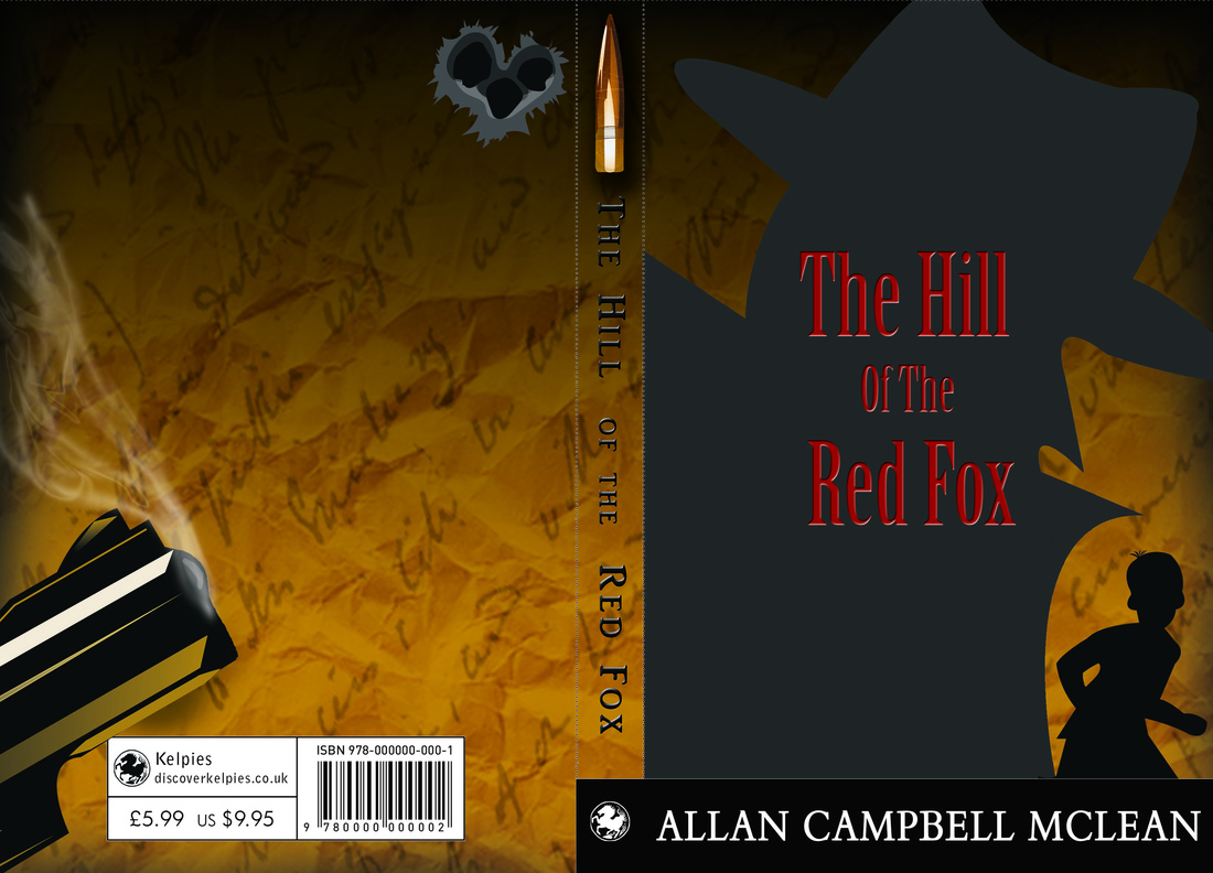
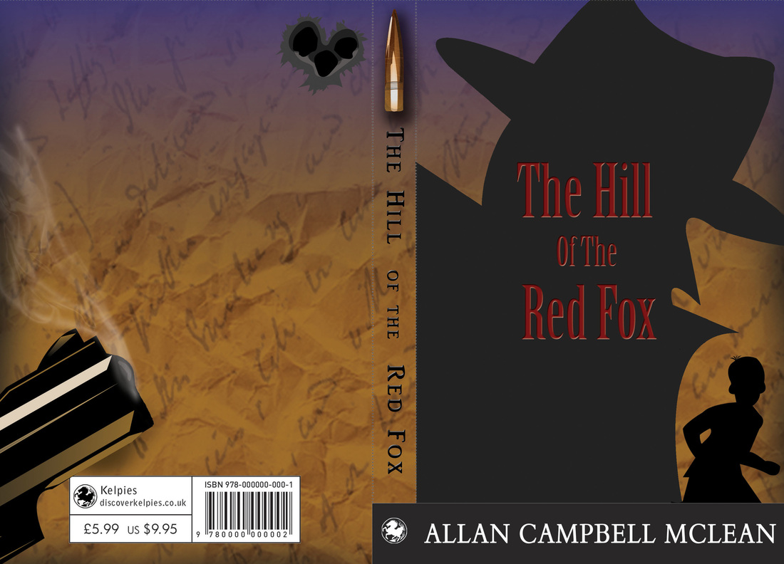
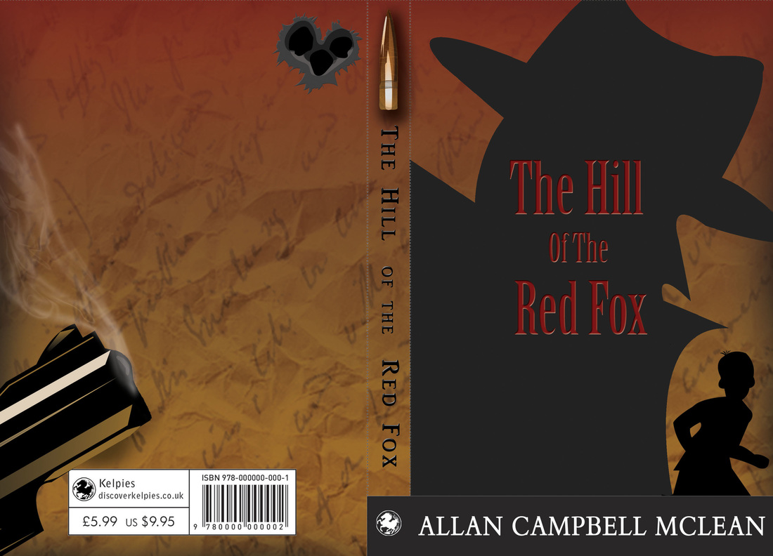
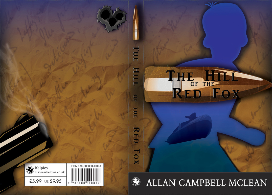
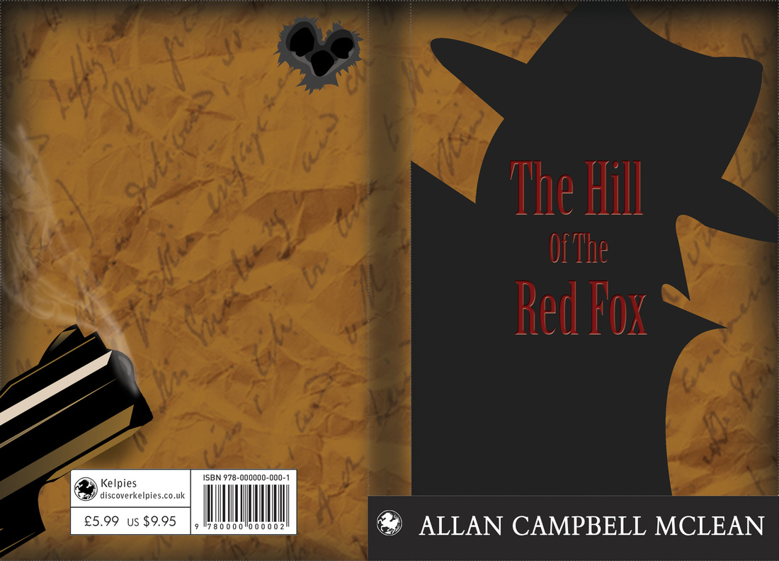
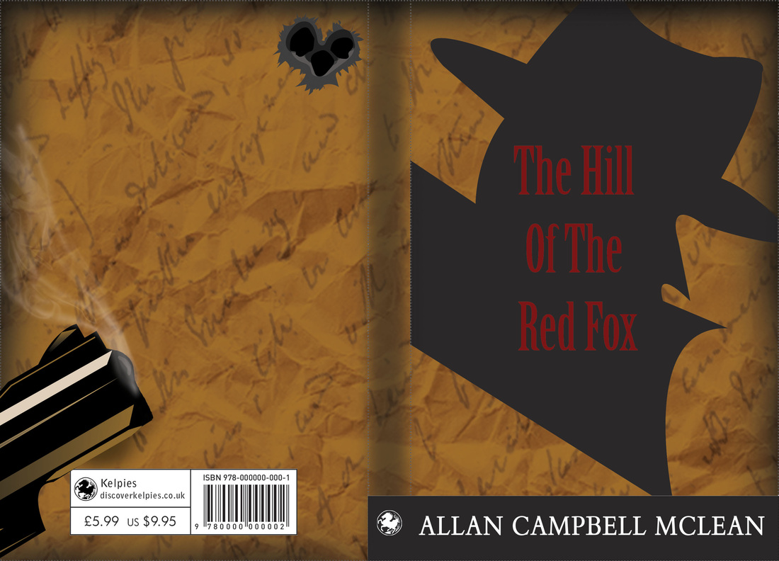
So I started looking at my dissertation today..... then I thought the dishes needed done, Have to get my finals ready for the interim show. So may as well add the blurb to the book covers. Had to then change some of my elements within the book covers around so the blurb would fit.... And about two hours spent arguing with myself on which fonts to use.... so yea..... em, didn't get much of anything to do with my dissertation done today. Whoops! I have to admit though, I really under estimated how much time it would take to not only tweak one of the covers to look semi finished, as the others do. But to then get the elements to change about and try to make them identical to the other. Such a pain in the arse! I did get it done though, in between cleaning my flat and any other distraction that I let take me away from my laptop. I got it done! 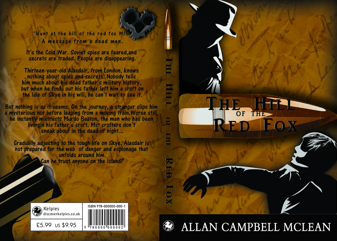 So this was the first font that I really liked. Also just to let you know, the colours are a little funny due to me being lazy about putting the images into RGB mode. I have uploaded too many so look through past blogs to get an idea of colour. I want you to look at the font anyways. So as I was saying. This was the first font I liked. I then tested a few others and finally landed on this one: 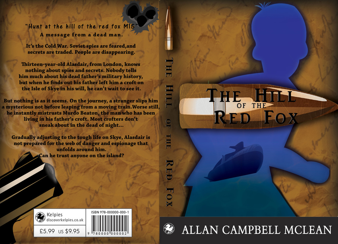 Now this is actually the font called "Chaparral Pro", this is it in bold. So I realized I had to move all the elements on the back page. I was determined not to move my guide lines though. The gun, smoke, bullet holes. ALL had to be moved to have room for the blurb. Took me a good few hours for each of the book cover, to try and get the placement exact on each one. So, eventually I got this working for me. I then decided to still have the font "Chaparral Pro" in regular. So these are my finals ready for print and hopefully mounting on Monday.
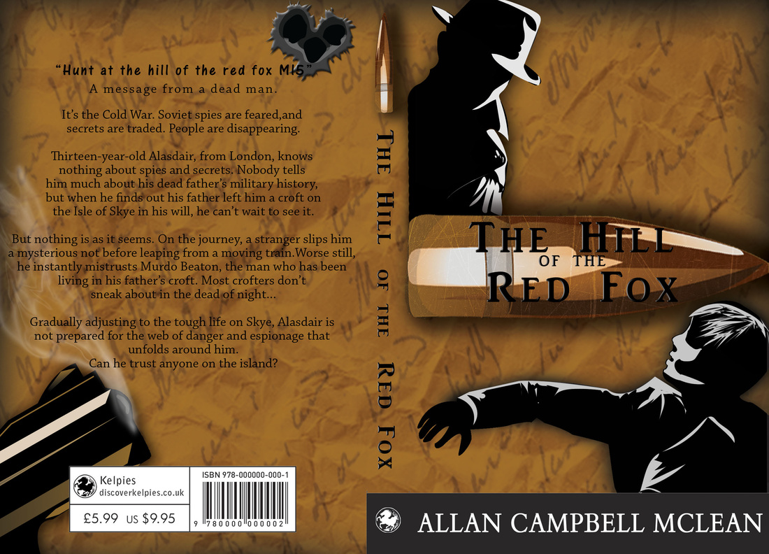
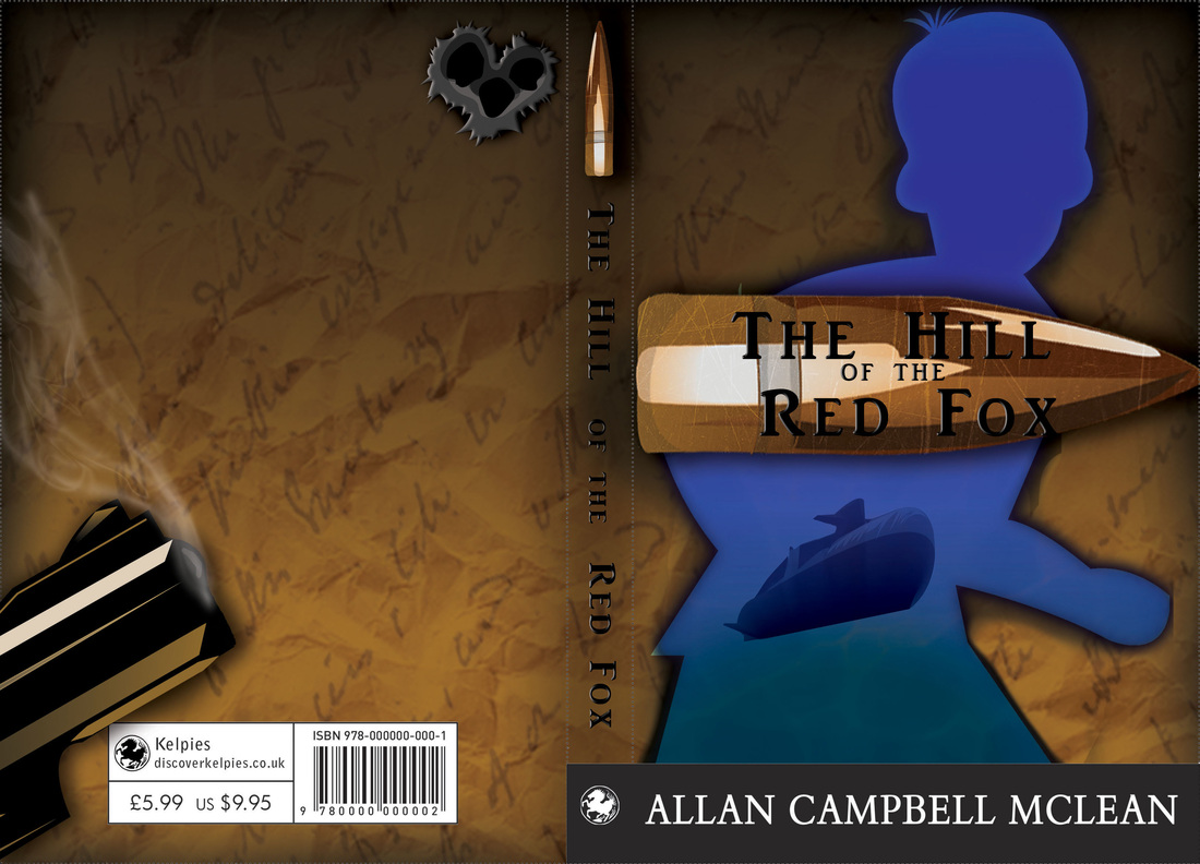
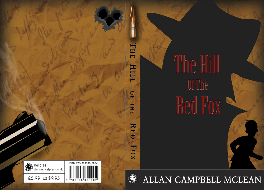
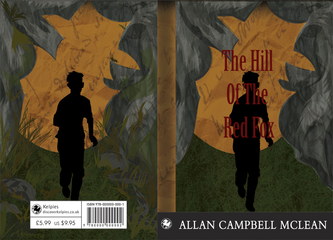
So, again really wasn't feeling well today. Spent another day in bed wrapped around my laptop doing more work. So I did soooo much today. A lot more book cover stuff for Kelpies. I did majority just variation work. So these are all different variations of the spy and the child work. I decided to play about with gradients . As I had said yesterday my relatives who are the age range that the book is aimed at. They preferred this image as apposed to my blue boy. So this was really me, trying to make myself like the image more, as I do think it looks very simple. I even did a few variations with my other preferred book cover, to see how it would look. So I added gradients to the image that I preferred most. I realized that actually still preferred my original of all of these with the boy and the submarine. 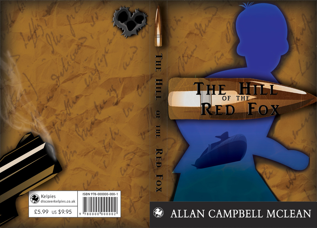 So, the more I think about it the more I keep thinking, this right here. This is going to be my final for the Kelpies book cover. I know my relatives really preferred the other. But I don't know, I keep being brought back to this cover. Also with the added, "Your also selling to the parents as well as the child". Keeps coming back to me and I think this really work. As within the story once you read it. The cover will suddenly make a lot more sense. Which should be how a book cover is made anyways, with clues and symbolism. I also started to go back and have a look at my Main Project. I have a fair wee bit to catch up on before I start to analyze the new data that I've collected. So I did a few more sort of little illustrations with some of the questions from old data. As I wanted to make it a little bit more fun to look at and more interesting than a pie chart. These are outrageously simple looking, but these are just little designs really. I'm more experimenting with how and in how many different ways I can show data. So these we're more little quick designs that I came up with. Tomorrow there should be more. I also have an interim show next week. So I have been having to get myself sorted for that. So I will try and get a few images of what my space looks like. Here is just a little quick design peek of what I am planning on putting up. 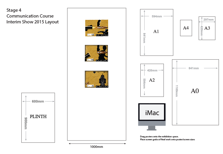 So as you can see I am planning on putting up 3 of my book cover designs. The interim show, is more or less a mock exam, to get me ready for my final end of year show. So yea, I will report back tomorrow.
So, today I still feel iffy, but feeling a whole lot better than what I was yesterday. So, I did what I mentioned yesterday about asking my relatives which of my book covered they preferred. As they are the age group the design is aimed for. I realized however that after I asked, I was slightly rooting for one design over the other. Especially when both my relatives said they preferred the image on the right. I had also asked some of my friends which ones they preferred. They all answered the image on the Left. So I think there is definitely something to be said about that. I then began to analyse both of the designs. Why did I really not like the image on the right, compared to the image on the right. I realized it was mainly due to the very simple shape and design of the spy like figure. I then looked at the image on the left , what did I like so much about this cover. I realized that it was just this. The image on the right, was a bit too complicated, too much going on. The image on the left, too simple and not much happening. So I went back into photoshop and made a few changes. So I added text to both of the spines, I took away one element from the left book cover, which was the little spy vector. I then made the right book cover a little more complicated. Now with the image on the right I still feel there needs to be more done to it. Even just making the little boy in it the same colour as the main figure of the book cover. I would also like to add gradients. Although I am still figuring that part out, in which way exactly I want to do that.
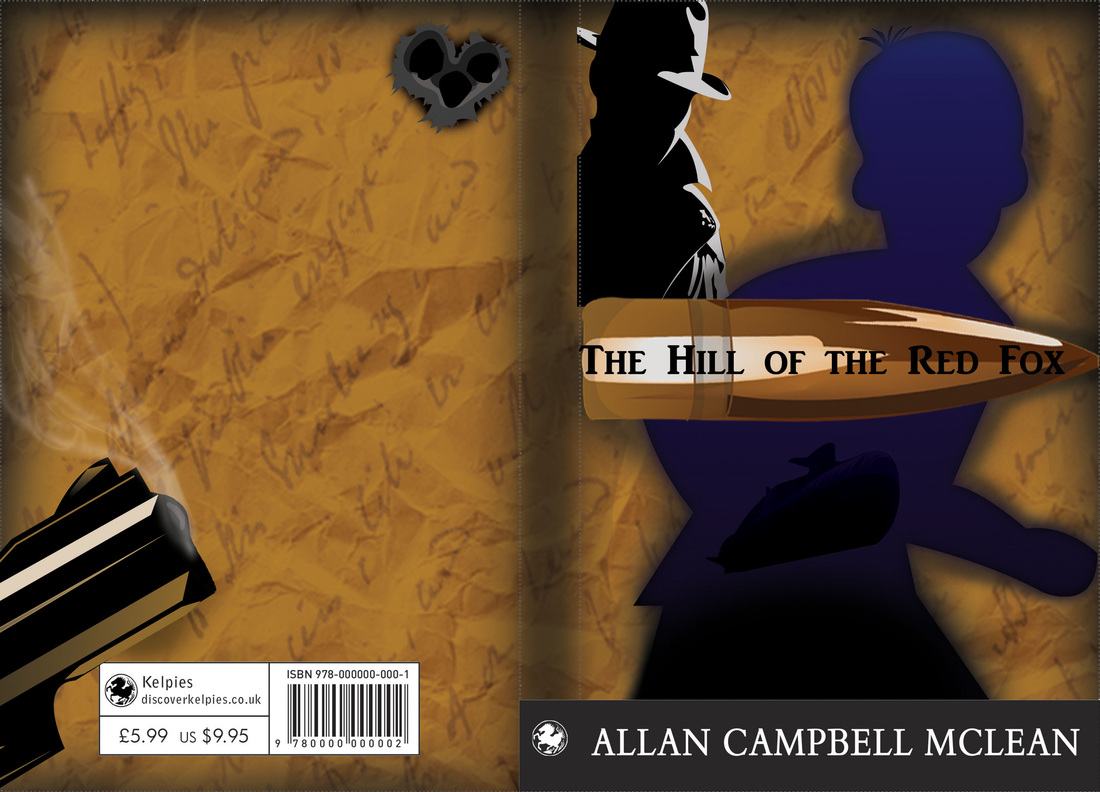
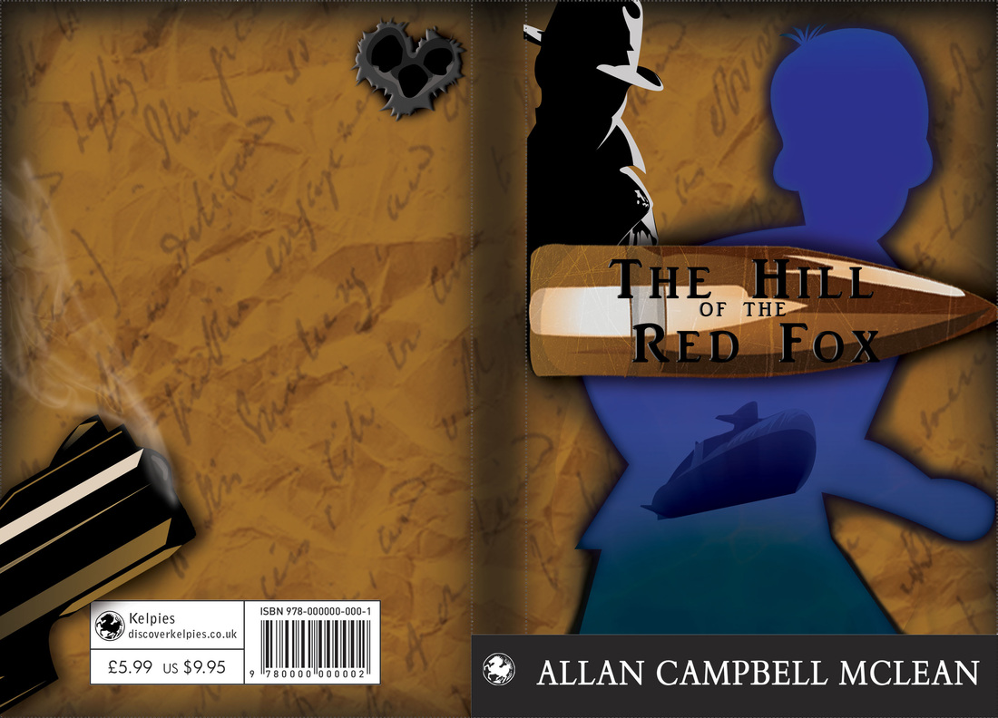
Now, here's the kicker. I show these new designs to my relatives. They still pic the same one as they did before. I ask friends who are the same age as myself. They still all pic the same book cover of the blue main figure. I really have no idea, what to do. Although after speaking about these with my friends. Something I hadn't realized was brought to my attention. When children want books, it's the parents that buy the books for them. So this cover needs to appeal to children as well as adults. This being a key factor I had forgotten. I am hoping to send my design off to them tomorrow, So here's hoping I will have made a decision. I still feel myself leaning towards the image on the left. whoops... So, I'm annoyingly feeling even worse today. Although I again just lay in bed, and wrapped myself around my laptop and did some work. I spoke yesterday of how I wanted to pick a few of my designs and really finish them off. So i chose these two designs: So these are the original, I then went on to tweak these a little more. However, I really like the back page design, and in all honesty. I don't really want to change that. I think though, that there still needs to be a lot more done to these. So these are the newest versions. I felt as though I had been concentrating so much on the illustrator point of view of these designs that I totally forgot about making things a little more realistic looking. So I added a scrape texture to the bullet with the title on it. I also added a water texture on to the boy to, not only brighten the image but, again make it a little more realistic. I really like these but I feel that they are just images hovering on a page. I feel that there should be more to these, However I just can't put my finger on it.
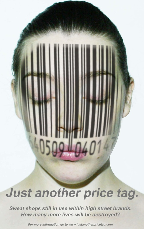
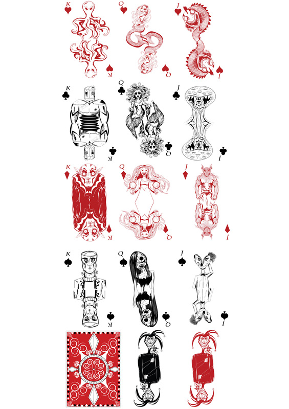
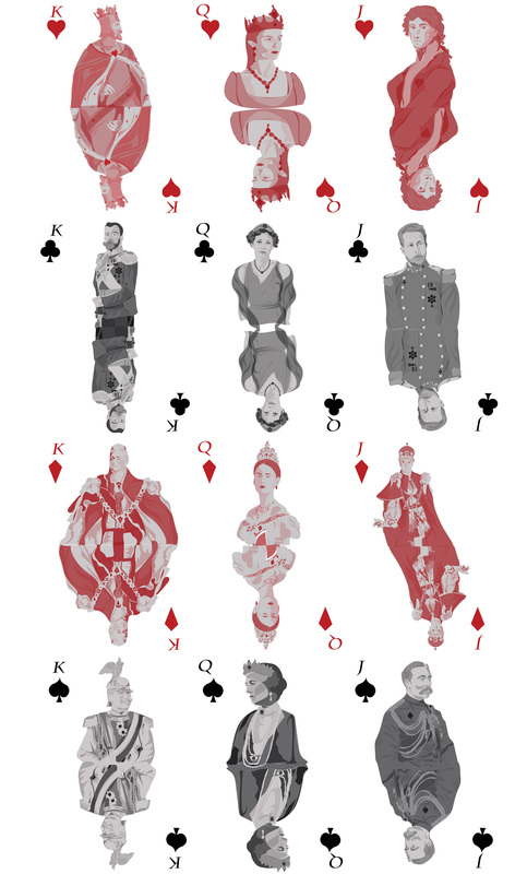
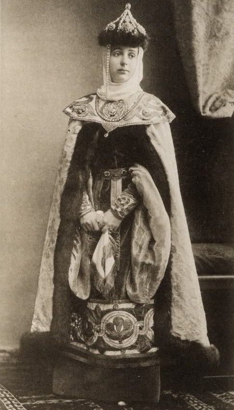
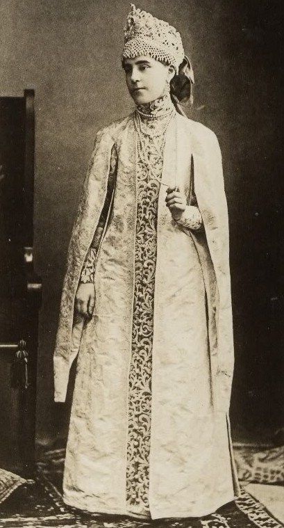
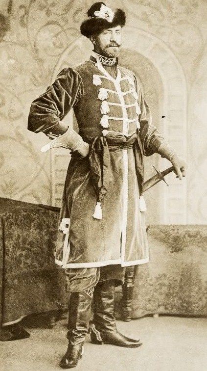
I have also decided to send my designs to a family member who is within the audience target age. She is not shy about letting anyone know her thoughts. So hopefully she'll be gentle. I also think that this is great for me, as I don't want the cover to look to aimed towards boys. So maybe she will like them, or say they need to be a bit more neutral. Here goes nothing.... So, still feeling super ill today. But I just curled myself around my laptop and sketch books and made myself do work. I actually got a lot done today! So I have two new book covers that I started working on today. I am still not too sure on either, but I have now realized with the deadline looming. It is perhaps time to look at the ones I already have a choose one or two and develop it further. So here are the two newest editions of my book covers: So as I had discussed yesterday, I had tried to recreate the same style of image as the Star Wars posters. I did this to the image on the left, I don't really feel that this worked. I even added textures to make it look more like rocks and wilderness. The book is based on the Isle Of Skye, Scotland. So I looked up lots of photos in hope of seeing lots of forests and things to create a similar branch effect to create a type of inception image. But no, just lots of mountains and wild flowers : 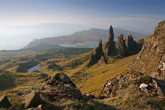 isle of skyeSo, as you can see just a lot of rough rocks and cliffs. Although I tried to recreate this landscape within my book cover I really don't think it worked. So I looked at all my previous book covers and thought, well what do I like about these? I then went back and created the image on the right. Of just a spy, It is definitely a lot simpler. than the image on the left. I also started doing a little more of my designing of a deck of cards. I looked up royal families from around the globe. Looking at the costumes, uniforms, jewelry and of course crowns and tiara's. I came across this photos. The only thing that was said about them was these are photos from a party. I don't know what year, or place. but the costumes and amazing looking. Hello! So I'm not going to lie, I have done 0 work today. I haven't been well all day. So I haven't really left my bed. I have however just been thinking about what I want to do with my book cover and such, so hopefully I will be well enough tomorrow to do some work and show you how I've been getting on. The heat is on, as the deadline is this Friday. However I have always preferred to upload my finals for online competitions the day before, to avoid any technical difficulties that I may end up having. I think this is just a good tip for anyone really. So If suddenly your internet goes, or your computer, printer etc. isn't working you can go to a friend or families home and get it sorted. Or in my case, panic and run to uni to use their stuff. And as I don't have anything to show for today, here's an image from my research for my main project. I am starting to think of doing photoshoots and having facts on how to stay positive and the reality of the effect on how we consume.  By Mirna Jose Photographer: Marcelo Cantu PhotographyToday, I just continued on with my book cover for the Kelpies. I have now decided to take a different route with it. Although I am still playing around with it and experimenting so I don't really have anything to show you today. 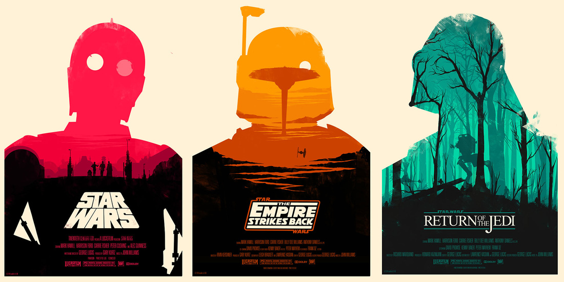 I am going to experiment with the book cover in hope that I can create something similar in style to these star war posters. Inspired by Saul Bass, one of my favorite designers. I really like how these have the idea of an image within an image, like inception . So hopefully I will have something interesting to show tomorrow. I have however already done something similar. with this image, in hope to do the same style as above. 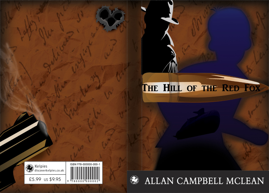 As you can see I tried to have the silhouette of Alistair representing the submarines in The Cold War. Which I have to admit I am very proud of my submarine. Just saying!
So here's hoping I will have more interesting trail runs to show tomorrow |